
Very few SQL Server practitioners have managed to avoid hearing of Power BI. Some have even used it to create impressive dashboards bulging with charts and other visuals. Even after the initial excitement of the ‘unboxing’ has faded, many of us have (occasionally grudgingly) admitted that it is a powerful product that certainly seems to deliver what it promises.
There is, however, a use for Power BI that is far removed from the graphical bells and whistles, but which could prove to be of most value to the database professional. This is the use of Power BI to model and shape data.
Why Shape Data?
The classic self-service BI approach usually follows the approach that is outlined in Figure 1, below:

Figure 1.
This is the solution that most users currently implement. You find data sources, connect to them, import what you need and then add any required calculations before creating dashboards. This is exactly what the product was designed for and it usually works flawlessly with an impressive range of data sources. Equally impressive is the power of DAX in its latest incarnation to extend a data model with complex additional metrics. Finally the data modelling capabilities allow you to add hierarchies and define KPIs.
However this approach assumes that the source data is comprehensible to users, and easy to apply. This is an optimistic assumption that can end in tears. What happens when the data is sourced from a complex relational system? This can result in lay users feeling helpless and lost in an unfriendly thicket of metadata. Even if Power BI can detect relationships between tables, and lets you, the developer, rename tables and columns to make the result seem less intimidating, an OLTP system is rarely designed to optimize end-user happiness.
Things can get even worse if your data source is an ERP system. Whatever the source, and even if the table names are in English – the metadata is largely incomprehensible and any traditional table relationships are probably absent.
Even when the database is relatively straightforward, you could have a valid reason to want to present data differently. Perhaps you want to try out a data warehouse topology or apply a rapid application development process to a Kimball model before you launch into the creation of a full-blooded enterprise data warehouse. Maybe you want to experiment with a Data Vault approach. Whatever the reason, adapting or refining the data landscape could be either an option or a necessity.
It follows that if you are going to attempt a self-service BI solution you are probably going to have to think in terms of adding a metadata layer to the source data to render the information accessible to users. This is the approach that is outlined in Figure 2:

Figure 2.
As any BI practitioner will immediately note, there is nothing original about this approach. It is probably what most BI architects and developers have been doing with the SQL Server stack for 15 years or more. So why not apply it to a Power BI solution?
Full-Stack BI with Power BI
It may come as a surprise to some, but Power BI can – with a little application – become a full-stack BI solution. This is because even though it is a single tool, it lets you carry out the key steps in a BI process. The table below lets you compare Power BI with the SQL Server BI stack:
|
Segment |
SQL Server Stack |
Power BI |
|
Data Load |
SSIS |
Power BI Query Editor |
|
Data Modelling |
SSAS (SSDT) |
Power BI Query Editor / Power BI |
|
Metrics |
SSAS (SSDT) |
Power BI / DAX |
|
Reporting |
SSRS (Paginated and Mobile) |
Power BI |
|
Distribution |
SharePoint |
PowerBI.Com |
Simply put, Power BI will let you do nearly everything that you can do using the traditional SQL Server BI toolkit.
The next question to ask is why you should want to use a simple, free tool to replace an industrial-strength tried and tested approach. The answer is, of course, much more nuanced. You might not want to replace an existing system. Yet you could want to:
- Develop a proof of concept data warehouse in a shorter time-frame
- Deliver a specific and tailored solution to a subset of users
- Avoid extending a corporate data warehouse to empower only a small group of users where the complexity is disproportionate
- Deliver a targeted solution for a specific group of users where a corporate solution is not cost-effective
- Allow users to access data from outside the specific corporate data that they use traditionally – specifically Big Data sources
- Model and test new data sources – and mix OLAP, OLTP and Big Data sources
This list could go on. However I hope that some of these ideas will strike a chord with readers.
The breadth of the capabilities that Power BI offers allows you to perform all of the following everyday BI tasks:
Data Load
- Data Profiling
- Load Sequencing
- Data Type Conversion
- Data Lookups
- Relational to dimensional conversion
Data Modelling & Metrics
- Schema design:– Dimensional vs. tabular
- Semantic layer (rename objects for greater clarity)
- Hierarchies
- KPIs
- Calculated metrics
Presentation Layer
- Compare visualization types / test chart types
- Mock-up reports / dashboards (element assembly)
- Test Filters (& Slicers)
- Try out Hierarchical Drilldown
- Define user interaction requirements (Self-Service vs. Enterprise BI)
Using Power BI Desktop to Apply a Logical Dimensional Layer
Although I haven’t the space to go into all the detail and to examine all the possible variations on the theme of BI, all the tasks listed above are perfectly possible using Power BI. For the moment we will concentrate on a few core elements of the stack to apply a logical dimensional structure to a relational data source, adapt the semantic layer and then add a couple of calculated metrics and a few hierarchies. This will allow you to appreciate some of the more well-known (as well as one or two of the less well-known) aspects of the Power BI Query Editor in Power BI Desktop. What we will see includes:
- Joining tables at query level (as opposed to doing this in the Power BI Relationships view)
- Using hidden intermediate queries as a data staging area
- Generating and applying surrogate keys in the Power BI Query Editor
- Renaming queries and fields
- Adding hierarchies
- Creating calculated measures
This article assumes that you already have some knowledge of Power BI Desktop and the Power BI Query Editor, but what follows should not, I hope, deter even beginners. After all, this tool is ostensibly designed for ease of use, and so even moderately complex modifications should be comprehensible by neophytes.
The Relational Schema
The sample data for this article is an OLTP database (albeit a very simple one) that contains six tables. These are illustrated in the following figure:
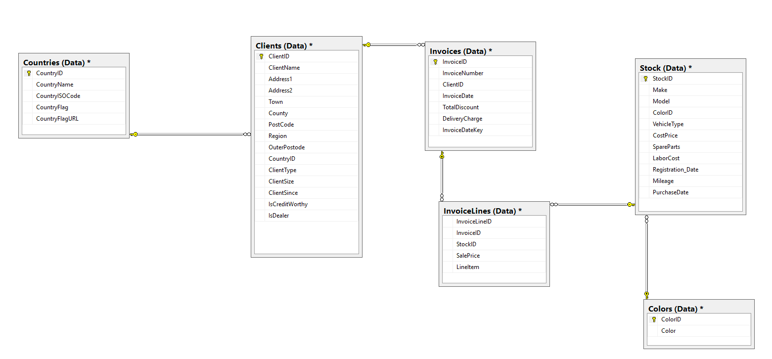
Figure 3
The Desired Dimensional Schema
The relational data has, inevitably, been optimized for transactional processing. Consequently the fields that users will need for analytics are distributed among several tables. What most users want is a simplified presentation layer that delivers attributes and metrics in classic star schema. In fact we could imagine that the CIO of the company just returned from a power lunch with a suite of highly-paid external consultants bearing a napkin containing the ideal BI architecture. This is shown in Figure 4:
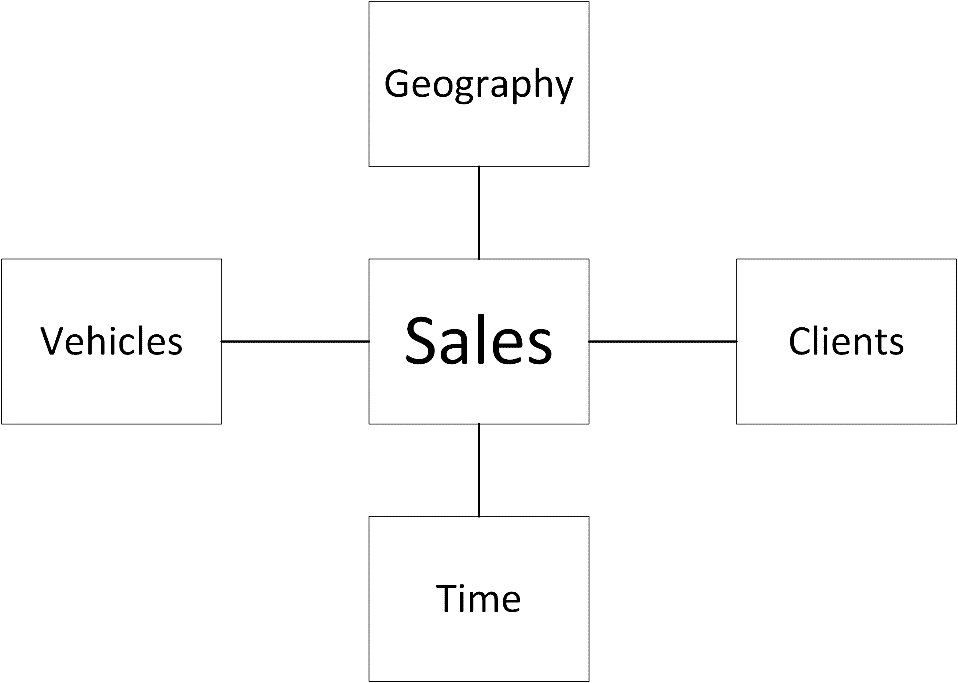
Figure 4
Clearly this design is not a fully-fledged enterprise data architecture. However it is enough for the purposes of this article, as it will let us overlay the existing relational design with a radically different data topology and then extend it with a time dimension.
Loading the Data
As a first step in creating a star schema over a relational model we need to load the data. This example will use the sample database CarSalesData. If you prefer to save yourself the trouble of creating a database and running the script to populate the tables, the data for these tables is also in a spreadsheet named CarSales_Tables that is supplied with this article. Power BI could, of course have sourced the data from any of the multitude of sources that it can handle.
- Launch Power BI Desktop and click ‘Get Data’ from the splash screen.
- Click ‘Database’, ‘SQL Server Database’ and ‘Connect.’ The SQL Server Database dialog will appear.
- Enter the server name, click ‘Import’ and ‘OK’. The Navigator dialog will appear.
- Expand the CarSalesData database and select the six tables that are in the ERD diagram in Figure 3. The Navigator dialog will look something like the one in Figure 5.
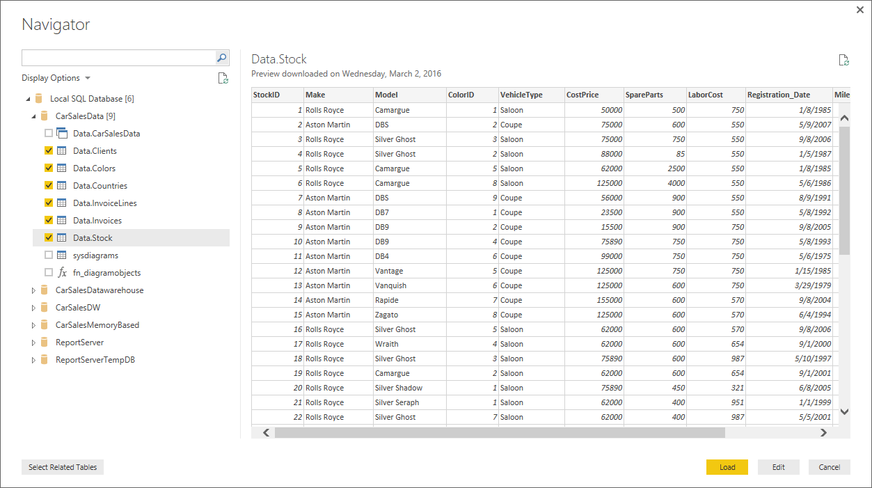
Figure 5.
- Click ‘Edit’. The Power BI Query Editor will open and display the tables that you have selected. You can see this in Figure 6.
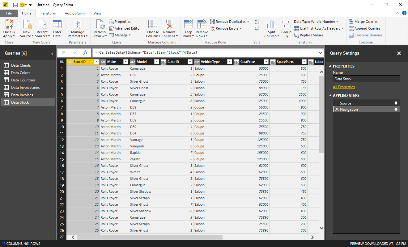
Figure 6
- In the Queries pane on the left of the screen, right-click on each source data table individually and uncheck ‘Enable Load’. This will make the source tables into “intermediate” or staging tables that will not be visible to end users but that can nonetheless be used as a basis for the data transformations that will be applied later. The table names will appear in italics in the Queries pane on the left.
- Rename all the queries to remove the “Data” prefix.
The first and fairly painless stage is finished. You now have the relational data in Power BI Desktop ready for dimensional modelling.
Creating the Vehicle Dimension
A quick look at the source data shows that the attributes describing vehicles can be found in a couple of tables – Stock and Colors. So we need to isolate the required attributes from these tables and create a single “virtual table” (which is really another query) that will be visible to the user as the Vehicle dimension.
- Right-click on the Stock query and select ‘Reference’. This will create a copy of the Stock query that will depend for its source data on the source query.
- In the Query Settings pane on the right rename the Stock (2) query Dim_Vehicle.
- Leaving the Dim_Vehicle query selected, click ‘Merge Queries’. When the ‘Merge’ dialog appears click on the ColorID column in the upper part of the dialog.
- Select the Colors query from the popup list and click on the ColorID column in the lower part of the dialog.
- Define the Join Kind as Inner. You will see something like Figure 7.
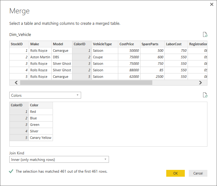
Figure 7
- Click ‘OK’. A new column (named NewColumn) will appear at the right of the data table.
- Click the icon at the right of the new column. In the popup select the ‘Expand’ radio button, uncheck ‘ColorID’ and also uncheck ‘Use original column name as prefix’. The dialog will look like the following figure:
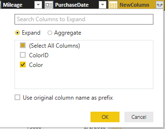
Figure 8
- Click ‘OK’. The Color column from the Colors query will be added to the Dim_Vehicle query. You have, in effect, created a “view” based on the two queries.
- Control-click to select the following columns: Make, Model, VehicleType and Color. Then right-click on any of the selected columns and choose ‘Remove other columns’. This will leave you with a data table containing four columns only. These columns are the attributes required by the Vehicle dimension.
- Select all four columns in the table and then, in the Home ribbon click Remove Rows and then Remove Duplicates. Only unique records will remain in the table.
- In the ‘Add Column’ ribbon, click the popup triangle in the ‘Add index Column’ button. Select From 1. A new column containing a unique monotonically increasing identifier will be added. This will be the surrogate key.
- Right-click on the new column and rename it VehicleSK. The final dimension query will look like the one in the following figure:
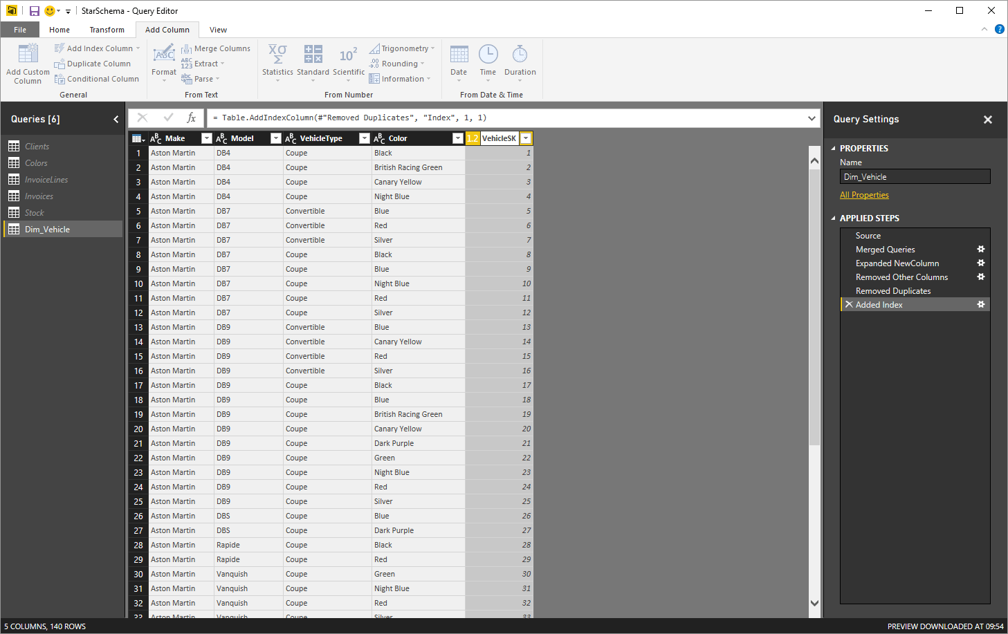
Figure 9
Creating the Sales Fact Table
Let us now jump straight to the creation of the fact table that shows all the car sales from the source database. Here is how to set this up:
- Right-click on the InvoiceLines query and select ‘Reference’. This will create a copy of the source query. The newly-created query will use the original query as a data source.
- Right click on the reference table that you just created and select ‘Rename’. Call it Fact_Sales.
- Leaving the Fact_Sales query selected, in the Home ribbon click ‘Merge Queries’. When the ‘Merge’ dialog appears click on the StockID column in the upper part of the dialog.
- Select the Stock query from the popup list and click on the StockID column in the lower part of the dialog. Set the Join Kind as Inner. Click ‘OK’.
- Click the icon at the right of the new column. In the popup select the ‘Expand’ radio button, uncheck ‘Select all columns’ and also uncheck ‘Use original column name as prefix’. Select the Make, Model, VehicleType and ColorID columns, then click ‘OK’.
- Click ‘Merge Queries’. When the Merge dialog appears click on the NewColumn.ColorID column in the upper part of the dialog.
- Select the Colors query from the popup list and click on the ColorID column in the lower part of the dialog. Set the Join Kind as Inner. Click ‘OK’.
- Click the icon at the right of the new column. In the popup select the ‘Expand’ radio button, uncheck ‘ColorID’ and also uncheck ‘Use original column name as prefix’. Select the Make, Model, VehicleType and ColorID columns, then click ‘OK’.
- Click ‘Merge Queries’. When the ‘Merge’ dialog appears click on the NewColumn.Make, NewColumn.Model, NewColumn.VehicleType and NewColumn.Color columns in this order.
- Select the Dim_Vehicle query from the popup list of available queries.
- Click on the Make, Model, VehicleType and Color columns in this order in the lower part of the dialog, then click ‘OK’. You are joining the two queries using multiple fields.
- Click the icon at the right of the new column. In the popup select the ‘Expand’ radio button, uncheck ‘Select all columns’ and select only the VehicleSK column. Click ‘OK’.
- Select the VehiclePrice and VehicleSK in the Fact_Sales table. Right-click on any of these columns and select ‘Remove other columns’. The fact table will look like it does in the following Figure:
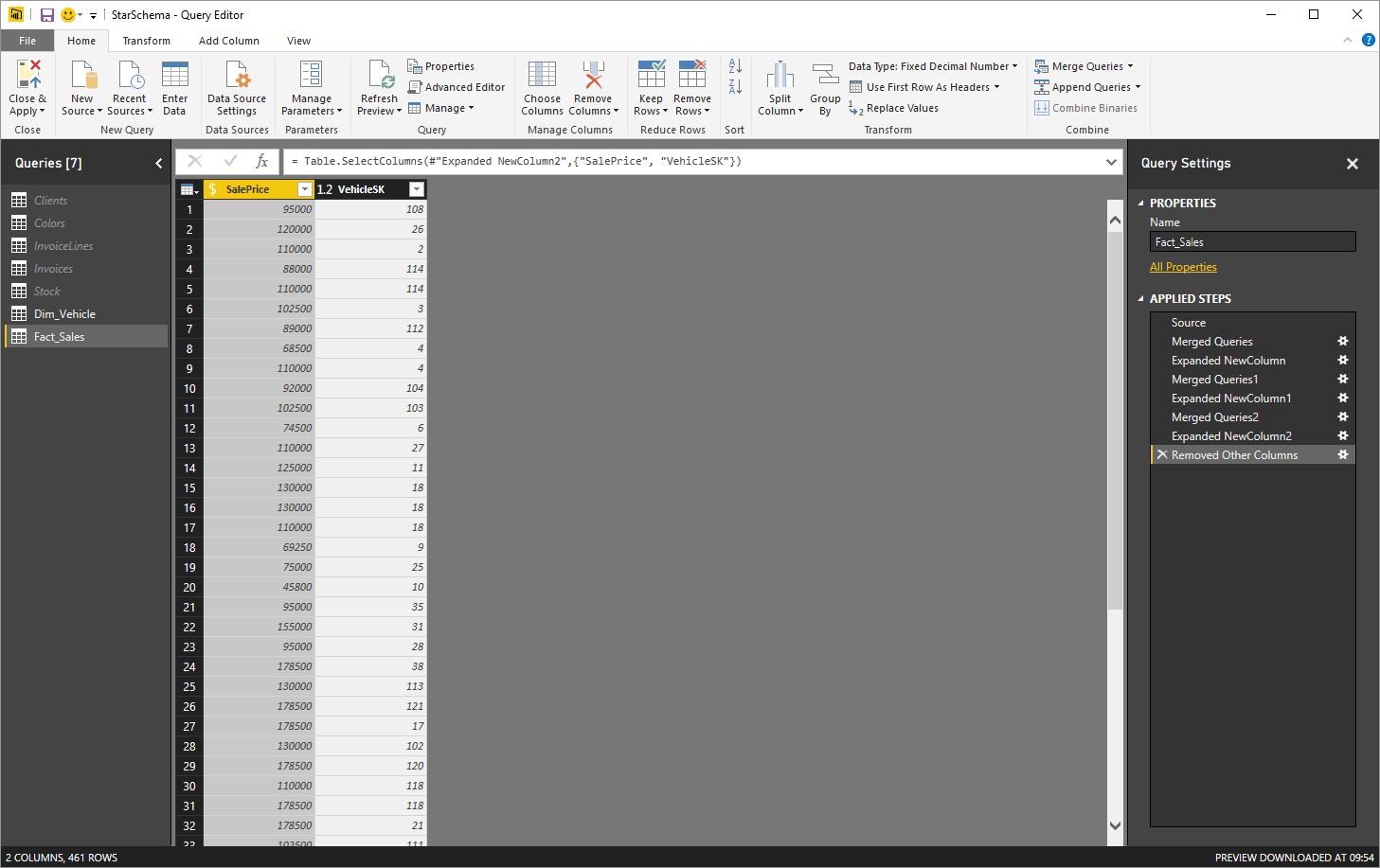
Figure 10
This process let you detect and add the VehicleSK field from the vehicle dimension to the fact table. I imagine that most BI practitioners have carried out these kinds of operations using SSIS and T-SQL many times in their careers.
Adding a Time Dimension
It is hard to imagine a data warehouse – even a tiny model like the one that you are seeing here – without a time dimension. So let’s see how to add this to the model in a couple of minutes.
- In Data View, activate the ‘Modeling’ ribbon and click the ‘New Table’ button. The expression Table = will appear in the Formula Bar.
- Replace the word ‘Table’ with ‘DateDimension’.
- Click to the right of the equals sign and enter the following DAX function
1DateDimension = CALENDAR( "1/1/2012", "31/12/2016" ) - Press Enter or click the tick icon in the Formula Bar. Power BI Desktop will create a table containing a single column of dates from the 1st of January 2012 until the 31st of December 2016.
- In the Fields list, right-click on the Date field in the DateDimension table and select ‘Rename’. Rename the Date field to DateSK.
- Add five new columns containing the formulas shown in the table below:
Column Title
Formula
Comments
FullYear
YEAR([DateSK])
Isolates the year as a four digit number
Quarter
“Q” &ROUNDDOWN(MONTH([DateSK])/4,0)+1
Displays the current quarter in short form
QuarterNumber
ROUNDDOWN(MONTH([DateSK])/4,0)+1
Displays the number of the current quarter. This is essentially used as a sort by column
MonthFull
FORMAT([DateSK], “MMMM”)
Displays the full name of the month
MonthNumber
MONTH([DateSK])
Isolates the number of the month in the year as one or two digits
- Select the Quarter column. In the Modeling ribbon click the popup triangle in the ‘Sort By Column’ button and select QuarterNumber.
- Select the FullMonth column. In the ‘Modeling’ ribbon click the popup triangle in the ‘Sort By Column’ button and select MonthNumber
In case this short sequence seems a little cabbalistic, let me explain what you have done:
- Using the DAX formula CALENDAR() you specified a range of dates for Power BI to generate a table containing a continuous date range.
- You added fields to display quarter and month – as well as the numbers for these items that are used as sort indicators.
- Finally you applied the sort order to any non-numeric columns. This prevents the month names appearing in alphabetical order.
Your Date dimension is now complete. It is, admittedly, an extremely shortened version of the kind of fully-fledged table that you would need in a large-scale application. However it is enough to make the design point that underlies this article.
Finishing the Data Model
Now let’s create the dimensional model – albeit with only one dimension for the moment, as I am keener on clarifying the principle that you can then employ for most other dimensions rather than wading through all the detail.
- Assuming that you are still in the Power BI Desktop Query Editor, click ‘Close’ and ‘Apply’ to return to the Report view.
- Click on the Relationships icon on the left (the third icon down). You should see the fact and dimension table joined on the VehicleSK field. The initial model will look like it does in the following Figure:
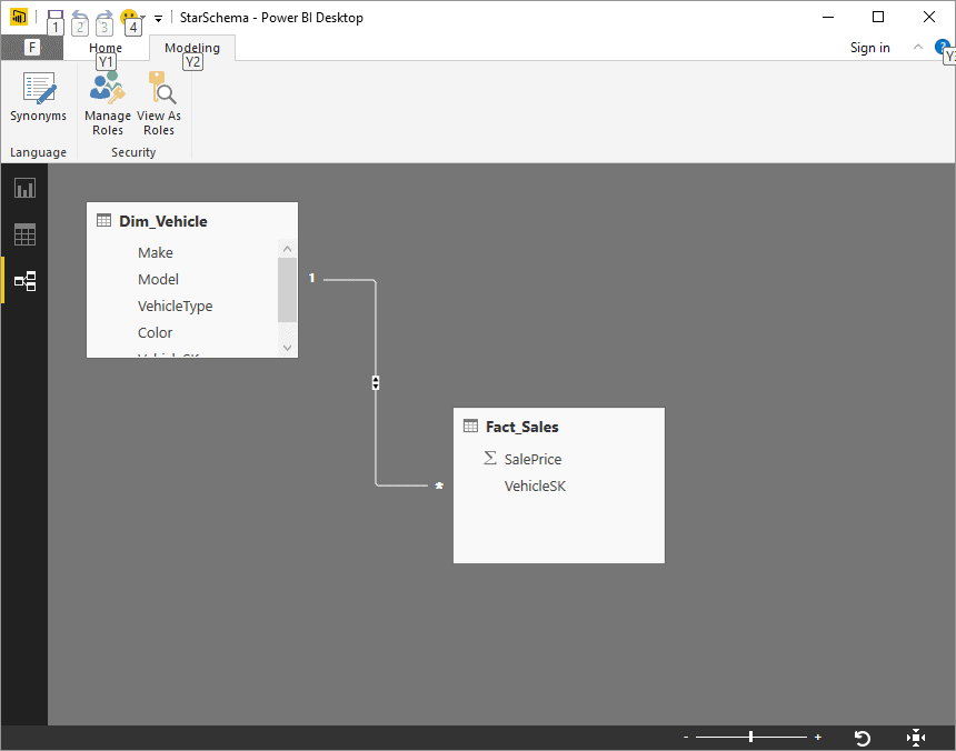
Figure 11
Yes, that is right, you have nothing more to do. Power BI Desktop has guessed that the queries (that are now, for Power BI, tables) are designed to be joined on a specific field and has helpfully added the relationship between the tables.
The remaining two dimensions can be created using exactly the same techniques that you saw in the section describing how to create the vehicle dimension. So I will not describe all the steps laboriously, but prefer to refer you to the finished model that you can find in the PowerBiForDataModelling.Pbix file that accompanies this article.
The finished data model that you can view in the Power BI Desktop Relationships view looks like the one in Figure 12, below. As you can see, we have created a practical implementation based on the high-level (that is, napkin-based) starting point that you saw above in Figure 4:
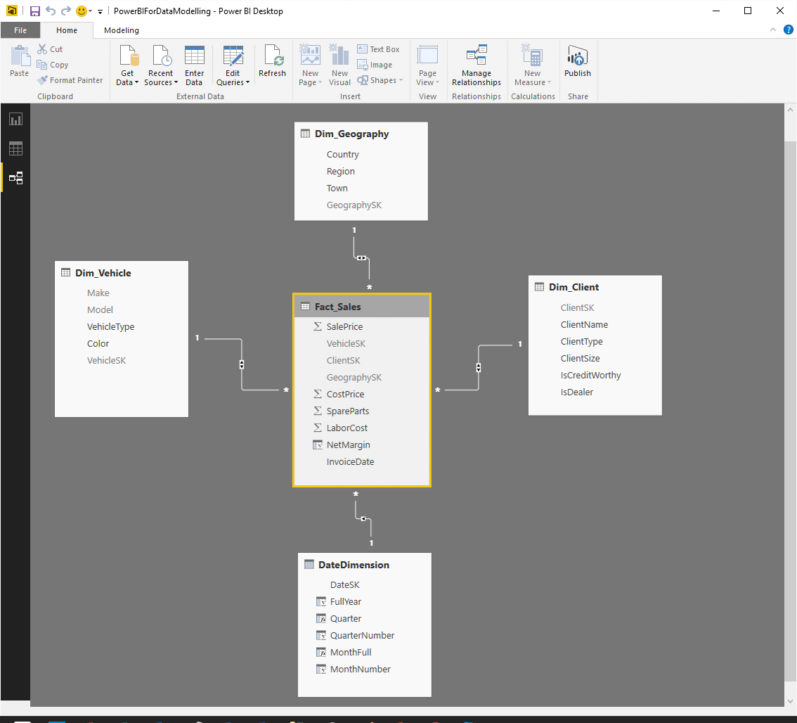
Figure 12
Power BI Desktop might not, in all cases guess the relationships correctly in a complex model. However adding a new relationship is as easy as dragging the surrogate key field from the fact table to the dimension (or vice-versa). Equally easily you can delete any erroneous relationships by right clicking on the relationship and selecting Delete.
Finalizing the Data Model
The data model still needs a few tweaks to make it truly user-friendly and ready for self-service BI. A couple of things to do are:
- Hide the surrogate keys and sort by columns.
- Add a vehicle hierarchy and a time hierarchy.
- Create a few calculated measures as simple examples of what can be done to extend a data model.
Hide the surrogate keys
This is extremely simple, but nonetheless necessary. All you have to do, in any of the Power BI views in Power BI Desktop is to right-click on the field that you want to mask and select ‘Hide’ in Report View. The surrogate key field will no longer be visible to users. They will, however appear in italics in ‘Relationship and data’ view. You have to do this not only for all the surrogate keys in all the tables, but also for the QuarterNumber and MonthNumber fields in the DateDimension table.
Add Hierarchies
Hierarchies are a traditional metadata structure in BI, and Power BI Desktop now (from the March 2016 update) allows you to create them.
- In ‘Report’ view, ensure that the ‘Fields’ list is visible on the right.
- Expand the Dim_Vehicle table.
- Right-click on the Make field and select ‘New Hierarchy’.
- Right-click on the Model field and select ‘Add to Make hierarchy’.
- Right-click on the original Make and Model fields (outside the hierarchy that you just created) and select ‘Hide’. This way these fields will only be visible in the hierarchy.
Now you have a ready to use parent-child hierarchy that can be applied to tables, matrices and charts.
Creating a time hierarchy is a virtually identical process. You start with the FullYear field as the basis for a new hierarchy in the DataDimension table and then add the Quarter and Month Full fields. Finally you hide these latter two fields outside the hierarchy.
Create calculated measures
BI inevitably involves adding further analytical calculations to the data model. As a full demonstration of DAX (the language that Power BI uses for calculating metrics) is beyond the confines of this article, I merely want to demonstrate the principle here.
- In ‘Data’ view, ensure that the ‘Fields’ list is visible on the right.
- Select the Fact_Sales table in the ‘Fields’ list.
- In the Home ribbon, click the popup triangle in the ‘New Measure’ button and select ‘New Column’. A column, enticingly named “Column” will appear in the Fact_Sales table at the right of any existing columns.
- Click inside the formula bar above the table and enter the following formula:
1TotalCosts = [CostPrice]-[SpareParts]-[LaborCost] - Press Enter – or click the tick icon in the formula bar.
The new column will calculate the total cost for every record in the fact table.
As a final flourish I want to add some Time Intelligence to the model. So
- In ‘Data’ view, ensure that the ‘Fields’ list is visible on the right.
- Select the Fact_Sales table in the ‘Fields’ list.
- In the ‘Home’ ribbon, click the popup triangle in the ‘New Measure’ button and select ‘New Measure’.
- Enter the following Measure
1QuarterSales = TOTALQTD(SUM(Fact_Sales[SalePrice]),DateDimension[DateSK]) - In the ‘Home’ ribbon, click the popup triangle in the ‘New Measure’ button and select ‘New Measure’.
- Enter the following Measure
1YearSales = TOTALYTD(SUM(Fact_Sales[SalePrice]),DateDimension[DateSK])
You now have a couple of MDX measures that will calculate month to date and year to date sales.
Now that the data model is finished, you should see all the measures and attributes that are displayed in the following figure – which is the Field List from the Report View in Power BI Desktop:
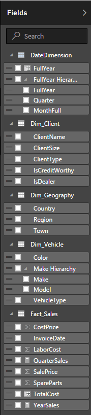
Figure 12
You can now save and close the Power BI Desktop Query Editor and begin using the available attributes and measures to create reports and dashboards. The sample data enabled me to create the dashboard that you can see in the following figure in approximately 3 minutes.
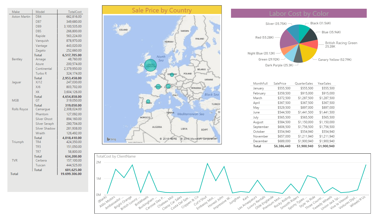
Figure 14
- There are a few points that I must make now that the star schema model has been created over the initial relational model:
- You might not need to create reference tables in reality – a finalized star schema might adapt certain tables rather than initially setting them to be reference tables. However this approach can be a valid phase when initially designing a radically different data topology over a relational model.
- Occasionally (as is the case with the ClientID field in this data model) you can use an ID as a surrogate key. Just remember to do this quietly and not to mention the fact to any Kimball purists or you will never hear the end of it.
- The tough part can be flattening the fact table so that it initially contains all the required fields that are necessary to map the fact table to each dimension table and deduce the appropriate surrogate key. However this becomes easier with practice, and is certainly easier if you know the source data model well.
- You may find that you have to use the “M” language in Power BI Desktop Query Editor to perform certain calculations if these are tightly bound to the relational data structure. An example can be discretizing data – in other words reducing mileage to “buckets” of mileage ranges, for instance. While you cannot hope to attain the ease and power of DAX in this environment, you can certainly carry out most of the kinds of calculations that you could perform using T-SQL when preparing a dimensional structure in SQL Server ready to be loaded into “Classic” SSAS.
The Limits to Power BI Data Modelling
The small example of in-process data modelling is, inevitably, an extremely simple one. Yet it hopefully suffices to make the point not only that this can be done, but that it can be performed relatively easily.
However I do not want the extreme simplicity of the approach to mask the sweep of data transformations that are available when modelling data with Power BI Desktop Query Editor. Joining tables and aggregating datasets are only a start. To give you a more comprehensive overview of what can be done, take a look at the following table that compares the data transformation capabilities of both SSIS and the Power BI Desktop Query Editor.
|
Data Transformation |
SSIS |
Power Query |
|
Pivot |
YES |
YES |
|
Unpivot |
YES |
YES |
|
Case Transformation |
YES |
YES |
|
Merge datasets |
YES |
YES |
|
Join datasets |
YES |
YES |
|
Deduplicate datasets |
YES |
YES |
|
Lookup |
YES |
YES |
|
Group and Aggregate |
YES |
YES |
|
Select Columns |
YES |
YES |
|
Exclude Rows |
YES |
YES |
|
Sort |
YES |
YES |
|
Split Columns |
YES |
YES |
|
Deduplicate |
YES |
YES |
|
Subset datasets |
YES |
YES |
|
Concatenate |
YES |
YES |
|
Split fields |
YES |
YES |
|
Filter Dataset |
YES |
YES |
|
Derived column |
YES |
YES |
|
Fuzzy Matching |
YES |
NO |
These are, inevitably, the good points. When it comes to heavy-duty processing, SSIS clearly comes out on top, because Power BI offers:
- No Logging
- No monitoring
- No complex error handling
- No Data Profiling
- Little flow logic
- No parallel processing
- Large dataset limitations
It follows that enterprise BI will remain the domain of the SQL Server toolkit for some time to come, and this is not in dispute. However I hope that, after a short time spent testing the data modelling capabilities of Power BI, even the most seasoned SQL Server professional will not be tempted to dismiss it out of hand as a lightweight tool for power users only.
Power BI Data Models for In-Memory Analytics
Earlier in this article I listed a few potential uses for Power BI in the enterprise. These included testing data integration approaches and trialing BI approaches. I want to finish with one more idea – and one that could prove to be a justification (as if any were needed) for rolling out SQL Server 2016 for in-memory analytics.
In-memory tables have reached a degree of maturity in the 2016 release of SQL Server. From a BI perspective they have made a quantum leap, with the addition of clustered columnstore indexes. These deliver OLTP speed allied the kind of with extreme compression ratios that, in their turn, allow for data warehouse-level quantities of data to be contained in memory – and so accessible nearly always instantaneously when using Power BI Desktop in Direct Query mode.
Power BI on top of these structures adds the final piece of the puzzle – it provides an easy to use and powerful user interface for analytics and reporting using the source data.
The only cloud in this otherwise clear blue sky is that some of the transformations that are necessary to overlay a different logical layer do not (yet) work in direct query mode. This means that it is not currently possible to create a scenario where data is not downloaded into Power BI Desktop, but read directly from SQL Server memory while presenting a separate logical data layer to the user. The specific function that blocks the kind of transformation that we used above is the generation of an index column. This is, unfortunately not possible when using a direct connection. However, given the continuing evolution of Power BI we can live in hope that this possibility – or a suitable workaround – may appear soon.
The result nonetheless is near-real-time analytics from transactional data presented in a comprehensible way to users. Self-service BI may just have made a great leap forward.
Pro Power BI Desktop
If you like what you read in this article and want to learn more about using Power BI Desktop, then please take a look at my book, Pro Power BI Desktop (Apress, May 2016).