
Nowadays, a common problem in web form design comes when you are implementing web application that requires the user to provide a large amount of data. You can, of course, provide a long scrollable HTML form but the users are unlikely to appreciate it because they have to scroll up and down between fields. Sometimes they will lose the focus and forget what they just typed. Occasionally, they will mistype values and get caught by arcane validation rules that make it difficult for them to correct the error. This can be horrible for them when the rules governing the way that data to be entered is quite strict and some data influences what has to be entered later.
For all these reasons, a single huge form is never a good idea. Stepped forms, also known as wizards are a much better practice of web forms design. A stepped input form allows us to break up large data input tasks into smaller pieces so that users face just one page at a time. For the user, the amount of information to enter remains the same but the overall process is smoother and much more manageable. In this article, I’ll discuss a couple of ways to implement a stepped form in ASP.NET MVC.
Using Bootstrap Tabs
The simplest way to implement a stepped form is to use a variation of the Bootstrap’s tab component. You just split all the input fields that would go in the form into a number of tabs and let Bootstrap render them. The figure below provides a glimpse of the final result you aim at.
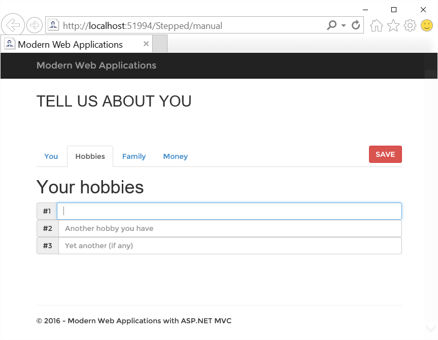
Users will see a classic tab strip where each pane contains a section of the original input form. In this way, users can focus on a small chunk of information at a time and have nearly no need to scroll the browser window up and down.
It is worth noting that at the HTML level there’s just one form to post data to the server. The overall markup you need to employ is shaped as below.
|
1 2 3 4 5 6 7 8 9 10 11 12 13 14 15 16 17 18 19 20 21 22 23 24 25 |
<form method="post" action="..."> <div id="wizard"> <!-- Tabstrip --> <ul class="nav nav-tabs" role="tablist"> <li role="presentation" class="active"> <a href="#personal" role="tab" data-toggle="tab">You</a> </li> <li role="presentation"> <a href="#hobbies" role="tab" data-toggle="tab">Hobbies</a> </li> : </ul> <!-- Tab panes --> <div class="tab-content"> <div role="tabpanel" class="tab-pane active" id="personal"> <!-- Input fields --> </div> <div role="tabpanel" class="tab-pane" id="hobbies"> <!-- Input fields --> </div> : </div> </div> </form> |
A FORM element surrounds the canonical Bootstrap’s tab markup. The user can freely navigate through the tabs but will still remain within the context of the same form. Because of this, it should be noted that the ID of all input fields must be unique, so as to avoid issues with posted data and any client script code that you may have. As obvious as it may sound, the rule of having unique element IDs helps identifying each precisely and avoids nasty misbehaviors.
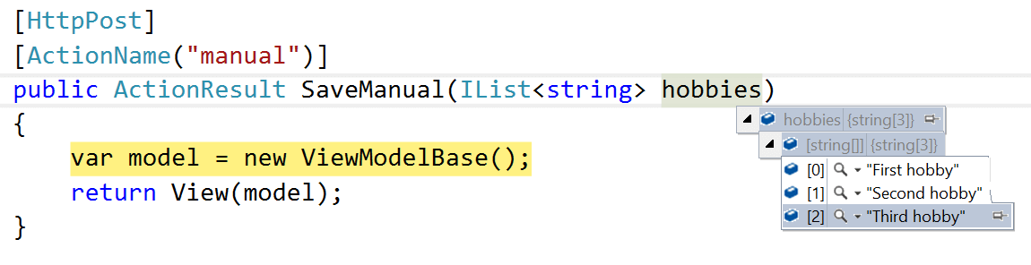
Having said that, however, it should be recalled that a stepped form is still the same as a plain single HTML form embedded in a Razor view and processed by the ASP.NET MVC runtime engine. This means that all the rules you know from ASP.NET MVC model binding apply as usual. The figure below, for example, shows that a variable number of related strings (such as hobbies in the sample markup) once labeled with the same name attribute value can be successfully mapped to an array of strings in a ASP.NET MVC controller.
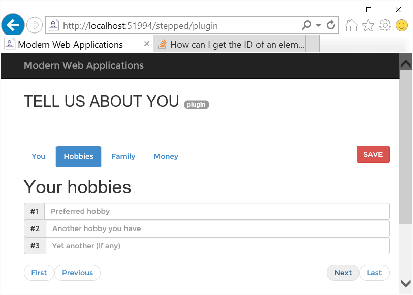
Where should you place the save button in a stepped form?
The short answer is that you can place it anywhere outside the tab panes. The button should be easy to click at any time and from any stage of the wizard. My preferred position is on the same row as navigational tabs, just pushed to the corner. You can achieve the result shown in the figure above with the following markup.
|
1 2 3 4 5 6 |
<form method="post"> <div id="wizard"> <button class="btn btn-danger pull-right">SAVE</button> <!-- Tabstrip --> </div> </form> |
By using the Bootstrap pull-right class you instruct the browser to render the button in line with the navigational tabs, just aligned to the right edge of the container. Depending on the context, you can even add a reset button to clear all the input fields or perhaps two flavors of ‘save’ buttons: one to save and continue and one to save and finish the process.
Pros and Cons of a Bootstrap-based Solution
By using the amenities of the Bootstrap’s tab component, it is fairly straightforward to build a stepped form. You just put known chunks of markup together and ensure that everything is wrapped up in a HTML FORM element. You are free to place buttons all around to clear, save, restore the content and whatever else you wish to have.
At the same time, nothing in this approach is really reusable except for the Bootstrap part of it. More importantly, there’s no easy way to force users to navigate through the panes in a fixed order. By default, tab panes are displayed all at a time and all of them are accessible. By the means of quite a bit of JavaScript code you can have all panes but the first one disabled at the beginning, or you can intercept the click event on the save button and more panes for the user to proceed with the workflow.
In a nutshell, a solution entirely based on the Bootstrap’s tab component is clearly a form that is broken up into several simpler and smaller pieces but it’s not what is commonly intended in software by the term “wizard”. From the user’s perspective, a wizard is primarily a multi-step form in which every step has its own ordinal position. Navigation is always sequential, though it can proceed both forward and backward.
In general terms, a Wizard is a type of stepped form. A stepped form is the combination of three logical elements: a list of panes, a list of buttons and last but not least a progress bar. I’ll return on the role (and benefits) of the progress bar in a moment. Let’s focus on some more advanced artifacts that enable sequential navigation and provide also a button bar for users to navigate and complete the workflow.
Using a Wizard Plugin
The wizard user interface is nothing new in modern software, and stepped forms are sometimes a real necessity. So it would come as no surprise that you can find a variety of wizard-like Nuget packages to choose from. A good example is the Twitter Bootstrap Wizard plugin that you can install with the following command in the package manager console.
Install-Package twitter-bootstrap-wizard
The nice thing about this package is that just extends the canonical structure of the Bootstrap’s tab component. In addition, it extends the core behavior of tabs, adding navigational buttons and exposing events for developers to programmatically hook into individual steps. Let’s find out more about its usage.
The package is pretty slim and has no dependencies whatsoever on external packages. It also doesn’t need any CSS file; all you need to link to your Razor views is the JavaScript file. When it comes to using it, you build the tab structure of Bootstrap as the first stage. To start with, the same markup presented earlier works just fine. To add a button bar, instead, you need some extra markup.
|
1 2 3 4 5 6 |
<ul class="pager wizard"> <li class="previous first"><a href="javascript:;">First</a></li> <li class="previous"><a href="javascript:;">Back</a></li> <li class="next last"><a href="javascript:;">Last</a></li> <li class="next"><a href="javascript:;">Next</a></li> </ul> |
You place this markup at the bottom of the same DIV that wraps up the tab panes markup.
|
1 2 3 4 |
<div class="tab-content"> <!-- Tab panes --> <!-- Button bar --> </div> |
The final step is launching the plugin with a line of JavaScript.
|
1 |
$("#wizard").bootstrapWizard(); |
The #wizard selector here refers to the DIV element that contains the entire tab structure.
Usually, you want to have a pair of buttons to go back (First and Back) and another pair to move forward (Last and Next). However, just because the button bar is an explicit chunk of markup it is under your total control and it can have any content that suits you. Buttons are automatically styled as in the figure below.
If you don’t like those buttons, you can replace them entirely. This is probably easier than just digging out some hidden CSS selectors and attributes to change. The official way of proceeding is to replace the UL block markup instead shown earlier with the following:
|
1 2 3 4 5 6 |
<div style="float:right"> <input type='button' class='btn button-next' value='Next' /> </div> <div style="float:left"> <input type='button' class='btn button-previous' value='Back' /> </div> |
Note that when you replace navigational buttons you also have to tell the plugin about them. To do so, it is a requirement that you add a couple of lines to the initialization of the plugin.
|
1 2 3 4 |
$('#wizard').bootstrapWizard({ 'nextSelector': '.button-next', 'previousSelector': '.button-previous' }); |
The properties nextSelector and previousSelector indicate the CSS selectors that identify the buttons to be used to advance forward and backward. In this regard, it is important to style your buttons with button–next and button–previous or whatever other name you choose.
Beyond the Basics
The primary reason for using a wizard plugin is so you can control navigation. Therefore, the first extension is to disable the clicking on individual tabs so that users are forced to advance only using navigational buttons. For this to happen another little piece of JavaScript code should be added to the configuration of the plugin.
|
1 2 3 4 5 |
$("#wizard").bootstrapWizard({ onTabClick: function (tab, navigation, index) { return false; } }); |
Because the plugin of choice relies heavily on the Bootstrap infrastructure it doesn’t have much control over the rendering of the tabs. The best we can do here is therefore to swallow the click event and pretend it never happened. That’s precisely the purpose of the code above. The onTabClick event fires when the user clicks any of the Bootstrap top-level tabs. The event passes three types of information to the handler code. The tab parameter is a reference to the jQuery object on top of the current tab. The navigation parameter points to the entire tab strip. Finally, the index parameter is the zero-based index of the current tab from where the user is trying to navigate away. By simply returning false from the handler, you stop the bubbling of the event and the clicked tab won’t be selected.
Another common behavior one would expect from a wizard is the validation of content across consecutive steps. In other words, users should be able to proceed to the next step if some content they entered is insufficient or invalid. Again, it’s all a matter of adding some JavaScript code. In particular, you handle the onNext event which fires whenever the user clicks the Next button.
|
1 2 3 4 5 6 7 8 |
$("#wizard").bootstrapWizard({ onNext: function (tab, navigation, index) { if (index == 0) { // Validate content of tab and // return false to prevent navigation } } }); |
You use the value of the index parameter to figure out the tab the user is trying to navigate away. You validate the content in the related form fields and decide whether navigation is allowed or not. If not, you return false from the handler. At the same time, you can use any of the collected information to update any of the subsequent tabs. There’s nothing you do here in any sort of declarative manner; it’s all about using JavaScript and selectors to retrieve and update markup elements as appropriate.
Additional Tips for Stepped Forms
From a user experience perspective, stepped forms are ideal for certain tasks such as a checkout or sign-up procedure. The longer the workflow the more a stepped form is the way to go. UX experts, though, recommend you apply a few tricks to make it even easier for the user. First off, in a stepped form you should try to be friendly to users more than in any other type of user interface. You’re driving users through a long and important workflow; you’re asking many questions and requesting a lot of data. Emphasizing the benefits and explaining why that data is required helps the users to persevere. Of course, it is best to limit as much as possible the amount of data to enter.
However, among the UX best practices for stepped forms, there’s one that becomes a requirement when the number of tabs is greater than three. In the UX lingo it is often called the “completeness meter” pattern. In spite of the fancy name, it is quite simple and common-sense: just add a graphical meter that tells users how much they did in the procedure. The figure below shows the sample stepped form we considered so far with a Bootstrap progress bar added.
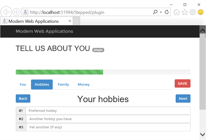
It is up to you how you advance the meter. You can opt for a linear calculation based on the current index and the total number of steps (as in the figure) or you can opt for a more sophisticated algorithm that counts the business relevance of the amount of information users already entered. Guessing the most likely content is a way to do it. Also, the horizontal progress bar is just one graphical artifact; circle bars or plain numbers are good as well. What matters is that you let users know where they are and how much they have done or are left to do.