In August, Microsoft released an update to Power BI Desktop, a self-service tool for developing reports that can deliver business intelligence (BI) to analysts, decision makers, and other information workers. Power BI Desktop lets you retrieve data from a wide range of sources and then use the features built into the application to transform the data. From there, you can create reports that include a variety of visualizations that render the transformed data. You can then post the reports to the Power BI service, where they can be accessed by users anywhere with an Internet connection.
This latest Power BI Desktop update (2.37.4464.321) includes several new features that further extend its reporting capabilities, allowing users to more easily comprehend complex information in digestible formats. For example, you can now create line charts that let users drill down into hierarchical data across the visualization’s entire dataset or into specific nodes within the visualization. In addition, the update adds the Analytics tab, which has been incorporated into the Visualizations pane in Report view. The tab includes features for adding dynamic reference lines to a visualization that provide users with relevant reference points.
In this article, we’ll look at how to incorporate both these features to create more comprehensive visualizations, using examples the demonstrate the various steps. To keep things simple, I’ve based the examples on the Sales.vSalesPerson view in the AdventureWorks2014 database, which I have installed on a local instance of SQL Server 2014.
For information about importing and transforming SQL Server data in Power BI Desktop, you can refer to my Simple Talk article Working with SQL Server data in Power BI Desktop. (You can find additional information about transforming data in my article Power Query Formula Language in Power BI Desktop.)
To try out the examples in this article, you must first create a dataset based on the vSalesPerson view. You can pull the view into Power BI Desktop in its entirety and then filter out any rows with a TerritoryGroup value of NULL, or you can instead use a T-SQL query to retrieve the data already filtered. Whichever approach you take, that’s all you need to do to prepare for the examples, other than to download and install Power BI Desktop if you haven’t already done so.
Creating dynamic reference lines
Dynamic reference lines provide a quick way to show important information in a visualization that’s related to the visualization’s underlying data. You can create reference lines that specify constant values or ones based on the measures used in the visualization. A reference line based on a measure aggregates the data in some way, such as calculating the minimum, maximum, or average value. In this way, end users can quickly see important trends, goals, or other insights within the visualization, as they compare to the underlying data.
You create dynamic reference lines by first selecting the target visualization and then accessing the Analytics tab, which is shown in the following figure. (The button you click to access the tab is circled in red.) The tab is available only if a visualization is selected. The tab’s options and settings are specific to the selected visualization.
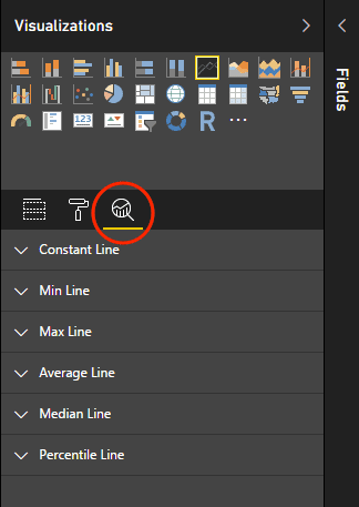
The figure shows most of the reference line types available on the Analytics tab. You can add one of more of each type to a visualization; however, not all line types are available to all visualizations. For example, the Stacked Area Chart visualization supports only Constant lines, but the Line Chart visualization supports all the line types shown in the preceding figure. Some visualizations, such as Filled Map, do not support any dynamic reference lines.
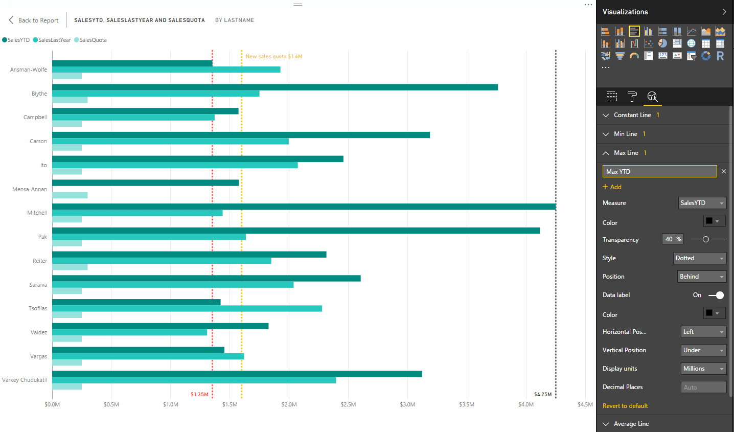
To demonstrate how dynamic references lines work, we’ll use a Clustered Bar Chart visualization. For the axis, we’ll add the LastName column from the vSalesPerson view, and for the measures, we’ll add the SalesYTD, SalesLastYear, and SalesQuota columns. Your visualization should look similar to the one shown in the following figure.
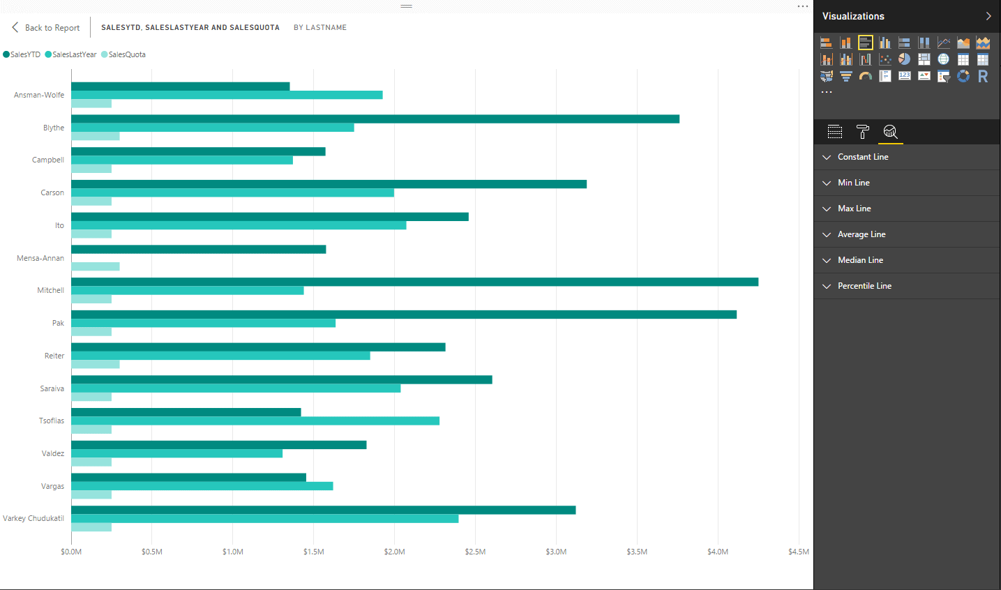
The chart provides the year-to-date sales, previous year’s sales and assigned sales quota (all in millions) for each sale representative.
Notice that the Analytics tab is selected, showing the various types of dynamic reference lines available to the visualization. The tab displays only the line types that are supported by the selected visualization. If a visualization does not support dynamic references lines, no line types are listed and you instead get a friendly little message informing you that you’re out of luck.
For our first reference line, we’ll create a Constant line that defines a new sales quota for all sales reps. To get started, click the Constant Line down arrow, and then click the + Add button. This opens a form for defining the new Constant line. For the name value, I used New sales quota and then specified 1600000 in the Value text box. I also specified a line color (gold), transparency level (20%), style (dotted), and position (behind). You can choose whichever values you think work best for your visualization, and you can choose different values for different reference lines. Your settings are applied immediately to the visualization, so you can easily try out different options and see their impact.
The following figure shows you how Analytics pane appears on my system after configuring the settings. (We’ll get to the remaining settings shortly.) The figure also shows the gold dotted line that runs behind the values associated with each sales rep. This is our new Constant line, which shows the updated sales quota.
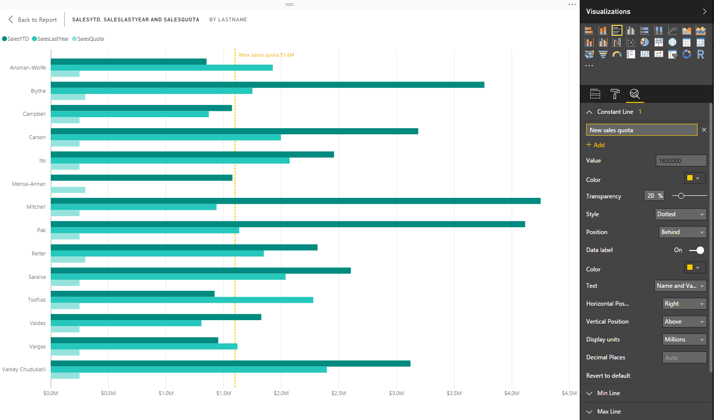
I should point out that, although Microsoft generally refers to all the reference lines available in the Analytics tab as dynamic, the Constant line is based on a fixed value and therefore is not dynamic. However, the other line types can all be considered dynamic because they’re based on data that can change.
When you create a reference line, the Data label option is turned off by default. If you set it to on, as I’ve done here, you’ll then be presented with additional options for configuring the label associated with the line.
For my visualization, I displayed both the name and amount (in millions), using the same color as the line, and I displayed the label at the top, to the right of the line. It might be difficult to find the label in this figure, but if you look close enough, you’ll see it’s there. When you’re setting up the Constant line for yourself, try out different colors and label positions to see what works best for your visualization.
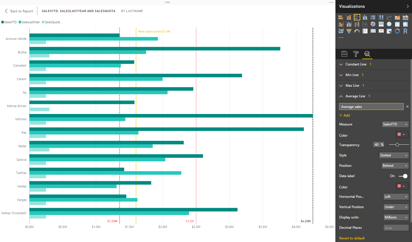
That’s all there is to setting up a Constant line. Setting up other reference line types is just as easy, although there are some differences. One of the biggest has to do with selecting a measure. Because the other line types aggregate data, you must specify one of the measure’s used in the visualization as the basis for that aggregation.
For example, the following figure shows the Min line (minimum) I created for my visualization. I based it on the SalesYTD measure, which I selected when I created the line. I also assigned a different color (red) and transparency level (40%).
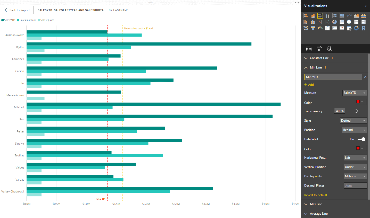
Another difference between a Min line and Constant line is the label. For most line types, you do not have the option to include the line name in the label. Instead, you can display only the calculated amount. (I would not be surprised if Microsoft updates this feature at some point with a bit of converting and concatenating in the background to provide better labels. Currently, it can be difficult for users to pick out a line’s meaning.)
As you can see in the preceding figure, a red dotted line has been added to the visualization to show the minimum year-to-date sales (in millions). In this case, I chose to place the label at the bottom and offset it to the left, using the same color as the line.
If you want to add a Max line (maximum), follow the same procedure you used for the Min line. Just pick the Max Line category on the Analytics tab. The following figure shows the Max line I added to my system, this time using a charcoal color to indicate the maximum year-to-date sales (in millions).
Or you can instead add an Average line, which as the name suggests, displays a measure’s average. The following figure shows the Average line I added to my visualization to indicate the average year-to-date sales, this time in orange.
That’s all there is to adding dynamic management lines to your visualizations. The process is straightforward and easy to carry out, and the results provide users with a quick and efficient way to understand other aspects of the data, within the context of the visualization’s underlying data.
Drilling down into a line chart
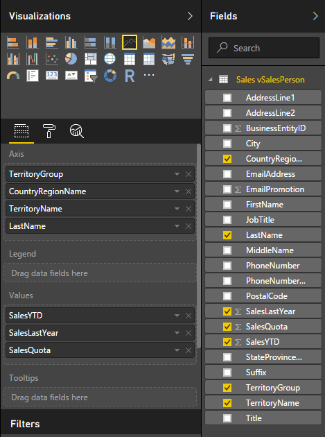
Another useful feature that has been added to Power BI Desktop is the ability to create line charts that users can drill into to get at different layers within the data hierarchy. To demonstrate how this works, I created a Line Chart visualization based on the values from the vSalesPerson view. For the axis, I added the following columns, in the specified order:
- TerritoryGroup
- CountryRegionName
- TerritoryName
- LastName
I then added the following measures, also in the specified order:
- SalesYTD
- SalesLastYear
- SalesQuota
The following figure shows the Visualizations pane and the Fields pane associated with the new visualization, after I added the columns.
The settings should give you a line chart similar to the one shown in the following figure. In this case, the sales details from the North America node are displayed in a pop-up window, as a result of the hovering over that part of the visualization.
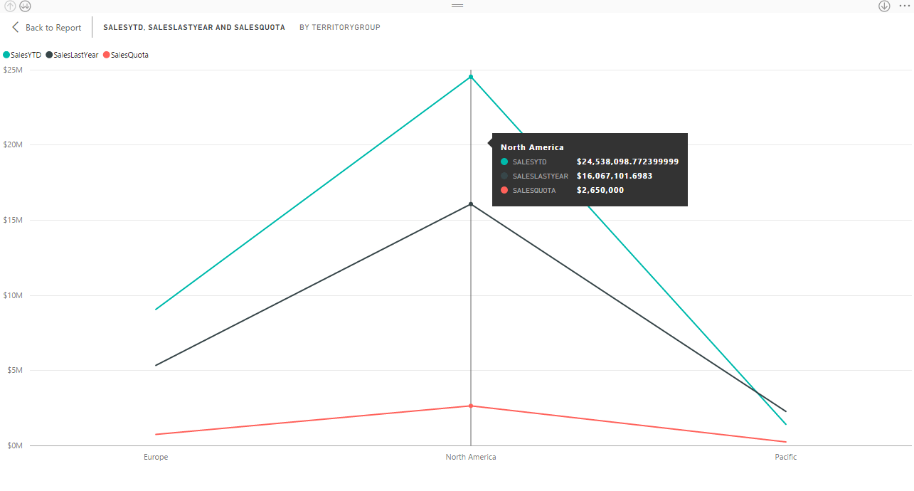
In itself, this isn’t much of a big deal, but if you look closely in the upper left corner, you’ll see buttons for drilling down into the hierarchy and then drilling back up. Power BI Desktop automatically adds the capacity to drill down into the visualization when you define an axis hierarchy in the Visualizations pane.
Not surprisingly, you use the button with the two down arrows to drill down a layer and use the button with the one up arrow to move up a layer. In this example, if you click the down button, the visualization drops down one layer in the hierarchy, from the TerritoryGroup layer to the CountryRegionName layer, as shown in the following figure.
Now the visualization shows each country associated with each territory. Here the United States node is selected, but you can select any node to view that country’s sales figures.
Notice that the label at the top of the visualization now reflects that the data is broken down by both the TerritoryGroup and CountryRegionName fields. In addition, the labels along the bottom axis show the individual names of both the territory group and country.
If you click the down button again, the visualization drills down one more layer and provides details specific to the TerritoryName field, as shown in the following figure. In this case, the Northwest territory in the United States is selected.
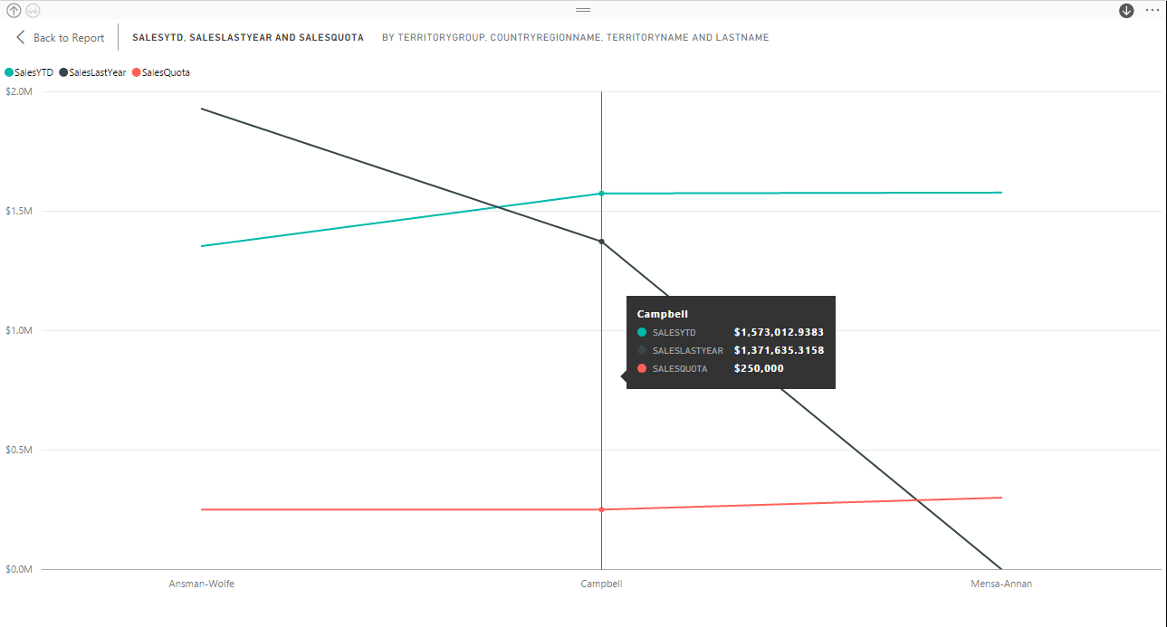
The more we drill down, the more granular the information becomes, with the labels changing accordingly. If we drill down once more, we get to the lowest level of the hierarchy, the LastName field, as shown in the following figure.
Now each label on the bottom axis shows the territory group, country, territory, and sales rep. In this case, the sales rep with the last name Campbell is selected.
By default, Power BI Desktop sorts the data based on the axis fields, but you can instead sort the data by one of the measures. To do so, click the ellipsis in the upper right corner of the visualization and then select the appropriate sort option, as shown in the following figure.
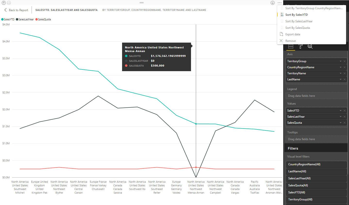
In this case, the Sort By SalesYTD option is selected, so the visualization is displaying the data according to the SalesYTD values, from the highest amount to the lowest.
You can move up the hierarchy at any time by clicking the up button. You can also navigate down the hierarchy by right-clicking the visualization and then clicking Expand All or move up the hierarchy by right-clicking the visualization and then clicking Drill Up. The menu options work just like the arrow buttons.
Drilling into specific data nodes
The ability to navigate through the hierarchy levels in a line chart is in itself a powerful addition to Power BI Desktop, but Microsoft takes this a step further by adding the ability to move through specific nodes of the hierarchy. To turn this feature on, you use the button with the single down arrow in the top right corner of the visualization.
Unlike the other drill buttons, this one is a toggle that turns the node-specific drill-down feature on or off. By default, the feature is turned off, but when you click the button, it reverses colors and enables the feature. The following figure shows the visualization at the top layer of the hierarchy, with the button selected.
As we’ve seen earlier, when you hover over a node, the visualization displays information about that node. It also displays a vertical line runs through the points on the three measure lines. When the node-specific drill-down feature is enabled, you need only click this line to drill down into the node. (The line doesn’t actually need to be visible, as long as you hit the right target.)
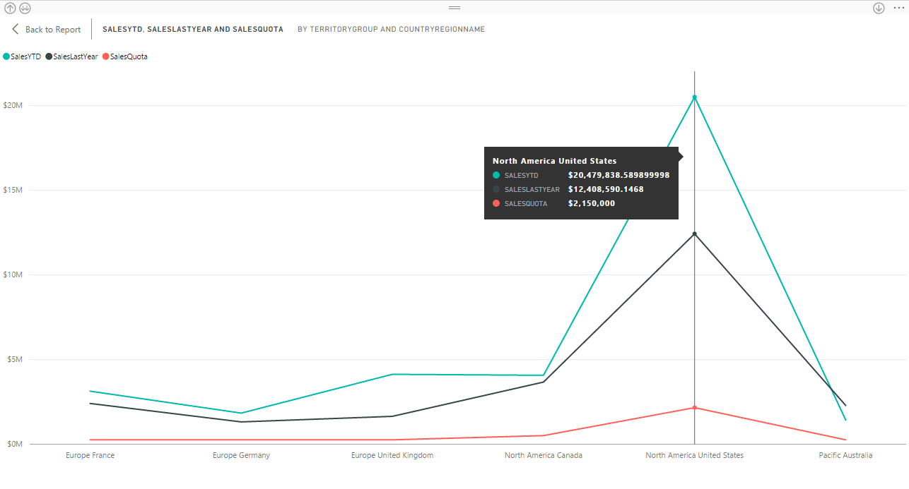
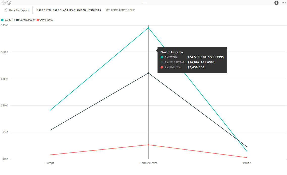
For example, if you click the line associated with North America, the visualization drops down to the CountryRegionName level and displays the data for the North America territory group, but no other group, as shown in the following figure.
Only two countries are in the territory group: Canada and the United States. Notice that the label at the top of the visualization show both the TerritoryGroup and CountryRegionName fields, but the axis labels include only the country names.
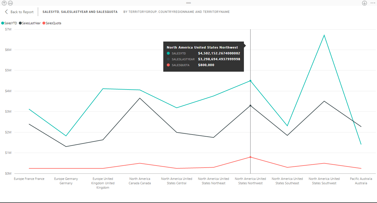
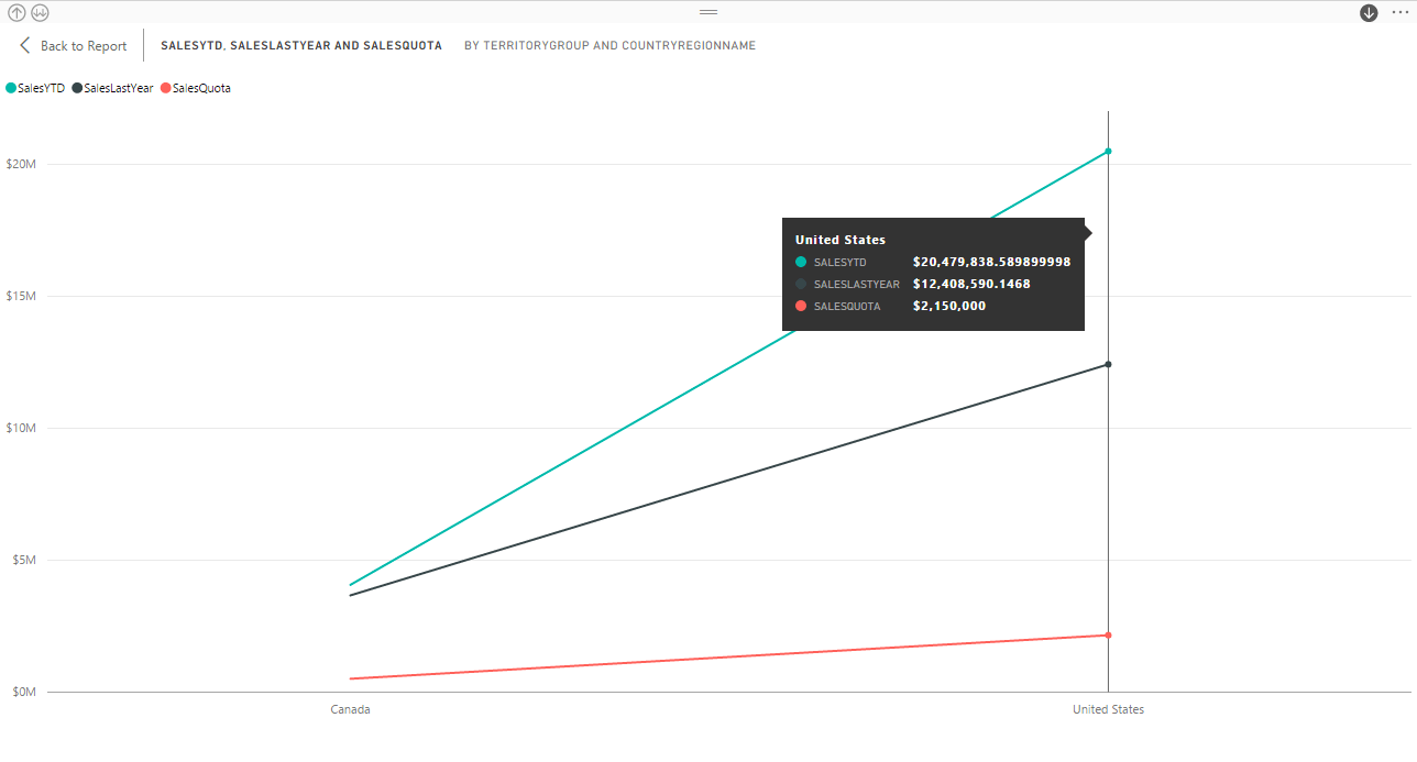
If we now click the United States node, the visualization will display data only for that country, breaking it out by territory, as shown in the following figure.
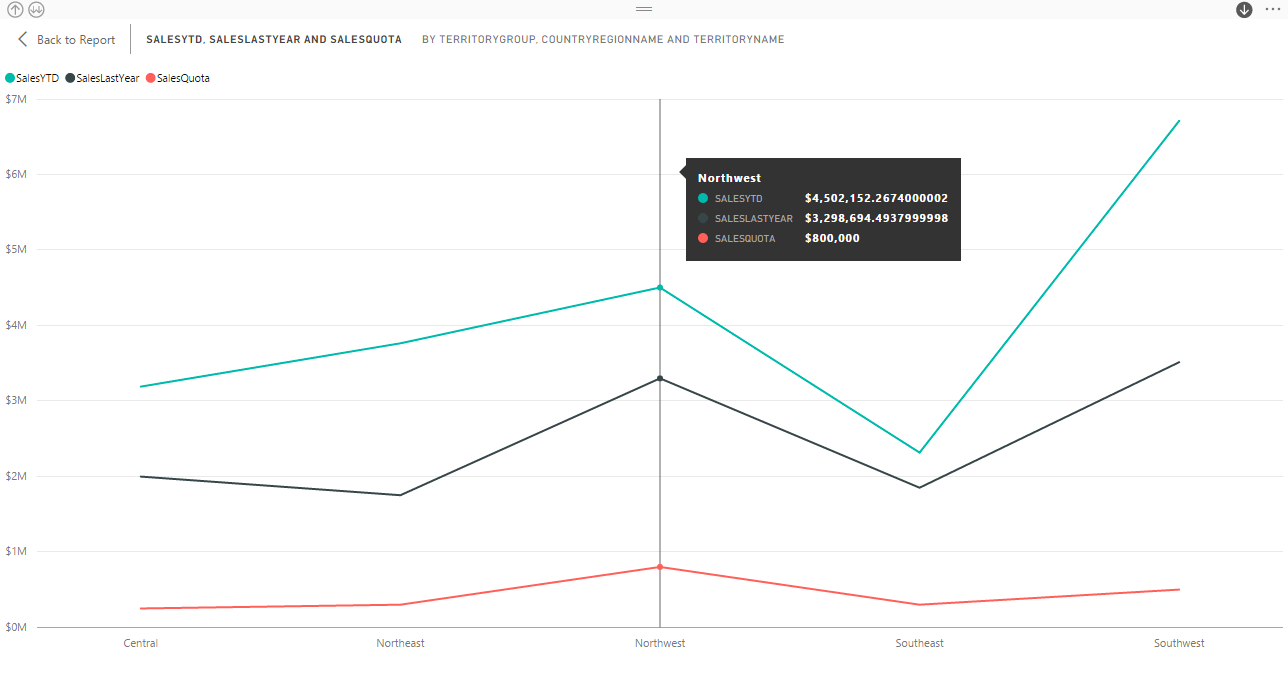
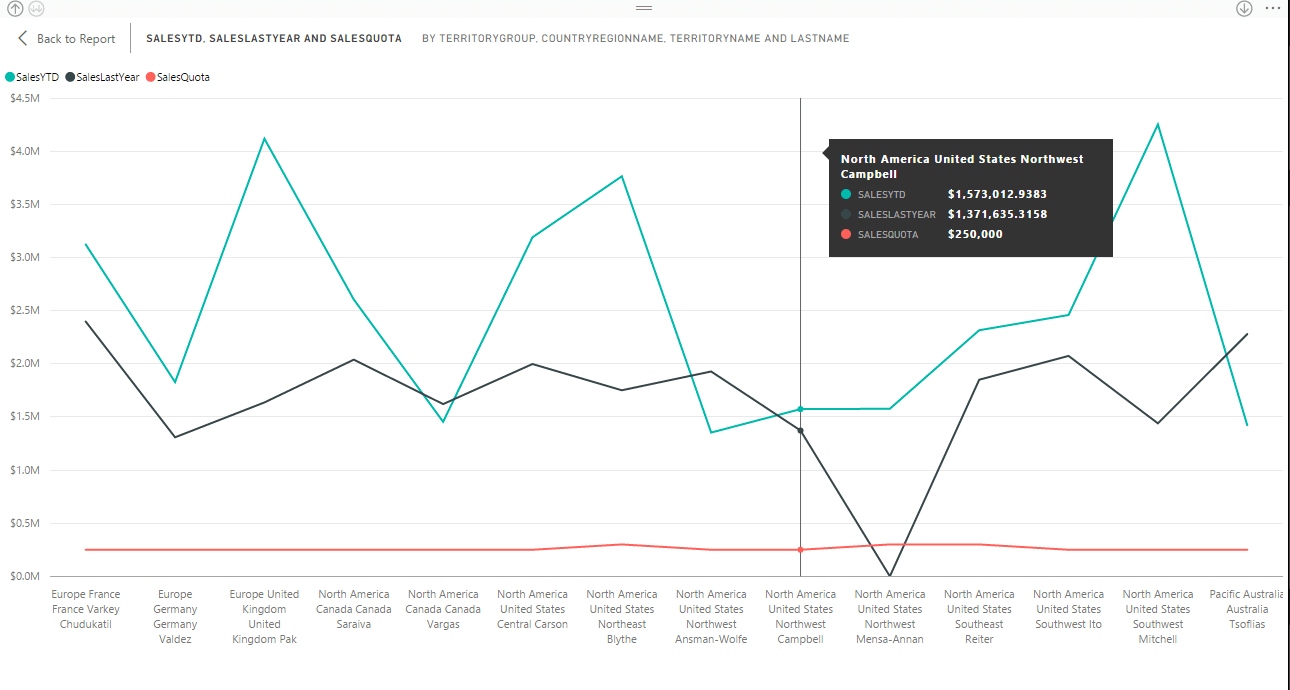
Now the axis labels show only the territory names in the United States. From here, we can drill down into the Northwest territory to see the sales for the individual sales reps, as shown in the following figure.
Once again, the sales rep Campbell is selected, but we can review information about any node at any level of the hierarchy.
To move back up the hierarchy, you can use the same up button you used before when all nodes at a hierarchy level were expanded, or you can right-click the visualization and click Drill Up to go up one level.
Also note that you can move down an individual node by right-clicking the node and then clicking Drill Down, as opposed to Expand All. The individual drill-down button in the upper right corner does not need to be enabled to use this option. Regardless of which option you use to drill down into a node, the same sorting options are available to the individual drill-down feature as they are to the general drill-down feature.
Working with Power BI Desktop
In themselves, the features we’ve covered here might not seem that significant, but they can provide an important aid to users who are trying to gain as much insight as possible from a report in the shortest amount of time. Best of all, the features are easy to implement in Power BI Desktop and provide a fair amount of flexibility for delivering the look and feel you want in your reports, at least within the context of the application’s current capabilities.
Over time, Microsoft has made numerous incremental changes to Power BI Desktop that continue to improve and expand its capabilities, making it easier than ever to build comprehensive reports that users can easily understand. The key, of course, still lies on the data side, in terms of importing and transforming the data. The better the data, the better the reports. In this sense, the visualizations are merely the icing on the cake. Even so, they’re no less important to the user’s overall experience, and being able to add dynamic reference lines to your visualizations and allow users to drill down into line charts makes that cake all the more palatable.
Load comments