Power BI has taken the world by storm when it comes to creating attention-grabbing dashboards that empower users. It has come to dominate the analytics arena with its ease of use, wide range of connectivity options, and the variety of available visuals. However, formatting (and reformatting) dashboard visuals can prove time-consuming and repetitive – as can standardizing the presentation of multiple dashboards to create a unified look and feel for a suite of reports. Most users would rather spend their time analyzing and delivering meaningful insights as opposed to applying colors and font choices to charts and tables. This article explains how Power BI themes can avoid that tedious work!
This is where the creation and application of Power BI themes comes in. A theme is a standardized definition of some – or all – of the formatting of a dashboard. This can range from defining a color palette and a selection of font choices to the detailed specification of each and every visual. Applying a theme allows you to format virtually every visual in a dashboard instantly. What is more, any changes that you subsequently make to a theme can be reapplied in a few clicks to update your dashboard’s presentation. Themes can be created once, then applied to dozens or even hundreds of Power BI dashboards to guarantee a coherent and rigorously standardized presentation style across a department or even an entire organization.
Theme overview
Themes can be as simple – or as detailed – as you require. They can specify standardized fonts, text colors, and font sizes or set the tiniest details of how each individual type of visual is formatted. Indeed, themes are designed to work at multiple levels – starting with general elements and then progressing deeper and deeper into tightly specified definitions of the presentation of each element in a dashboard. This gives you a range of options when it comes to defining how you standardize Power BI dashboards.
At their heart, Power BI Themes are JSON files that define some – or even all – of the following presentational elements-most of which are, otherwise, set manually using the Power BI Desktop Format pane:
- The colour palette.
- The detailed formatting of every standard Power BI visual.
- Generic style attributes – these are attributes that are common to many visuals that can be defined once (rather than having to apply them repeatedly for dozens of visuals).
- Colour classes – these are a collection of predefined settings which can be used to apply colours across a range of visuals.
- Text classes – another collection of predefined settings, this time used to apply text attributes to various text elements across a range of visuals.
Explaining each of these elements in detail would make for a vast subject extending over hundreds of pages. So the aim of this article is to introduce two aspects of theme creation – how to set the colours used in the colour palette and how to define generic themes. Learning these two aspects of theme file creation (one extremely simple, and the other a little more complex) should help to get you started on the path to much more intricate and powerful theme file preparation.
Setting the colour palette
In case the use of Power BI theme files is completely new to you, let’s look at an extremely simple Power BI theme file that defines the core colours that you use in a Power BI dashboard. Once this is understood, we can move on to the more complex subject of defining generic theme attributes.
The JSON required to set the colors in a color palette looks like this:
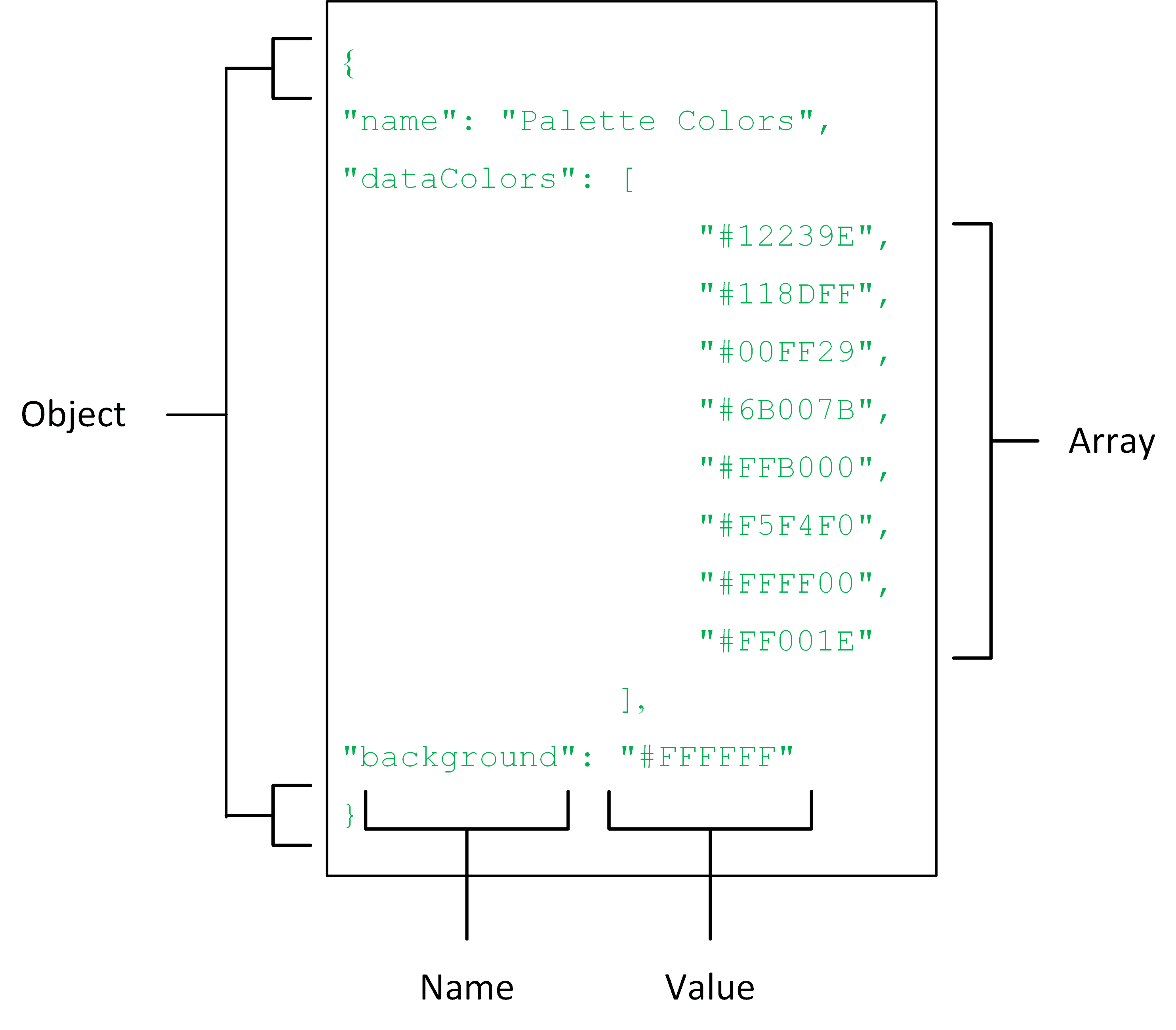
The two sets of formatting attributes that are defined are:
- dataColors: The color palette
- background: The page background color
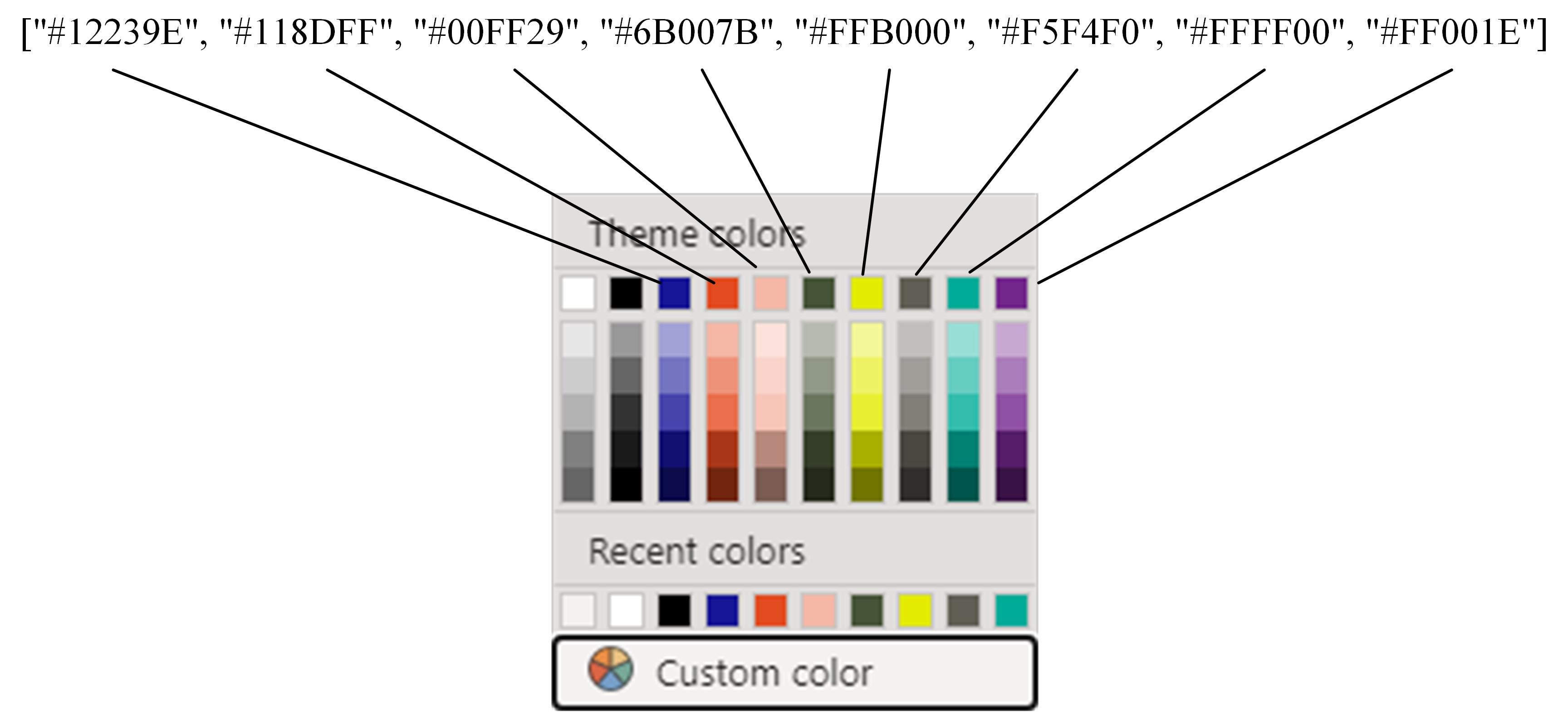
So, what have you created in this small theme file? Quite simply, you have defined the base color palette that will appear every time you want to apply colors in a Power BI dashboard. You can see this in Figure 3-2, below where the hexadecimal color definitions in the dataColors array in the theme file define the color palette elements.
This JSON code is available in the sample file PaletteColors.json from the sample files that come with this article.
I realise that this theme is wildly simplistic, but it gets you started on the path to theme creation. You can now apply the theme file in Power BI Desktop by clicking View=>Themes=>Browse for themes and selecting the JSON file that you created. This will set the colours of the colour palette to the hexadecimal values that you defined in the JSON file.
Defining generic themes
Much of the documentation on theme creation covers the detailed intricacies of formatting every possible aspect of each and every available Power BI Visual. In practice, however, it can often be extremely effective to adopt another approach which is to define a handful of “default” stylistic elements that apply to a range of visuals rather than defining the exact specification for 30 or so separate visuals. This is made possible by the fact that Power BI has ensured that any aspect of a visual that it has in common to other visuals (think borders or backgrounds, for instance) uses the same formatting approach in Power BI Desktop format pane whatever the visual that you are tweaking – and this commonality is extended to the JSON theme files. What this approach means is that you can specify a format element once only in a theme file and nonetheless see it applied to any visual that supports it.
Suppose, for instance, that you want to define borders and titles for all visuals and then specify a handful of common elements (such as X and Y axis definitions) for charts as well as a few core table elements such as formatting totals and values. It is worth noting at this point that you do not even have to specify the entire gamut of formatting that is available for a visual in Power BI. In other words, if you only want to define that a title is required (without defining any other characteristics of the title), then you can limit the specification to this single attribute. This saves you from having to write (and test) dozens of unnecessary lines of JSON.
All of this is possible through a hand-crafted theme file where you define visual characteristics without specifying which visual type the formatting must apply to. The JSON format will be applied – instantly and automatically – to any visual that contains the attributes that you define. There are three great things about this approach:
- It simplifies theme preparation, as you only define an element once (as opposed to defining it individually for each type of specific visual).
- You can make the definition of the formatting as detailed or high level as you wish and then tweak individual format options in Power BI Desktop to add completeness.
- You can add default formatting “in case.” This is because any formatting that you add that is not used by a visual type (such as defining certain detailed elements of a certain chart type) will not prevent other formats being applied where they are supported by a different chart type.
What is more, you can subsequently overwrite or extend these common attributes at the level of each individual visual if you so wish. Unfortunately, space constraints do not allow for me to explain the detailed formatting of specific visuals in the current article.
Common visual elements
There are a series of elements that are common to most – if not all – visuals in Power BI dashboards. These elements are
- Background
- Title
- Border
- Shadow Tooltip
- Visual header
- Lock aspect
You are probably used to setting these – time and time again, if the truth be told – using the Power BI formatting pane. These format elements are defined by the following JSON theme keywords:
- background: Sets all the attributes in the Background card of the Format Pane for a visual as well as setting the background for the page
- title: Sets all the attributes in the Title card of the Format Pane for a visual
- border: Sets all the attributes in the Border card of the Format Pane for a visual
- shadow: Sets all the attributes in the Shadow card of the Format Pane for a visual
- visualTooltip: Sets all the attributes in the Tooltip card of the Format Pane for a visual
- visualHeader: Sets all the attributes in the Visual header card of the Format Pane for a visual
- lockAspect: Sets all the attributes in the Lock aspect card of the Format Pane for a visual
The time has come, then, to define these common elements using JSON in a theme. As is the case with most of the approaches to formatting Power BI dashboards using themes, it is best to take a look at the JSON code first and explain how it works once you have seen the code. So here is a code snippet that adds some core visual default formatting to elements that are common to most visuals. The complete code is in the file ColorWithCoreVisualDefaults.json.
|
1 2 3 4 5 6 7 8 9 10 11 12 13 14 15 16 17 18 19 20 21 22 23 24 25 26 27 28 29 30 31 32 33 34 35 36 37 38 39 40 41 42 43 44 45 46 47 48 49 |
{ "name": "Visual Defaults", "dataColors": ["#171796", "#E34B20", "#F4B7A6", "#465437", "#E2EB00", "#615E55", "#00AC98", "#73268c"], "visualStyles": {"*": {"*": { "background": [{ "color": {"solid": {"color": "#F5F4F0"}}, "transparency": 0 }], "visualTooltip":[{ "titleFontColor":{"solid":{"color":"#D7CACA"}}, "valueFontColor":{"solid":{"color":"#FFFFFF"}}, "background":{"solid":{"color":"#938888 }], "title": [{ "show": true, "text": "Visual Title", "fontColor": {"solid": {"color": "#ffffff"}}, "background": {"solid": {"color": "#171796"}}, "alignment": "Center", "fontSize": 8, "fontFamily": "Arial" }], "lockAspect": [{ "show": false }], "border": [{ "show": true, "color": {"solid": {"color": "#171796"}} }], "dropShadow": [{ "show": true, "color": {"solid": {"color": "#D7CACA"}}, "position":"Outer", "preset":"TopLeft" }], "visualHeader": [{ "show": true, "background": {"solid": {"color": "#ffffff"}}, "border": {"solid": {"color": "#171796"}}, "foreground": {"solid": {"color": "#171796"}} }] } } } } |
In this code snippet, you can see that the keywords in italics correspond to sections in the Power BI formatting pane:
- The title keyword corresponds to the Title section.
- The lockAspect keyword corresponds to the Lock aspect section.
- The border keyword corresponds to the Border section.
- The dropShadow keyword corresponds to the Shadow section.
- The visualHeader keyword corresponds to the Visual header section.
Now for some explanations concerning this particular piece of JSON. Each JSON attribute corresponds to an element in a specific section of the format pane in Power BI Desktop. The core JSON approach of defining key/value pairs is still respected. However, as you can see, each of these value settings is defined as an array that contains one or more objects. Some objects contain further nested objects – that is, inner sets of elements in curly brackets, sometimes up to three objects deep.
There is something else that is interesting in this JSON code. You are referring to selections made using popup menus in Power BI Desktop to format elements such as
- Title alignment
- Shadow position
- Shadow preset
You need to be warned that, in these cases, the exact spelling of each JSON keyword is required – and this must always be enclosed in double quotes. Finding the exact keyword to use can necessitate a certain amount of trial and error.
The good news about these definitions is that they do not cause the JSON file load to fail if you misspell one of them. All that will happen is that the actual attribute will not be formatted and will remain as the default format once the JSON theme file has been loaded. Finally, the actual element definitions (background, title, etc.) are, themselves, nested inside two “anonymous” elements –When defining generic elements (i.e., formatting not strictly attributed to a specific type of visual), they have to be nested at this lower level. The asterisks mean that the formatting is generic – not tied to a specific object. This does admittedly make tracking the nesting levels (and all the pairs of curly brackets) a little more complex. However, it is something that you get used to the more that you work with JSON theme files. Also, it is worth reminding you that this code makes no attempt to format every possible aspect of this series of elements.
Elements common to most chart types
Now that you have seen how to define the formatting for shared (or common) elements, we can move on to the next level of “generic” formatting. This involves setting some of the formatting parameters of chart visuals. There are several aspects of chart formatting that are shared by multiple charts. For instance, stacked bar charts, stacked column charts, clustered bar charts, clustered column charts, line charts, area charts, stacked area charts, line and clustered column charts, and line and stacked column charts all contain the following elements:
- The category (X) axis
- The values (Y) axis
- Data labels
- Plot area
- Legend
Indeed, certain of these elements are also common to a few other chart types such as ribbon charts, waterfall charts, and scatter charts (even if these chart types only contain some of the formatting options in the preceding list). There are even charts such as funnel charts, pie charts, and donut charts that use at least one of the formatting elements listed earlier. To save you the effort of having to define these similar or identical aspects of chart formatting to each individual chart type, you can specify standard formatting that will be applied to a chart element if it exists. This means that if you have created a chart that does not have one of these elements (say a donut chart that does not have category and values axes but does have a legend) but have nonetheless set these attributes in a theme file, then the definitions of any nonrelevant formatting elements are simply not applied to the chart in question. Once again, you do not have to define every format option that exists in an expanded tab of the Format Pane. That is, you can only decide to set one or two formatting options for the legend out of all the available options, if you so wish. In other words, you can predefine as many aspects of chart formatting as you want without worrying about actually having to use them. Power BI Desktop does not care about whether a JSON format is used – only if it is syntactically accurate. This means that you can define as much (or as little) generic formatting as you like as long as the JSON is correct. You can see this in the JSON file ColorWithCoreVisualDefaultsAndKeyChartTypes.json, shown below:
|
1 2 3 4 5 6 7 8 9 10 11 12 13 14 15 16 17 18 19 20 21 22 23 24 25 26 27 28 29 30 31 32 33 34 35 36 37 38 39 40 41 42 43 44 45 46 47 48 49 50 51 52 53 54 55 56 57 58 59 60 61 62 63 64 65 66 67 68 69 70 71 72 73 74 75 76 77 78 79 80 81 82 83 84 85 86 87 88 89 90 91 92 93 94 95 96 97 98 99 100 101 102 103 104 105 106 107 |
{ "name": "Visual Defaults", "dataColors": ["#171796", "#E34B20", "#F4B7A6", "#465437", "#E2EB00", "#615E55", "#00AC98", "#73268c"], "visualStyles": {"*": {"*": { "background": [{ "color": {"solid": {"color": "#F5F4F0"}}, "transparency": 0 }], "visualTooltip":[{ "titleFontColor":{"solid":{"color":"#D7CACA"}}, "valueFontColor":{"solid":{"color":"#FFFFFF"}}, "background":{"solid":{"color":"#938888"}}}], "background":[{"color":{"solid":{"color":"#7A0A0A"}} }], "title": [{ "show": true, "text": "Visual Title", "fontColor": {"solid": {"color": "#ffffff"}}, "background": {"solid": {"color": "#171796"}}, "alignment": "Center", "fontSize": 8, "fontFamily": "Arial" }], "lockAspect": [{ "show": false }], "border": [{ "show": true, "color": {"solid": {"color": "#171796"}} }], "dropShadow": [{ "show": true, "color": {"solid": {"color": "#D7CACA"}}, "position":"Outer", "preset":"TopLeft" }], "visualHeader": [{ "show": true, "background": {"solid": {"color": "#ffffff"}}, "border": {"solid": {"color": "#171796"}}, "foreground": {"solid": {"color": "#171796"}} }], "categoryAxis": [{ "show": true, "axisScale": "Linear", "position": "left", "labelColor": {"solid": {"color": "#949494"}}, "fontFamily": "Arial", "fontSize": 8, "showAxisTitle": true, "titleText": "Add an Axis Title", "titleFontSize": 8, "titleFontFamily": "Arial", "titleColor": {"solid": {"color": "#949494"}}, "gridLineShow": true, "gridLineColor": {"solid": {"color": "#949494"}}, "gridLineThickness": 1, "gridLineStyle": "Solid" }], "valueAxis": [{ "show": true, "position": "Left", "axisScale": "Linear", "labelColor": {"solid": {"color": "#949494"}}, "fontFamily": "Arial", "fontSize": 8, "showAxisTitle": true, "titleText": "Add an Axis Title", "titleFontSize": 8, "titleFontFamily": "Arial", "titleColor": {"solid": {"color": "#949494"}}, "gridLineShow": true, "gridLineColor": {"solid": {"color": "#949494"}}, "gridLineThickness": 1, "gridLineStyle": "Solid", "axisStyle": "ShowTitleOnly" }], "labels": [{ "show": true, "labelPosition": "InsideEnd", "color": {"solid": {"color": "#ffffff"}}, "fontFamily": "Arial", "fontSize": 7, "enableBackground": false, "backgroundColor": {"solid": {"color": "#d9d9d9"}}, "backgroundTransparency": 0 }], "plotArea": [{ "transparency": 0 }], "legend": [{ "show": true, "position": "Bottom", "showTitle": true, "titleText": "Add a legend title", "legendColor": {"solid": {"color": "#949494"}}, "fontFamily": "Arial", "fontSize": 8 }] } } } } |
Extending generic formatting for specific chart types
The previous JSON snippet showed how to define core formatting for five chart elements. There could be cases, however, where you want to add a few elements that only apply to a select few types of chart – or even a single chart type. Fortunately, this is a simple extension to the JSON code. Suppose, for instance, that you want to add the following two elements to the theme file:
- The line and join formatting found in line charts, area charts, stacked area charts, line and clustered column charts, and line and stacked column charts
- The central radius percentage used in donut charts
You can do this by extending the previous JSON with the following code snippet (and ensuring that there is a comma separating the two pieces of code in the JSON file).
The code that is added to the snippet that you saw previously is
|
1 2 3 4 5 6 7 8 |
"lineStyles": [{ "ShadedArea": true, "strokeWidth": 1, "lineStyle": "Solid", "showMarker": true, "markerShape": "Triangle", "markerSize": 2, "markerColor": {"solid": {"color": "#949494"}} }], "slices": [{ "innerRadiusRatio": 20 }] |
The complete JSON theme file can be found with the sample files. It is called ColorWithCoreVisualDefaultsAndKeyChartTypesExtended.json.
This JSON will only be applied to charts that actually contain the following formatting sections in Power BI Desktop:
- Shapes (represented by the lineStyles keyword in JSON for line and area charts)
- Shapes/Inner radius (represented by the slices keyword for donut charts)
As you are starting to see, the correlation between the Power BI Desktop formatting section and the corresponding JSON keywords is not always completely intuitive. However, once the mappings are understood, creating and modifying JSON theme files becomes fairly straightforward.
Table elements
Not all visuals in Power BI, of course, are charts. There are core visuals that are very unlike charts that you probably rely on in your dashboards such as tables, matrices, and cards. Fortunately, it is also possible to define the core formatting of these types of visuals quickly and easily. The following code snippet adds the formatting specification for the following table (and matrix) elements:
- Grid
- Column headers
- Values
- Total
Fortunately, the JSON keywords correspond very closely to the section headers in the Power BI Desktop format pane for tables and matrices. Also, the format elements are simple key/value pairs that map closely to the actual format attributes in Power BI Desktop, so little additional explanation is necessary here.
|
1 2 3 4 5 6 7 8 9 10 11 12 13 14 15 16 17 18 19 20 21 22 23 24 25 26 27 28 29 30 31 32 33 34 35 36 |
"style": [{"styleType": "Minimal"}], "grid": [{ "gridVertical": false, "gridVerticalColor": {"solid": {"color": "#171796"}}, "gridVerticalWeight": 1, "gridHorizontal": false, "gridHorizontalColor": {"solid": {"color": "#171796"}}, "gridHorizontalWeight": 1, "textSize": 8, "rowPadding": 1, "outlineColor": {"solid": {"color": "#ffffff"}}, "outlineWeight": 1 }], "columnHeaders": [{ "fontColor": {"solid": {"color": "#ffffff"}}, "backColor": {"solid": {"color": "#E34B20"}}, "outline": "Frame", "alignment": "Left", "wordWrap": true }], "values": [{ "fontColorPrimary": {"solid": {"color": "#3D4E57"}}, "backColorPrimary": {"solid": {"color": "#F5F4F0"}}, "fontColorSecondary": {"solid": {"color": "#3D4E57"}}, "backColorSecondary": {"solid": {"color": "#E3DFD4"}}, "outline": "Frame", "outline": "Frame", "alignment": "Left", "wordWrap": true }], "total": [{ "totals": true, "fontColor": {"solid": {"color": "#000000"}}, "backColor": {"solid": {"color": "#D1CAB8"}}, "outline": "Frame" }] |
This file is available as ColorWithCoreVisualDefaultsAndKeyChartTypesAndTableElements.json in the set of JSON theme files that come with this article.
Power BI themes
This article introduced you to the concept of “stylesheets” for Power BI dashboards – called theme files in the Power BI universe. You saw how to create JSON files that allow you to specify a range of formatting options that will be applied to a range of visuals in a Power BI Dashboard. This technique not only can save hours of repetitive formatting, but ca become the basis for corporate standards in dashboard presentation.
Once you have mastered the core techniques you can then progress to the next level – the detailed formatting of every standard visual in Power BI Desktop.
This article is taken from Pro Power BI Desktop Theme Creation by Adam Aspin – Apress, May 2021.
If you like this article, you might also like Power BI Introduction: Building Reports in Power BI Desktop — Part 7 – Simple Talk (red-gate.com)

Load comments