In my previous article, I explained how to create a date dimension in the SSAS multidimensional model. In this article, you will see how to create a date dimension in a tabular model. The tabular model uses an approach more similar to Excel to build the model, so most users will feel more at home with the Analytics Service (SSAS) tabular model than with the SSAS multidimensional model although there are a few limitations with the tabular model. Tabular projects and multidimensional projects have several differences as I’ll be demonstrating in this article, I will call your attention for them.
The Sample Database
We will use ‘AdventureworksDW’ again as the sample database for the tabular model. You can download ‘AdventureWorksDW’ from http://msftdbprodsamples.codeplex.com/
The initial solution
Exactly as in the first article in this series, I have published a Visual Studio solution with a single project and a tabular model that is already started: The tabular model with a fact table, ‘FactInternetSales’, and some dimension tables, ‘Promotion’, ‘Customer’, ‘Sales Territory’ and ‘Product’.
You will need to download the initial solution and open it in Visual Studio to follow the step-by-step guide presented in this article. You can download the solution here.
After you have opened the solution, you will need to correct two configurations before starting to create the date dimension.
You need to …
- Point the project inside the solution to the server that will be used to process the tabular model.
- Correct the connection to the data source, pointing to the server where you installed ‘AdventureworksDW’ database.
Tabular Model projects use a workspace database as a temporary area while designing the model in Visual Studio, so we don’t need to deploy the model to test it: All the data processing is done in the workspace database and only when the model is ready do we publish it to production. Although tabular projects can be developed using the workspace server that you are about to configure, multidimensional projects doesn’t have this concept and you always need to deploy the project to test it.
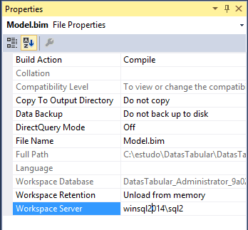
You can find the workspace database and server configuration in the ‘Model.bim’ file properties. Select ‘Model.bim’ file in the ‘Solution Explorer’ window and you will notice the properties in the ‘Properties’ window. The workspace database name is generated automatically, but you need to change the ‘Workspace Server’ property to point to a SSAS server installed in tabular mode.
After configuring the ‘Workspace Server’ property, you can configure the connection in the project using the following steps:
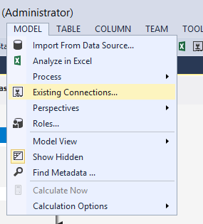
- Click in ‘Model’ menu-> ‘Existing Connections’
- In ‘Existing Connections’ window Select the existing connection (‘SqlServer WIN2SQL014 AdventureWorksDW2014’) and click in ‘Edit’ button
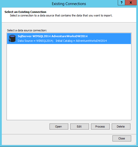
- In ‘Edit Connection’ window, change the connection information, pointing to the server where you installed ‘AdventureWorksDW’ database
-d71bc34b-663c-4f7c-8008-ba7c2e9bf77e.png)
- Click ‘Save’ button
- Click ‘Close’ button in ‘Existing Connections’ window
- Select ‘Model’ -> ‘Process’ -> ‘Process All’ on the menu
Tabular x Multidimensional
Multidimensional projects allows several cubes in the same project and we can reuse the dimensions in several cubes. Tabular projects doesn’t have this concept, one tabular project is one cube in the tabular database on the server.
This means we can’t reuse the dimension that we will build, we will need to re-create it for every cube where we need a date dimension (in general, all cubes).
Create Order Date Dimension
Let’s start the creation of our date dimension
- Click on ‘Model’ menu-> ‘Existing Connections’
- Select the existing connection and click ‘Open’ button
- Insert the credential for the database
Notice that is very easy to make a mistake here. If you use ‘Model’ menu -> ‘Import from data source’ you will end up with several connections to the same data source. Since the connection already exists and you would like only to select additional tables, you need to use ‘Existing Connections’ menu item.
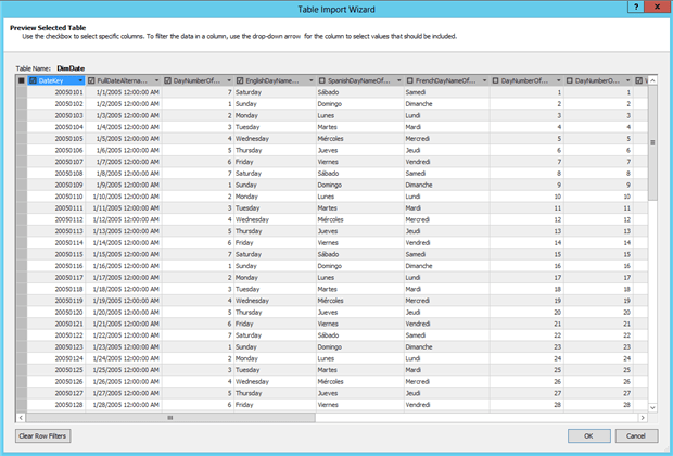
In the first step of ‘Table Import Wizard’, keep ‘Select from a list of tables’ selected and click ‘Next’ button In ‘Tables and Views’ grid, select ‘DimDate’ table In ‘Friendly Name’, change the name to ‘Date’
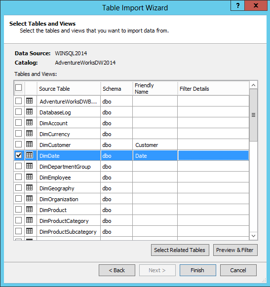
Click the button ‘Preview & Filter’ In ‘Preview Selected Table’ step, uncheck the following Fields: ‘SpanishDayNameofWeek’, ‘FrenchDayNameofWeek’, ‘SpanishMonthName’, ‘FrenchMonthName’, ‘DayNumberOfYear’
Tabular x Multidimensional
In the multidimensional model, we see all the fields in the data source view and choose the attributes of the dimensions one by one.
On the other hand, in the tabular model the default is to have all fields as attributes of the dimension. However, the tabular model uses in-memory technologies, so you need to have memory for all the data you include in the model. We need to plan which fields we would like in each dimension and remove any extra field, so we don’t waste memory.
Notice that I excluded all the fields needed for translation. The tabular model doesn’t support translation. I have written a blog post about dimension translation, but only in the multidimensional model.
Click the ‘Ok’ button Click the ‘Finish’ button in ‘Table Import Wizard’ Click the ‘Close’ button in the ‘Importing’ step of ‘Table Import’ wizard
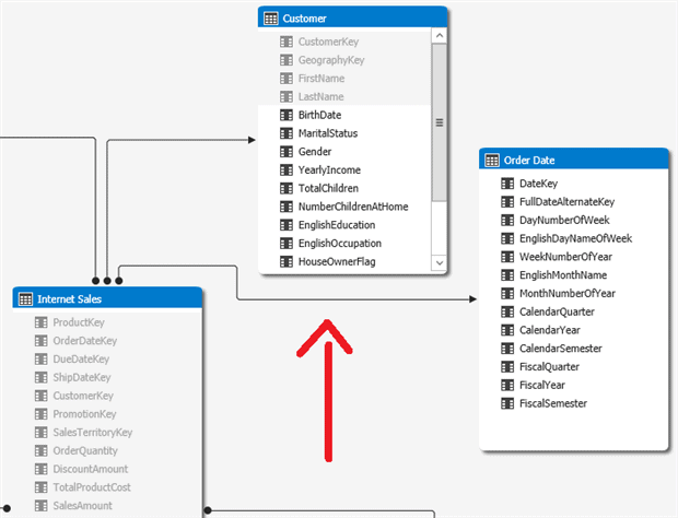
At this point, you can see the ‘Date’ table in the model, but it is disconnected from the other tables. We need to create a relation between the fact table, ‘Internet Sales’, and the ‘Date’ table.
Drag the ‘OrderDateKey’ field in the ‘Internet Sales’ table to the ‘DateKey’ in the ‘Date’ table Right-Click the ‘Date’ table, select ‘Rename’ in the context menu and rename the table as ‘Order Date’.
Tabular x Multidimensional
The ‘Internet Sales’ table has three date fields: ‘OrderDateKey’, ‘ShipDateKey’ and ‘DueDateKey’. If we create three relations, only one will be active.
Inactive relations can only be accessed using DAX expressions, the syntax used in tabular model. This means that if we create three relations between the ‘Internet Sales’ table and the ‘Date’ table, only one would be available for drag-and-drop in pivot tables inside Excel, the other two would only be accessible through custom DAX expressions.
Precisely because of this, I created only one relation and renamed the table to ‘Order Date’, that’s exactly the meaning of this single relation.
The solution for this problem is to insert the ‘DimDate’ table multiple times in the model, each one related to a different relation key. All the configurations that I will demonstrate to ‘Order Date’ table would need to be done in the other two tables as well.
As you can appreciate, the tabular model doesn’t have the role playing dimension feature I used in multidimensional model, on the previous article.
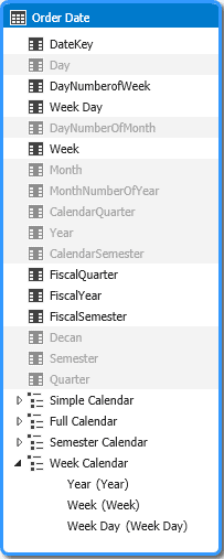
Create the calendar hierarchies
The date dimension allows us to aggregate the fact information by month, year, semester and many other options. In our example, the fact information is the amount of sales, so we can see the total of sales by month, semesters and many other options.
These aggregation options are hierarchical. We can aggregate by year and month, for example, creating a hierarchy.
When using Excel to access the cube, the users can, of course, build their own hierarchies by dragging individual attributes to a pivot table, one by one. Besides being a boring, repetitive task for the user, this can also lead to errors if the user drags the attributes in an order that makes no sense.
Our objective while designing the dimension is to make things easier for the user by creating useful pre-defined hierarchies.
Firstly, we must decide what hierarchies will we create and how to configure them.
You will notice that, for the date dimension, a single hierarchy isn’t enough. For example, we cannot mix the fiscal year with calendar year. We also cannot mix month with weeks. We will need several hierarchies in our date dimension.
Tabular x Multidimensional
Tabular model works with tables, so it is correct to refer to ‘Order Date’ as a table, in contrast to the multidimensional model, which works with dimensions created from the tables.
On the other hand, ‘Dimension’ is the name used not only in the multidimensional model but also in BI as a whole for a collection of reference information about the fact.
We can refer to ‘Order Date’ as both a ‘Table’ or a ‘Dimension’.
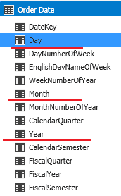
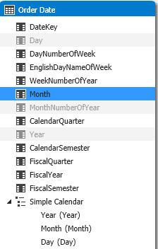
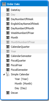
Firstly, let’s rename the fields to a friendlier name:
- Double-click the ‘CalendarYear’ field in the ‘Order Date’ table and rename it to ‘Year’
- Double-click the ‘EnglishMonthName’ field in the ‘Order Date’ table and rename it to ‘Month’
- Double-click the ‘FullDateAlternateKey’ field in the ‘Order Date’ table and rename it to ‘Day’
Now let’s create our first hierarchy:
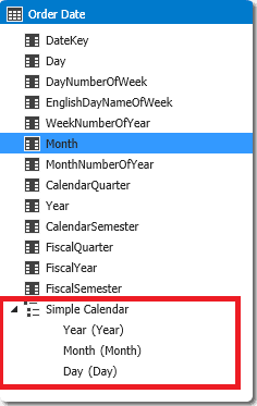
Right-click ‘Year’ field in ‘Order Date’ table and select ‘Create Hiearchy’ menu item
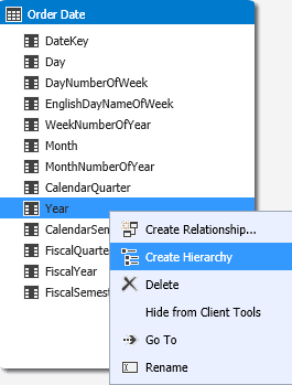
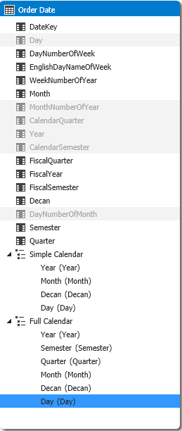
Type ‘Simple Calendar’ as the name of the hierarchy Drag ‘Month’ field in ‘Order Date’ table to the hierarchy, below ‘Year’ Drag ‘Day’ field in ‘Order Date’ table to the hierarchy, below ‘Month’
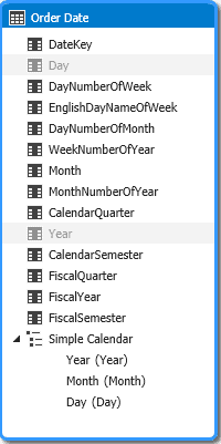
Right-click the ‘Year’ field in the ‘Order Date’ table and click the ‘Hide from client tools’ menu item Right-click the ‘Day’ field in the ‘Order Date’ table and click the ‘Hide from client tools’ menu item
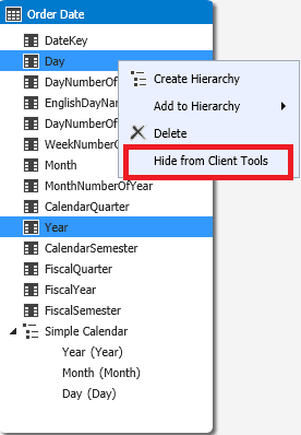
The ‘Year’ and ‘Day’ fields only need to be available inside the hierarchy:
Year: This is the first attribute in the hierarchy, so we don’t need this attribute to be visible. If we drag the ‘Calendar Year’attribute to a pivot table or drag the hierarchy, we will see the same information, so we can hide the ‘Calendar Year’attribute.
Day: The days are the last level, the leaf level of our dimension. It ‘s not usual to aggregate the sales by days; it results in too many detail lines.
On the other hand, the ‘Month’ field will be very useful outside the hierarchy, so we can aggregate the sales by months across several years.
Let’s test the new hierarchy in Excel:
- Click the ‘Excel’ button on the toolbar
-
- Click ‘Ok’ button in ‘Analyze in Excel’ window
- In ‘Excel’, if the alert bar appears, click ‘Enable’ button on the alert bar
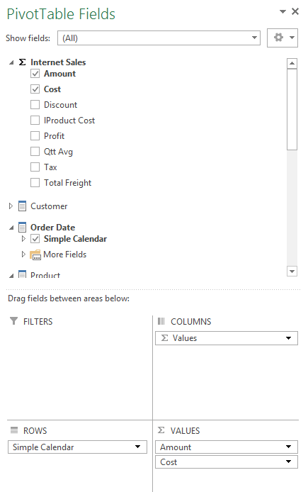
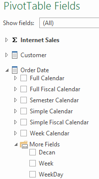
- If not already there, click inside the pivot table area in the spreadsheet, so the ‘Pivot Table Fields’ area will appear at the right side of the screen
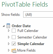
- In ‘Pivot Table Fields’ area, ‘Internet Sales’ fact table, select ‘Amount’ and ‘Cost’ fields
- In ‘Pivot Table Fields’ area, ‘Order Date’ dimension, select ‘Simple Calendar’ hierarchy
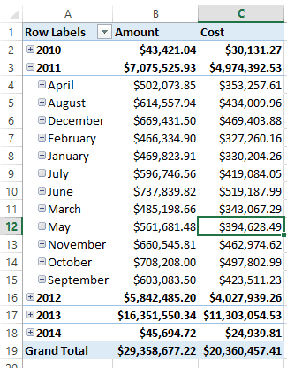
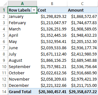
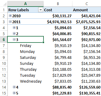
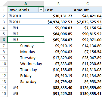
- Open 2011 year and notice the months out of order
- In the ‘Pivot Table Fields’ area, uncheck the ‘Simple Calendar’ hierarchy under the ‘Order Date’ dimension
- In the ‘Pivot Table Fields’ area, open the ‘More Fields’ folder under the ‘Order Date’ dimension
- In the Pivot Table Fields’ area, check the ‘Month’ attribute under the ‘More Fields’ folder
Since we let ‘Month’ field visible, we can aggregate information by month, across several years. On the other hand, we also see the months out of order.
The server is ordering the rows by the name of the month and we need the order by the number of the month. Let’s correct this problem and go ahead creating the hierarchies:
- Switch back to Visual Studio window
- Select ‘Month’ field in ‘Order Date’ table
- In properties window, change ‘Sort by Column’ property to ‘MonthNumberOfYear’ field
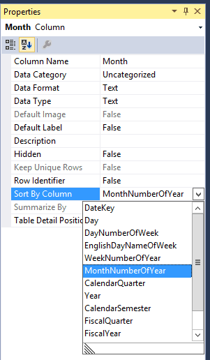
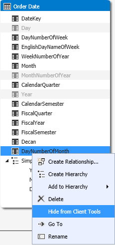
- Right click ‘MonthNumberOfYear’ field and select ‘Hide From Client Tools’ menu item
- Switch to Excel window
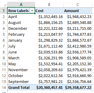
- On the toolbar, click ‘Refresh’ button -> ‘Refresh All’
-a441f6a9-e78d-4c61-bb8d-c9aabf89a60a.png)
Now the month are ordered correctly.
Tabular x Multidimensional
At this point you are probably noticing several differences between these steps and what we did in the article about the multidimensional model.
- You don’t have configure attribute relationships, the tabular model get in charge of this.
- You can use the same attribute in a hierarchy and outside the hierarchy, as we just did with ‘Month’ field.
- There isn’t a ‘NameColumn’ property as in the multidimensional model, so the options to configure the fields are less flexible, but this isn’t exactly a problem, we just need to select always the field that has the name to use and configure the ‘Sort by Column’ property as we just did.
By the way, since we can call ‘Order Date’ as table or dimension, we can call ‘Month’ as field or attribute.
Discretization of the Days
Each month has around thirty days. If we display them all, it means that there will be too many detail lines in the pivot table, making the visualization much less useful. It would be better to find a way to group the days below the month level. How can we create clusters among the thirty days in a month?
We can aggregate the days using groups of ten days. It will result in two groups of ten days and one final varying group for each month. We will have fewer detail lines and the user will be able to identify which part of the month get the best sales result. For example, it would be easy to identify if the most amount of sales happens in the beginning or in the end of the month.
Let ‘s call these groups as ‘Decans’ (yes, I found this name in astrology). We need to create a calculated member named ‘Decans’ to classify each record in 1st, 2nd or 3rd decan.
This kind of grouping of a level that doesn’t have a natural grouping is called discretization. We are discretizing the day level in the hierarchy.
Let’s start the steps do create the ‘Decans ‘:
- Switch the visualization to grid by clicking the ‘Grid’ button at lower right corner of ‘Model.bim’ window

Select ‘Order Date’ tab
After the last column, double click ‘Add Column’ title Type ‘Decan’ as the name of the new column and press enter
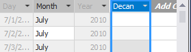
Click the first empty cell in ‘Decan’ column Type the following expression:
|
1 |
=if([DayNumberOfMonth]<=10,"1st Decan",if([DayNumberOfMonth]<=20,"2nd Decan","3rd Decan")) |
This expression uses the DAX syntax to decide if the row is from the first, second or third ‘Decan’. DAX is the syntax used for the tabular model to create expressions for calculated fields, measures or to do queries.
Switch the visualization to diagram view by clicking ‘Diagram’ button at lower right corner of ‘Model.bim’ window
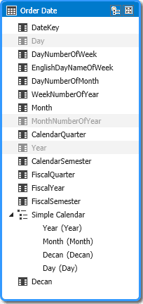
Drag the ‘Decan’ field in ‘Order Date’ table to ‘Simple Calendar’ hierarchy, between ‘Month’ and ‘Day’ fields
Right-click ‘DayNumberOfMonth’ field and click ‘Hide from client tools’menu item
We don’t need ‘DayNumberOfMonth’ field anymore, so we can hide it. It was included exactly to make this formula easier.
Probably you have noticed the ‘Decan’ field in a strange position, under the the ‘Simple Calendar’ hierarchy. If you close the ‘Model.bim’ window and open it again, double-clicking ‘Model.bim’ item in ‘Solution Explorer’ window and returning to diagram view, ‘Decan’ field will be in the right position, above the ‘Simple Calendar’ hierarchy.
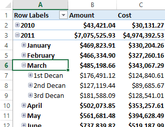
Let’s test the ‘Decan’ attribute:
- Switch to the Excel window
- On the toolbar, click the ‘Refresh’ button -> ‘Refresh All’
- In the ‘Pivot Table Fields’ area, under the ‘More Fields’ folder under the ‘Order Date’ dimension, uncheck the ‘Month’ field
- Check the ‘Simple Calendar’ field under the ‘Order Date’ dimension in the ‘Pivot Table Fields’ area
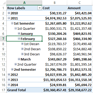
- In the pivot table, expand ‘2011’ year
- Under the ‘2011’ year, expand the ‘March’ month
Tabular x Multidimensional
In multidimensional projects, we create calculated members inside the data source view. In most cases, the views are queried and the data is stored in the multidimensional database.
In tabular projects, on the other hand, we create calculated columns in tables and the data will be stored in memory. This will have a bigger impact on performance. Because of this it’s even more important to pre-calculate the values in the data source whenever possible.
Creating the Full Calendar hierarchy
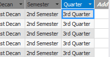
We haven’t used the information about semester and quarter yet. Now it’s time to create a bigger hierarchy using these fields.
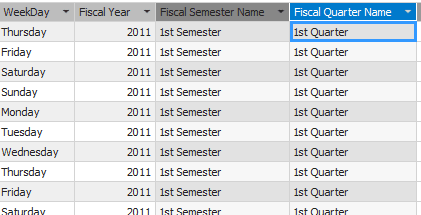
Both fields, ‘CalendarQuarter’ and ‘CalendarSemester’ are numeric. If we use these fields in our hierarchy, we will have two levels with numeric descriptions. This will be confusing, as in the image below.
-e7cc7251-4f61-4682-87f7-f33946590f53.png)
We can create calculated fields to name these values and avoid this problem. For example, we can name the semesters as ‘1st Semester’ and ‘2nd Semester’. We need two calculated fields: ‘Semester’ and ‘Quarter’.
In DAX, we have the function SWITCH that we can use to “translate” the numeric value to a string name of the semesters and quarters.
DAX formula for the ‘Semester’ field:
|
1 |
=SWITCH([CalendarSemester],1,"1st Semester",2,"2nd Semester") |
DAX formula for the ‘Quarter’ field:
|
1 |
=SWITCH([CalendarQuarter],1,"1st Quarter",2,"2nd Quarter",3,"3rd Quarter",4,"4th Quarter") |
Let’s create both fields:
- Click the ‘Grid’ button in bottom-right corner of ‘Model.bim’ window to switch the visualization to grid.
- Select ‘Order Date’ tab
- After the last column, double click ‘Add Column’ title
- Type ‘Semester’ as the name of the new column
- Select the first empty cell in the new ‘Semester’ column
- Type the DAX formula for the ‘Semester’ field

- After the last column, double click ‘Add Column’ title
- Type ‘Quarter’ as the name of the new column
- Type the DAX formula for the ‘Quarter’ field

- Switch to the diagram view using the ‘Diagram’ button at the bottom-right corner of the ‘Model.bim’ window
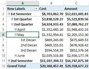
- Right-click the ‘Year’ field in the ‘Order Date’ table and click the ‘Create new hierarchy’ menu item
- Type ‘Full Calendar’ as the name of the new hierarchy
- Drag the ‘Semester’ field from the ‘Order Date’ table to the ‘Full Calendar’ hierarchy, below the ‘Year’ field.
- Drag the ‘Quarter’ field from ‘Order Date’ table to ‘Full Calendar’ hierarchy, below the ‘Semester’ field
- Drag the ‘Month’ field from ‘Order Date’ table to ‘Full Calendar’ hierarchy, below the ‘Quarter’ field
- Drag the ‘Decan’ field from ‘Order Date’ table to ‘Full Calendar’ hierarchy, below ‘Month’ field
- Drag the ‘Day’ field from ‘Order Date’ table to ‘Full Calendar’ hierarchy, below the ‘Decan’ field
- Right-Click the ‘CalendarSemester’ field in ‘Order Date’ table and click the ‘Hide from client tools’ menu item
- Right-Click the ‘CalendarQuarter’ field in ‘Order Date’ table and click the ‘Hide from client tools’ menu item
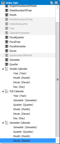
Semester Calendar
Several fields like ‘Semester’, ‘Quarter’, ‘Month’ and ‘Decan’ for example, are very useful for analysis across the years. It’s useful to know which semester, quarter, month or decan has higher or lower sales amount, independent of the year.
We can create one hierarchy for these fields to make thing even easier for the user, let’s call this hierarchy ‘Semester Calendar’.
Follow these steps:
- Right-click the ‘Semester’ field in the ‘Order Date’ table and click the ‘Create hierarchy’ menu item.
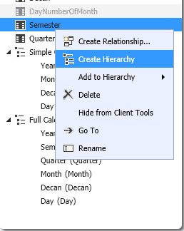
- Type ‘Semester Calendar’ as the name of the new hierarchy
- Drag ‘Quarter’ field in ‘Order Date’ table to ‘Semester Calendar’ hierarchy, below ‘Semester’ field
- Drag ‘Month’ field in ‘Order Date’ table to ‘Semester Calendar’ hierarchy, below ‘Quarter’ field
- Drag ‘Decan’ field in ‘Order Date’ table to ‘Semester Calendar’ hierarchy, below ‘Month’ field
- Right click ‘Semester’ field in ‘Order Date’ table and click ‘Hide from client tools’ menu item
- Right-click ‘Quarter’ field in ‘Order Date’ table and click ‘Hide from client tools’ menu item
- Right-click ‘Month’ field in ‘Order Date’ table and click ‘Hide from client tools’ menu item
Since we already have the hierarchy, we don’t need these fields to be visible outside the hierarchy anymore. The exception is the ‘Decan’ field: Inside the hierarchy it’s always attached to ‘Month’ field, so if we would like to analyze the amount of sales by decan independent of the month we will need to keep this field visible.
Testing in Excel
- Switch to Excel window
- On the toolbar, click ‘Refresh’ button -> ‘Refresh All’
- On ‘Pivot Table Fields’, inside ‘Order Date’ dimension, notice the three hierarchies we already created
- Check the ‘Full Calendar’ hierarchy, uncheck all others hierarchies and notice the result in the pivot table
- Check the ‘Semester Calendar’ hierarchy, uncheck all others hierarchies and notice the result in the pivot table
Week Hierarchy
The ‘ Order Date ‘ table has a field named ‘ Week Number of Year ‘. Some companies do analysis with the week, so we can create hierarchies using Week. On the other hand, we shouldn ‘t include Semester, Quarter and Month in hierarchies with week, because about ten weeks in the year are part of two different months.
The week hierarchy will be, basically, the ‘Year’, ‘WeekNumberofYear’ and ‘EnglishDayNameOfWeek’ attributes.
Let’s create this new hierarchy using the following steps:
- Right-click ‘WeekNumberofYear’ field in ‘Order Date’ table and rename it to ‘Week’
- Right-click ‘EnglishDayNameOfWeek’ field in ‘Order Date’ table and rename it to ‘WeekDay’
- Right-click ‘Year’ field in ‘Order Date’ table and click ‘Create Hiearchy’ menu item
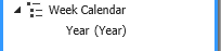
- Type ‘Week Calendar’ as the name of the hierarchy
- Drag the ‘Week’ field in ‘Order Date’ table to the ‘Week Calendar’ hierarchy, below ‘Year’ field
- Drag the ‘WeekDay’ field in ‘Order Date’ table to the ‘Week Calendar’ hierarchy, below ‘Week’ field
Test the hierarchy in Excel:
- Switch to Excel window
- Click ‘Refresh’ button -> ‘Refresh All’ in the toolbar
- In ‘Pivot Table Fields’ area, expand ‘Order Date’ dimension and notice the new hierarchy we just created, ‘Week Calendar’
- Uncheck all hierarchies in ‘Order Date’ dimension and check ‘Week Calendar’ hierarchy
Notice the hierarchy in the pivot table
You will notice the ‘Weekday’ field completely out of order. It’s been ordered alphabetically by the weekday name. We already had this problem before with the ‘Month’ field and the solution is the same: We need to configure ‘Sort by Column’ property of ‘WeekDay’ field.
- Switch back to Visual Studio window, if not already there
- Select ‘WeekDay’ field in ‘Order Date’ table
- In ‘Properties’ window, change the value of the property ‘Sort by Column’ to ‘DayNumberofWeek’
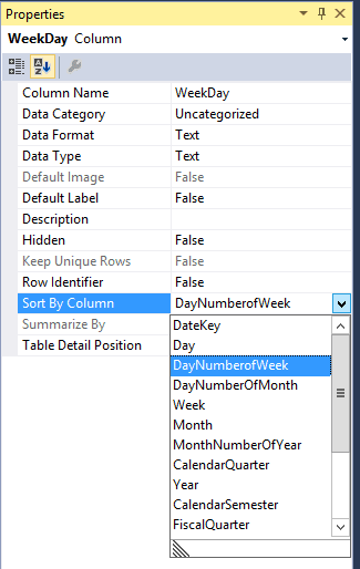
- Right-click ‘DayNumberofWeek’ field in ‘Order Date’ table and click ‘Hide from client tools’ menu item
- Switch to Excel window
- Click ‘Refresh’ button -> ‘Refresh All’
- In pivot table, expand ‘2011’ year
- In the pivot table, expand any week below ‘2011’ year
- Now the weekdays are in the correct order
Fiscal Hierarchies
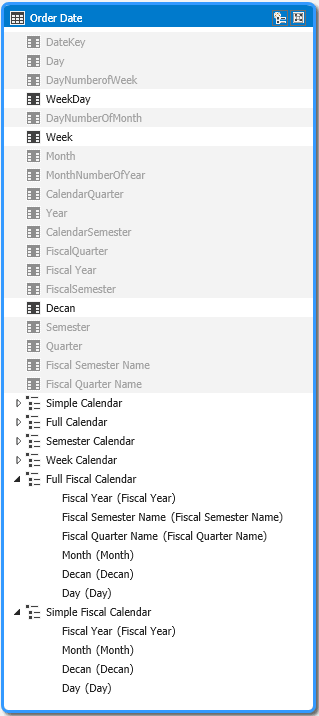
The next step is to create hierarchies for the fiscal calendar. The ‘Order Date’ has several fields that allow us to create fiscal calendar hierarchies. We need two hierarchies: ‘Simple Fiscal Calendar’ and ‘Full Fiscal Calendar’, following the same pattern that we created with ‘Simple Calendar’ and ‘Full Calendar’. We don ‘t need a ‘Fiscal Semester Calendar’ hierarchy, because would be the same as ‘Semester Calendar’ hierarchy we already have.
The creation of these hierarchies follows the same steps we used before, it’s the same as the calendar hierarchies, so let’s summarize the steps:
- We will need ‘FiscalYear’ field in ‘Order Date’ table, both hierarchies starts with this field
- We will need two new named calculations, ‘Fiscal Semester Name’ and ‘Fiscal Quarter Name’. The DAX instruction will be the same we used for ‘Semester’ and ‘Quarter’, only changing the fields.


- We will use the same ‘Month’, ‘Decan’ and ‘Day’ fields
- We can hide ‘FiscalSemester’, ‘FiscalQuarter’, ‘Fiscal Semester Name’, ‘Fiscal Quarter Name’ and ‘FiscalYear’ fields
Tabular x Multidimensional
In Tabular mode we haven’t anything like ‘AttributeHierarchyDisplayFolder’ or ‘DisplayFolder’ properties that we have in multidimensional.
There is no way in tabular mode to organize the hierarchies and fields in custom folders as I did in the previous article
Using Perspectives to control Hierarchy visualization
Perspectives are like views for an entire cube. A perspective determines which parts of a cube a user can view when using the perspective.
For some users the excess of hierarchies can be confusing. We can use perspectives to create different views of the cube, simplifying the user work.
Perspectives are available in Business Intelligence edition and Enterprise Edition, but not in Standard Edition.
In our example, we have plenty of possibilities for creating perspectives of the cube. Let’s try the following combination:
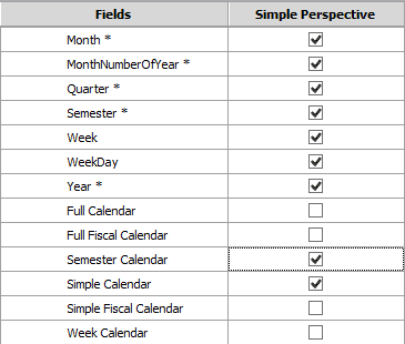
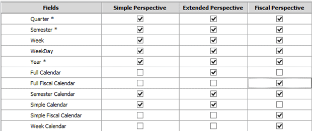
Simple Perspective: This perspective can have the ‘Simple Calendar’ hierarchy and ‘Semester Calendar’ hierarchy
Extended Perspective: The same as the simple perspective plus the ‘Full Calendar’ hierarchy
Fiscal Perspective: This perspective will contain the ‘Simple Fiscal Calendar’ and ‘Full Fiscal Calendar’hierarchies, ‘Semester Calendar’ and ‘Week Calendar’hierarchies
Let’s create the perspectives:
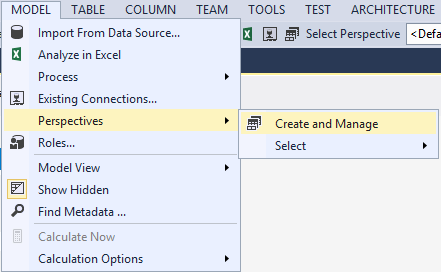
- Click ‘Model’ menu -> ‘Perspectives’ -> ‘Create and Manage’
- In ‘Perspectives’ window, click ‘New Perspective’ button
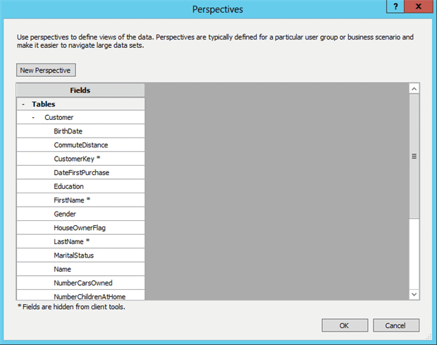
- Type ‘Simple Perspective’ as the name of the new perspective
- Check the checkbox in the ‘Tables’ line, below ‘Simple Perspective’ column. This will check all the checkboxes
- Click the ‘-‘ button besides the ‘Customers’ table, this will collapse the table names
- Click the ‘+’ button besides the ‘Order Date’ table, this will expand the table fields and hierarchies
- Uncheck all hierarchies other than ‘Simple Calendar’ and ‘Semester Calendar’
- Click ‘New Perspective’ button
- Type ‘Extended Perspective’ as the name of the new perspective
- Check the checkbox in the ‘Tables’ line, below ‘Extended Perspective’ column. This will check all the checkboxes
- Click the ‘-‘ button besides the ‘Customers’ table, this will collapse the table names
- Click the ‘+’ button besides the ‘Order Date’ table, this will expand the table fields and hierarchies
- Uncheck all hierarchies other than ‘Simple Calendar’, ‘Semester Calendar’ and ‘Full Calendar’
- Click ‘New Perspective’ button
- Type ‘Fiscal Perspective’ as the name of the new perspective
- Check the checkbox in the ‘Tables’ line, below ‘Fiscal Perspective’ column. This will check all the checkboxes
- Click the ‘-‘ button besides the ‘Customers’ table, this will collapse the table names
- Click the ‘+’ button besides the ‘Order Date’ table, this will expand the table fields and hierarchies
- Uncheck all hierarchies other than ‘Simple Fiscal Calendar’, ‘Semester Calendar’, ‘Full Fiscal Calendar’ and ‘Week Calendar’
Test the Perspectives
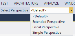
You will notice in the toolbar a combobox named ‘Select Perspective’. If you choose a perspective in the combobox, the model will display only the elements that are included in the perspective.
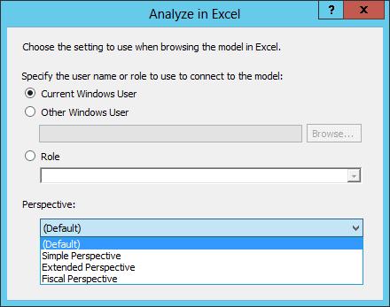
When you click the ‘Excel’ button in the toolbar and open the ‘Analyze in Excel’ window, you have the option to choose the perspective that will be opened in Excel, turning available only the items included in the perspective.
The Date Table
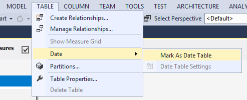
Our last, but not least, task is to specify the table as ‘Date Table’.
There are some analysis we can do using DAX queries that needs the dimension type specified. For example, there is a function named ‘ParallelPeriod’ that allow us to analyze periods across the time, for example, the same month across several years.
For this function, ‘ParallelPeriod’, and several others can work properly, there must be a table marked as being of type ‘Date’.
It’s easy to do this: We only need to use ‘Table’ menu -> ‘Date’ menu -> ‘Mark as Date Table’ menu item
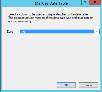
In the ‘Mark as Date Table’ window, we only need to keep the ‘Day’ field selected, because it’s the date type field with unique values.
Conclusion
Implementing a date dimension in the SSAS tabular mode is much simpler than in the SSAS multidimensional mode, but it has certain limitations as you will have noticed in this article.
The power pivot add-on in Excel is also useful for building tabular models. It’s very similar to Visual Studio and useful for self-service BI.