

Simpson’s Paradox in Data
I was reading some articles related to the general failure of analytics during the past election – when I came across this very interesting phenomenon called in statistics and probability as ‘Simpson’s Paradox’. Data often presents paradoxical scenarios that cannot be fitted into one specific conclusion but need to be understood from different perspectives. Simpson’s Paradox is a classic example of ‘It Depends’ , or perspective influencing findings from data.
What is Simpson’s Paradox?
We are observing several variables in a scenario, and we establish a correlation or relationship between variables. Let us say that variable x increases with variable y. Now, if we combine multiple similar scenarios with variables x and y, the relationship of the combined scenarios maybe the opposite of what was observed in individual ones. In some cases, this may be clearly identified to be a variable z, also called ‘confounding variable’, that changes the equation. In other cases, it may just be due to the mathematical nature of the variables involved. There are several examples of this phenomenon – the wiki article gives a good summary of the more popular ones.
Case Study
For this article I chose a dataset from here. This is a dataset from California Department of Developmental Services. They provide financial aid and support for citizens with disabilities such as autism,cerebral palsy and various developmental disorders. The data set is a collection of financial aid provided to such people, sorted by age and ethnicity.
There were charges of ethnicity based discrimination made some years ago. Our goal is to examine the statistics related to financial aid to support this claim. There is some analysis done in the article itself for students of statistics - but for this article I chose to do my analysis with T-SQL queries supported further by graphs from R. The same analysis is possible with several other tools such as Excel and Power BI.
The table I have created in my SQL Server database named ‘simpsons’ is as below:
CREATE TABLE [dbo].[paradox_data](
       [ID ] [varchar](50) NULL,
       [AgeCohort] [varchar](50) NULL,
       [Age] [int] NULL,
       [Gender] [varchar](50) NULL,
       [Expenditures] [float] NULL,
       [Ethnicity] [varchar](50) NULL
) ON [PRIMARY]
GO
I have imported the dataset provided in the appendix of the above link into this. My goal now would be to run descriptive statistics on the dataset and analyze the following relationships:
- Ethnicity vs Expenditures
- Age vs Expenditures
- Gender vs Expenditures
I need to also keep in mind some rules on data analysis – such as treating outliers differently, and using conclusions drawn from one phase of analysis in another.
Ethnicity Vs Expenditure
The query I run for this and results are as below:
SELECT
    ethnicity,
    ROUND(AVG(expenditures), 2) AS averagefunding
FROM [dbo].[paradox_data]
GROUP BY ethnicity
ORDER BY averagefunding DESC;
The results are as below:
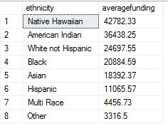
On the face of it, there are big differences in averagefunding between lowest and highest and suggest a possible bias based on ethnicity.
Gender Vs Expenditure
The query to examine any possibility of bias based on gender is as below:
SELECT
    gender,
    ROUND(AVG(expenditures), 2) AS averagefunding
FROM [dbo].[paradox_data]
GROUP BY gender;
Results are as below:
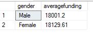
The values gender wise are too close to suggest any possible gender based bias, so this can be safely ruled out.
Age Group vs Expenditure
The third query is to check for bias based on age groups.
SELECT
    agecohort,
    ROUND(AVG(expenditures), 2) AS averagefunding
FROM [dbo].[paradox_data]
GROUP BY AgeCohort
ORDER BY averagefunding DESC;
The results are as below:
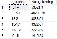
It is easy to see that the first two age groups have significantly higher funding than lower age groups. But it is important to bear in mind that older people need more funding than younger ones, so this is not necessarily any indicator of bias and can be safely disqualified.
Out of the three criteria for bias examined, the one on ethnicity shows maximum potential for bias, and needs further investigation. The next step is to to look into ethnicity based funding in greater detail.
SELECT
    ethnicity,
    AVG(expenditures) AS averagefunding,
    SUM(expenditures) AS totalfunding,
    ROUND((SUM(expenditures) * 100 / SUM(SUM(expenditures)) OVER ()), 2) AS percenttotalfunding,
    ROUND((COUNT(*) * 100.0 / SUM(COUNT(*)) OVER ()), 2) AS percentofcustomers
FROM [dbo].[paradox_data]
GROUP BY ethnicity
ORDER BY percentofcustomers DESC;
Results are as below:
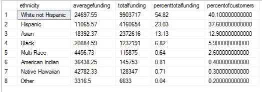
Based on the results – it is easy to see that White not Hispanic ethnic group had 40 percent of total customers and got 54.82 % of total funds. The second is the Hispanic ethnic group that had almost the same percentage of people, 37.6% but got only 23.03% of total funds. On the face of it this looks like significant bias. The other ehtnic groups have significantly smaller percent of customers and can be considered too low in volume for this analysis. This does not imply that they are not suffering any bias, only that there is not enough data to compare with the other two groups.
So the research now narrows down into these two ethnic groups in particular.
Rerunning the same query for these two ethnic groups:
SELECT
    ethnicity,
    ROUND(AVG(expenditures), 2) AS averagefunding,
    SUM(expenditures) AS totalfunding,
    ROUND((SUM(expenditures) * 100 / SUM(SUM(expenditures)) OVER ()), 2) AS percenttotalfunding,
    COUNT(*) AS customercount,
    ROUND((COUNT(*) * 100.0 / SUM(COUNT(*)) OVER ()), 2) AS percentofcustomers
FROM [dbo].[paradox_data]
WHERE
    ethnicity IN ( 'White not Hispanic', 'Hispanic' )
GROUP BY ethnicity
ORDER BY percentofcustomers DESC;
Results are as below:
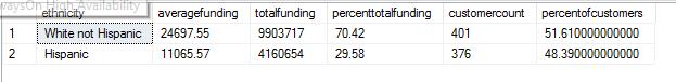
The results seem to reconfirm the existence of bias – the number and percentage of customers are very close, but funding for one group is 40% higher than the other.
Now let us consider adding in the age cohort to see if this is consistent.
SELECT
    agecohort,
    ethnicity,
    ROUND(AVG(expenditures), 2) AS averagefunding,
    COUNT(*) AS customercount,
    ROUND((COUNT(*) * 100.0 / SUM(COUNT(*)) OVER (PARTITION BY agecohort)), 2) AS percentofcustomers,
    SUM(expenditures) AS totalfunding,
    ROUND(
             (SUM(expenditures) * 100
              / SUM(SUM(expenditures)) OVER (PARTITION BY agecohort)
             ),
             2
         ) AS percenttotalfunding
FROM [dbo].[paradox_data]
WHERE
    ethnicity IN ( 'White not Hispanic', 'Hispanic' )
GROUP BY
    agecohort,
    ethnicity
ORDER BY
    agecohort,
    ethnicity;
Results are as below:
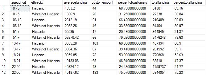
Surprisingly, the average funding for both ethnicities in each age group are very close to each other. The percentage of customers also closely follows the percent total funding thus indicating that there is little to no bias when age is taken into consideration along with ethnicity for the selected two ethnic groups.
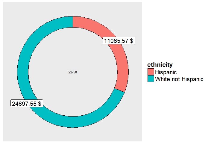
If we want to visualize the same results with R, we get as below - the code used is attached.
The doughnut chart below shows distribution across two selected ethnic groups, clearly showing the 'White Not Hispanic' group getting maximum funding.
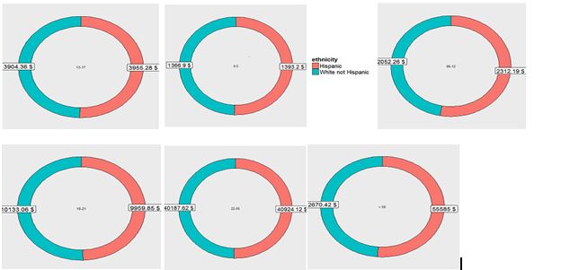
But if we were to break up the same chart into smaller individual charts for the selected two ethnicities, we can clearly see that the difference is evened out and the distribution of funds is, in fact, more or less equal in proportion across two ethnicities.
Understanding this phenomenon can be very useful for analyzing data from multiple perspectives and coming up with conclusions that are possibly very different. There are a number of very interesting blog posts on this subject - a few I liked are as below:
