
Conditional formatting with Reporting Services
Anyone who has created reports with SQL Server Reporting Services has tweaked the presentation of a table or matrix to enhance its visual appeal. However in most cases, you do this once and for all, to produce a static result. The row or table cell is set to fixed and final presentation, with background colors, font attributes and borders defined once and for all. This is great when you want a uniform presentation, but in these days of information overload, you often need to allow certain pieces of data to stand out and to draw the reader's attention. Even better, you want to automate this process, and have certain values draw attention to themselves when specific thresholds are met. What you need is conditional formatting - just like Access and Excel have had for years.
Fortunately Reporting Services allows you to vary almost any aspect of a report's presentation based on the underlying data. So when a sales figure shoots up - or down - you can have the report draw attention to this fact by:
- changing the colour cell backgrounds;
- changing font colour and attributes;
- adding or altering cell borders;
Indeed, you can combine most of these techniques in many ways to ensure that your reports deliver analysis as well as data to their users.
Just to be clear, I am not pretending that this is some wildly useful but undiscovered feature of Reporting Services. Far from it. I am merely attempting to draw your attention to useful ways of enhancing your reports and reaching further levels of automation in report creation using Reporting Services expressions.
Basic conditional formatting
Anyway, now we know what we are aiming for, let's see it in practice.
A report example
Firstly, we are going to need some data. I suggest using the Adventureworks database to return a few rows about sales people and their sales figures, as this will give us a set of data which can then be used to highlight the best- (and the worst-) performing sales staff.
So here is the stored procedure that will return data to Reporting Services. If you have not already done so, I suggest that you download the AdventureWorks database from the CodePlex web site, install it, and then create the following procedure in the AdventureWorks database:
ALTER PROCEDURE pr_GetSalesData
AS
SELECT
CT.FirstName + N' ' + CT.LastName AS PersonName
,SP.Bonus, SP.SalesQuota
,SP.CommissionPct * SP.SalesYTD AS Commission
,SP.SalesYTD, SP.SalesLastYear
,SP.SalesYTD - SP.SalesLastYear AS SalesIncrease
FROM Sales.SalesPerson SP INNER JOIN HumanResources.Employee EMP
 ON SP.SalesPersonID = EMP.EmployeeID INNER JOIN Person.Contact CT
 ON EMP.ContactID = CT.ContactID AND EMP.ContactID = CT.ContactID
The first thing to note here is that I am Using T-SQL to perform all calculations, rather than use Reporting Services. This is a personal choice, but I consider that this approach is fundamental to efficient and easy conditional formatting with Reporting Services.
You will then need to create a new Reporting Services project. Then create a new data source which connects to the AdventureWorks database. Finally add a new report (Right-click Reports, then Add/New Item/Report), and create a new dataset for the report, being careful to use pr_GetSalesData as the query string, and "Stored Procedure" as the command type.
Then switch to the layout tab, and drag a table object from the toolbox onto the report body. Add another four columns (making seven in all), and drag the data fields, one by one, into the table details row. You should end up with something like this:

At a minimum, I suggest that you format the figures to display a thousands separator and two decimal places - it makes them easier to read.
Applying basic conditional formatting
Now for some conditional formatting. For starters, let's say that we want to flag immediately anyone who has sold less this year than last year. This boils down to using the "Sales Increase" field, and seeing if it is ever negative, So, to have the figure for sales increase turn red if ever the figure turns negative, you need to:
- Click on the table cell for the detail row in the "Sales Increase" column.
- Display the properties window (pressing F4 will do this if it is not already visible).
- Click the popup box to the right of the "Color" attribute, and select "Expression". The "Edit Expression" dialog will be displayed.
- Enter the following code: =IIF(Fields!SalesIncrease.Value<0,"Red","Black"). You should see something like this:

5 - Click "OK"
6 - Preview the report.
You should see the data for two sales reps (Pamela Ansman-Wolfe & Lynn Tsoflias) turn red.
OK, so this is neither difficult, nor unusual. Indeed people who have been using Excel for the last 15 years for instance are probably wondering what all the fuss is about. But this is only the first step to show the principle, now we can graduate to some more interesting uses of this approach.
So now that you have got the hang of this, let's see how to apply it to another couple of aspects of report formatting. The basic principles will be the same, and it is only the specifics of the kind of formatting that will change.
Supposing that you want any sales figure over 5,000,000 to have a cell border - to be "boxed in", as it were.
- Click on the table cell for the detail row in the "Sales YTD" column.
- Display the properties window (pressing F4 will do this if it is not already visible).
- Click the popup box to the right of the "Border Style" attribute, and select "Expression". The "Edit Expression" dialog will be displayed.
- Enter the following code: =iif(Fields!SalesYTD.Value>5000000,"Solid","None").
- Click "OK"
- Preview the report.
You should see two salesperson's sales figures with a cell border.
Of course, if you apply this only to the bottom border, then you can underline figures instead.
You can test on one field and apply formatting to another field, For instance, suppose that you want to highlight the names of the sales staff getting a bonus of more than 5,000.
- Click on the table cell for the detail row in the "Person Name" column.
- Display the properties window (pressing F4 will do this if it is not already visible).
- Expand the "Font" attribute and click the popup box to the right of "FontWeight", then select "Expression". The "Edit Expression" dialog will be displayed.
- Enter the following code: =iif(Fields!Bonus.Value>5000,"Bold","Normal").
- Click "OK"
- Preview the report.
You do not have to remember all the possible values for font weights, colors etc. In the Edit Expression dialog, click "Constants" to see (and select by double-clicking) any element that you wish to use. Reporting Services will always display the choices appropriate to the property that you are modifying.
More advanced conditional formatting
So let's take this one step further. Suppose that you wish for a series of colors to be applied to the cell background of the "Commission" column, to draw attention to the lowest and highest commissions, as well as indicating the lower and higher of the intermediate commissions.
For argument's sake, I suggest the following requirement:
| Amount | Color |
| 0 | red |
|---|---|
| 1 - 25,000 | yellow |
| 25,001 - 50,000 | light green |
| 50,001 - 75,000 | dark green |
| 75,001 + | blue |
I have to agree that I have no taste in colour, and that I could never get a job as a graphic designer. But that is not the point. What matters is that the commission column will change color according to where in the range of data the figure lies.
At this point, we need to do some strategic thinking, as we are trying to do two things here:
- Apply a set of conditions, and not just a simple IF..ELSE.
- Test a range of figures, and not just carry out a simple comparison,
Now we could use the IIF function that we used above have negative numbers appear in red. However using more than two IIF functions can get very difficult to get right, so I suggest using the Reporting Services SWITCH function to apply the color coding. However, while this solves the first problem, it does not help with the second problem at all. Therefore I think that using T-SQL to apply range-based conditional analysis is a much better idea than attempting this with Reporting Services.
So, you need to return to SQL Server Management Studio, and add the following to the SELECT clause of your stored procedure:
;CASE
WHEN (SP.CommissionPct * SP.SalesYTD) > 75000 THEN 5
WHEN (SP.CommissionPct * SP.SalesYTD) BETWEEN 50001 AND 75000 THEN 4
WHEN (SP.CommissionPct * SP.SalesYTD) BETWEEN 25001 AND 50000 THEN 3
WHEN (SP.CommissionPct * SP.SalesYTD) BETWEEN 1 AND 25000 THEN 2
ELSE 1
END AS CommissionFlag
This simple snippet will calculate the commission for each salesperson, and categorise it according to the amount of commission received. This is then returned as a figure between 1 and 5.
I see several advantages to this approach:
- All calculations are server-based, centralised - and compiled the first time that the stored procedure is run
- The analysis method is blissfully simple - and allows for considerable complexity in its application.
You will need to add the new field that the stored procedure is returning to your reporting services dataset. To do this:
- Click on the "Data" tab of your report.
- Click the "Edit Selected Dataset" ellipsis on the tab toolbar.
- The "Dataset" dialog will appear. Click the "Fields" tab.
- Scroll to the bottom of the list of fields and click in a blank row.
- Add the field name to both the "Field Name" and "Value" cells. You should end up with something like this:
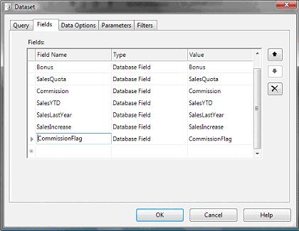
You can then Click "OK" and right=click on "Report Datasets" in the "Datasets" pane, and select "Refresh" to make the new field appear in the fields collection.
Now that you have fed the analytical flag for commissions through to the report, you can use it to apply some conditional formatting.
- Click on the table cell for the detail row in the "Commission" column.
- Display the properties window (pressing F4 will do this if it is not already visible).
- Click the popup box to the right of the "Background Color" attribute, and select "Expression". The "Edit Expression" dialog will be displayed.
- Enter the following code: =switch(Fields!CommissionFlag.Value=1,"Red",Fields!CommissionFlag.Value=2,"Yellow",Fields!CommissionFlag.Value=3,"LawnGreen",Fields!CommissionFlag.Value=4,"DarkGreen",Fields!CommissionFlag.Value=5,"Blue")
- Click "OK"
- Preview the report.
So now we can safely assume three things, two of which are fairly fundamental:
- We can instantly see which sales people might soon be looking for another job (including those that we now know that we have to keep, because they are so good.)
- The Switch function is much easier to use than nested IIF functions.
- I have no colour sense.
The SWITCH function is worth making a few comments about:
- It is really easy to use when you want to apply one of many possible choices. All you have to do is remember to keep the Test/output pairs comma separated.
- I have not yet met any practical limits on the number of selection elements that it can hold - because the practical application reaches the end of its usefulness long before any programming limits are reached.
- It is always worth using T-SQL to define the selection elements for the SWITCH statement, as you cannot use it to compare ranges, only text or numbers. If you want to validate a number against a range, then you will have to use IIF and AND to create the multiple range selections. I strongly advise you against doing this, as it is turgid to write and very difficult to maintain.
This principle - applying a flag or range indicator to each row in a T-SQL rowset - can be applied in many ways to return a field to Reporting Services. This field will then be used not for display purposes, but to apply conditional formatting.
Exception highlighting
To conclude this article, let's look at what I have heard called "exception highlighting". This is best understood using an example. Suppose that you wish to flag the highest and lowest selling salespersons. Let's suppose that you wish to change the font color for the bonus attributed to these salespeople
Once again, this is most easily handled at the T-SQL level. So start by adding the following to the start of the existing stored procedure:
DECLARE @Topseller INT
DECLARE @Bottomseller INT
SELECT @Topseller = MAX(Bonus) FROM Sales.SalesPerson
SELECT @Bottomseller = MIN(Bonus) FROM Sales.SalesPerson
Then add the following to the end of the SELECT clause:
,CASE
WHEN SP.Bonus = @Topseller THEN 1
WHEN SP.Bonus = @Bottomseller THEN 2
ELSE NULL
END AS TopBottomSeller
So the entire T-SQL should now be:
ALTER PROCEDURE [dbo].[pr_GetSalesData]
AS
DECLARE @Topseller INT
DECLARE @Bottomseller INT
SELECT @Topseller = MAX(Bonus) FROM Sales.SalesPerson
SELECT @Bottomseller = MIN(Bonus) FROM Sales.SalesPerson
SELECT
CT.FirstName + N' ' + CT.LastName AS PersonName
,SP.Bonus
,SP.SalesQuota
,SP.CommissionPct * SP.SalesYTD AS Commission
,SP.SalesYTD, SP.SalesLastYear
,SP.SalesYTD - SP.SalesLastYear AS SalesIncrease
,CASE
WHEN (SP.CommissionPct * SP.SalesYTD) > 75000 THEN 5
WHEN (SP.CommissionPct * SP.SalesYTD) BETWEEN 50001 AND 75000 THEN 4
WHEN (SP.CommissionPct * SP.SalesYTD) BETWEEN 25001 AND 50000 THEN 3
WHEN (SP.CommissionPct * SP.SalesYTD) BETWEEN 1 AND 25000 THEN 2
ELSE 1
END AS CommissionFlag
,CASE
WHEN SP.Bonus = @Topseller THEN 1
WHEN SP.Bonus = @Bottomseller THEN 2
ELSE NULL
END AS TopBottomSeller
FROM Sales.SalesPerson SP INNER JOIN HumanResources.Employee EMP
 ON SP.SalesPersonID = EMP.EmployeeID INNER JOIN Person.Contact CT
 ON EMP.ContactID = CT.ContactID AND EMP.ContactID = CT.ContactID
You will now need to add the field "TopBottomSeller" to the report dataset, as described above.
Now you can set the conditional formatting for the font:
- Click on the table cell for the detail row in the "Bonus" column.
- Display the properties window (pressing F4 will do this if it is not already visible).
- Click the popup box to the right of the "Color" attribute, and select "Expression". The "Edit Expression" dialog will be displayed.
- Enter the following code: =IIF(Fields!TopBottomSeller.Value=1,"Blue",IIF(Fields!TopBottomSeller.Value=2,"Red","Black"))
- Click "OK"
- Preview the report.
If you have applied all the conditional formatting described above, then you should see something like this:
Conclusion
Applying conditional formatting is neither difficult, nor time-consuming. You just need some idea of what can be done and how to do it. I hope that this article has given you some ideas, and that you will find an opportunity to apply them in your report creation with Reporting Services.
And of course, if you want the colours, font attributes and cell borders to be part of a stylesheet, and not hard-coded - then you can mix the techniques described here with those described in my article "Centralising Reporting Services Stylesheets ".