
Few visual elements are capable of conveying quite as much information as a map. It follows that a well thought-out map can be a tremendous enhancement to your Business Intelligence deliverables. The advantages of adding a map to a dashboard or report are:
- Maps are an immediate and visual way to display information for countries and regions
- As countries, regions and states (or counties) are, for the most part, instantly recognizable your users do not need added text in the visualization. This frees up space on screen.
- Maps allow drillthrough that lets you hierarchize your information
There can be a couple of drawbacks to using maps in BI, which include:
- Obtaining - and occasionally adjusting - the geographical data can take time and money
- Maps are slow to render which can affect the user experience
- Ensuring that the geographical data set can join to the business data often requires extending or modifying ETL processes
In most cases, however, the positives far outweigh the negatives when it comes to using maps to convey information in a comprehensible format that is both intuitive and easy to understand. What is more, most of the downsides to using maps can be overcome in practice. This article will show you an initial example of Business Intelligence using geographical visualization to deliver your insights.
In this article I am going to presume that you already have a reasonable knowledge of basic SSRS and that you can build reports already – but that you may not yet have ventured into adding maps to your reports. If you need further information then please consult my book, Business Intelligence with SQL Server Reporting Services – Apress – February 2015.
This example uses a sample database called CarSales_Reports_SSC that contains all the data that you need to create a map in Reporting Services. You can find the link to the sample database at the bottom of this article.
First, find your (Geographical) Data
Before you can even contemplate adding a map to a dashboard you will need to find the geographical data (also known as spatial data) that will allow Reporting Services to draw the map. If you are reporting on US data then you are in luck, as SSRS comes with basic North American data built in. Unfortunately if you need to report on Europe, Asia or the rest of the world you will need to find your own geographical data.
Fortunately there are many suppliers of mapping data, so you have a fairly wide choice - if you are prepared to pay for it. If you do not want to invest sometimes considerable sums of money to obtain the data that you need, then there are certain publicly available data sources, both freeware and shareware. You will, however, have to be prepared to invest some time searching for and then testing them.
A Heat Map of European Sales by Country
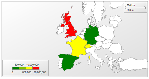
Let's suppose that you work for a small English car reseller called Brilliant British Cars ltd. It has been going since 2012 and now exports a small set of English luxury and sports cars to Europe and North America. A request has come in from the finance director to see the European countries where we make sales. Not only that, but ideally she would like each country to be displayed in a colour that indicates the extent of the sales for that country. Fortunately Reporting Services can deliver just what we are looking for. This is called a Heat Map, and it requires two things:
- Geographical data for the countries of Europe. In this case I suggest using the World Borders data from http://thematicmapping.org/downloads/world_borders.php.
- Business data that contains a way of joining the sales data to the geographical data. This can be a standardized country name or the two or three letter ISO Code, which is used in the World Borders shapefile.
In the case of Brilliant British Cars, our sales data table already contains the three letter ISO country code. We should have no difficulties in joining our geographical data to our sales data.
The map that we are trying to create will look something very close to that shown in the following image where the colour shows the value of the sales for each country.
Using Geographical Data in Reporting Services
You should probably be aware that there is a de facto file format for geographical data. It is the .Shp file - or Shapefile. If you can obtain data in this format then you have every chance of reading it successfully into Reporting Services and generating maps. Many of the publicly available geographical data sets are in shapefile format, as are much of commercial data sets.
Although Reporting Services can read shapefiles directly, there are several reasons why you may want to add an extra step and load the geographical data into an SQL Server table, which you will then use as the source for SSRS maps. These reasons include:
- You can read the geography table directly in SSMS and verify the data that it contains
- Reporting Services files based on shapefiles can be huge - as they contain the geographical data. SSRS files that link to geographical data in a database are much smaller
- You can remove any unwanted data from the data table in SQL Server, and consequently reduce the database size
- It is easy to reuse the same source data from a database for multiple reports.
- Data tables can be filtered just like any other data source to subset map output. This makes the final report smaller than a similar report based on a shape file containing all the map data.
- Using a data table allows you to add columns containing the data that you will use to join business data to the geographical data. For instance, your business data may not be using standard country or region names. If you load a shapefile into SQL Server, you can subsequently add or modify the data so that your two data sets can be joined.
Loading Geographical Data into SQL Server from Shapefiles
If you are going to go the extra mile to base your geographical data in SQL Server (and learning this is one of the aims of this article), then there is one freeware program which you will need to know about. It is the remarkable and superbly easy-to-use application called Shape2SQL that you can use to load shapefiles into SQL Server tables. I can only advise that you download this from http://www.sharpgis.net/page/shape2sql and that you add it to your armory. Let’s see how to use this application before we go any further,
As I mentioned at the start of this article, mapping data can become voluminous - and the more complex a map, the longer it can take to render. Therefore we will do two things here:
- Load the geographical data from the shapefile into SQL Server
- Subset the geographical data so that we only display a precise set of countries - Europe in this case
Loading a Shapefile into SQL Server
Although we could use the source shapefile directly, I will take this opportunity to load the geographical data into SQL Server so that we can output only the data required to draw a map of Europe. This extra effort will speed up the map rendering and so enhance the user experience.
- Download (or copy) the shapefile that you will be using for the spatial data into a source folder.
- Download Shape2SQL (from the URL given previously) - and run it.
- Click on the Configure button and connect to the database into which you want to load the spatial data from the shapefile. This is so intuitive that it needs no explanation.
- Select the source shapefile and unselect any fields which you are sure that you do not either want or need. The Shape2SQL dialog will look something like this:
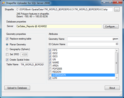
- Click Upload to Database.
- Close the Shape2SQL dialog and rename the table that has been created if you need to - I have called it Reference.WorldMap in the CarSales_Reports_SSC database.
That is all that you have to do. You now have spatial (geographical) data in your database rather than in a shapefile.
The Source Data
To create this map you will need two data sets: the geographical data and the business data. Let's look at each in turn.
The Geographical Data
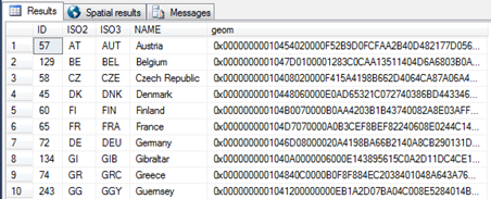
Now that you have loaded the geographical data into SQL Server you can define a query that only returns the rows and columns that we need. As we only want European data, a simple query that filters on the ISO codes for a set of European countries will do the trick. This query is shown below:
-- European Country Geocode
SELECT
 ID
,ISO2
,ISO3
,NAME
,geom
  FROM Reference.WorldMap
  WHERE ISO3 IN
  (
   'DNK'  ,'IRL'  ,'AUT'  ,'CZE'  ,'FIN'  ,'FRA'  ,'DEU'  ,'GRC'  ,'HUN'  ,'ISL'  ,'ITA'
  ,'LVA'   ,'LTU'  ,'SVK'  ,'LIE'  ,'MKD'  ,'BEL'  ,'GIB'  ,'IMN'  ,'LUX'  ,'MNE'  ,'NLD'
  ,'NOR'  ,'POL'  ,'PRT'  ,'ROU' ,'SVN'  ,'ESP'  ,'SWE'  ,'CHE'  ,'GBR'  ,'TUR'  ,'GGY'  ,'JEY'
  )
  ORDER BY NAME
Running this code returns the following table - of which I am only displaying a few records to save space:
Generating the Business Data
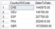
Now all we need is the metrics for sales by country to date. You can obtain this by running the following code snippet against the CarSalesData table in the sample database (this table holds all the data for this simple example).
-- Sales Data Selection Snippet
SELECT
 CountryISOCode
,SUM(SalePrice) AS SalesToDate
FROM         Data.CarSalesData
WHERE        CountryISOCode NOT IN ('USA')
GROUP BY     CountryISOCode
ORDER BY     CountryISOCode
Running this snippet gives the following output:
How the Code Works
The first piece of code selects the geographical data for the countries of Europe from the available world data in the table that we previously loaded into the database. As you can see, the actual geographical data is on a binary format. The second code snippet simply returns the sales figures for all sales to date.
Creating the Map
With all the building blocks in place we can now create the map.
1. Open SQL Server Data Tools, create a new project (or open an existing project) and then create a new SSRS report named EuropeSalesMap.rdl. Resize the report so that it is sufficiently large to hold a map.
2. Right-click on Data Sources in the Report Data window to add a data source named CarSales_Reports to this report (we won’t bother with shared data sources for one report). Ensure that it connects to the CarSales_Reports_SSC database. I suggest using Integrated Security for this simple sample map to avoid unnecessary complexity.
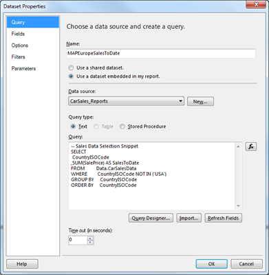
3. Right-click on Datasets in the Report Data window to create an embedded dataset named MAPEuropeSalesToDate. Have it use the CarSales_Reports data source, and the code snippet (Sales Data Selection Snippet) that you created earlier as its query. The Dataset Properties dialog should look like this:
4. Create a dataset named MAPEurope. Set it to use the CarSales_Reports data source, and the embedded European Country Geocode snippet that you created earlier.
5. Click on the Map item in the SSRS toolbox and drag the mouse in the report area to define the map. Ensure that it covers most of the available report. The New Map Layer dialog will appear showing the Choose a source of spatial data pane. This is shown in the following image:
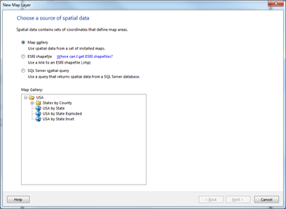
6. Note that if you only need North Americal mapping data, then this is available “out of the box” by clicking “Map gallery”. Select SQL Server spatial query and click Next. The Choose dataset with SQL Server spatial data pane will appear.
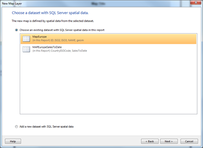
7. Click on the dataset which you created earlier named MAPEurope. This dialog will now look like this:
8. Note that you can add a geography dataset at this point if you had not already prepared the data. Click Next. The Map dialog will display the Choose spatial data and map view options pane.
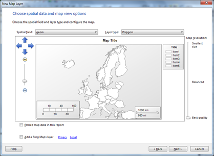
9. Adjust the size and placement of the map using the buttons on the left of the dialog if you wish. The arrow buttons move the map around inside the box, and the plus and minus buttons allow you to zoom in or out. The dialog will look like the following figure. Note that it displays only the countries from the query which we defined previously.
10. Click Next. The Choose map visualization pane will be displayed. It looks like this:
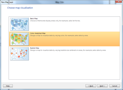
11. Select Color Analytical Map and click Next.
12. In the Choose the analytical dataset dialog, select the dataset MapEuropeSalesToDate. It will look like this:
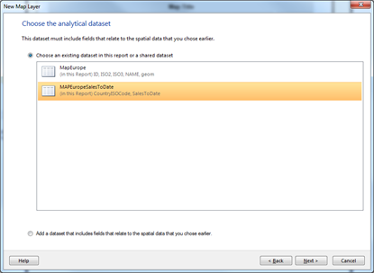
13. Click Next.
14. Check the box next to the ISO3 field in the upper section of the dialog, and then select CountryISOCode field from the popup menu. The Wizard should look like this next figure that displays the way that the geographical and sales data are joined:
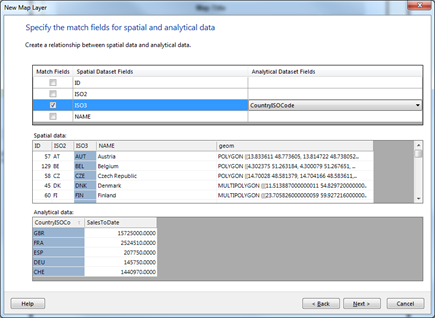
15. Click Next.
16. Select [SUM(SalesToDate)] as the field to visualize, and try out any of the themes and color rules which you like! The Final wizard pane could look something like this:
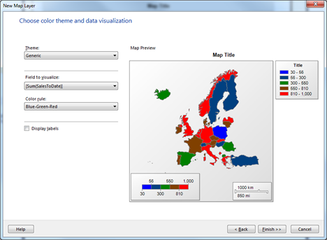
17. Note that you can add the data labels to the map if you want. Click Finish.
18. Right-click on the legend (at the top right) and click Delete Legend.
19. Drag the Distance scale from the bottom right to the top right.
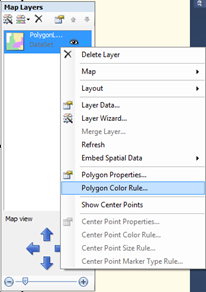
20. Click twice on the map. The MapLayer pane will appear to the right of the map
21. Click on the context menu triangle (at the top right beside the "eye" icon). Select Polygon color rule. The Map Color Rule Properties dialog will appear.
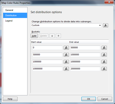
22. Select Distribution on the left.
23. Choose Custom - and add the following data ranges:
a. 0 to 500,000
b. 500,000 to 1,000,000
c. 1,000,000 to 10,000,000
d. 10,000,000 to 20,000,000
24. The dialog will look like the one that follows.
25. Click OK. You may want to resize and recenter the map for the best effect.
That is it. If you preview the map in Reporting Services (or deploy it and view it) you should now have a map that looks like the one at the start of this article. Just remember that you will not see your own data applied to the map until you preview it.
How it Works
The key to the success of this map (as is the case for virtually any map) is to have the correct geographical data that can be joined accurately to the business data. In this example we have an ISO country name, which is an ideal field when dealing with data at the country level.
Once the tables have been joined (in step 14) the rest is essentially a question of aesthetics. This covers sizing and placing the map inside the map viewport and configuring the color rule - which is really a legend by another name.
Note: You can resize and reposition maps in two main ways. You can use the direction arrow and slider that are in the Map Layers pane, which appear when you select the map. Alternatively you can select the map layer and use the mouse to move the map to the position that you want or the scroll wheel to adjust the size of the map.
Conclusion
This article provided a short introduction to the use of maps and spatial data for Business Intelligence. The subject is vast - and the Reporting Services mapping options so extensive - that we were only able to see a small part of all the available options. I hope that this has whetted your appetite for using maps in your own Business Intelligence output with Reporting Services.
If you need further examples of using maps in SSRS – and how to use Reporting Services for corporate Business Intelligence, then there is plenty more in my book.
Adam is the author of Business Intelligence with SQL Server Reporting Services – Apress, February 2015, which you can purchase at Amazon.