

Principal Components Analysis (PCA) is a method that should definitely be in your toolbox. It's a tool that's been used in nearly all of my posts, to visualise data, but I have always glossed over it. So in this post, we are going to focus specifically on PCA. We will cover what it is and how you can use it to visualise your data and understand potentially hidden relationships.
What is PCA?
Principal Components Analysis (PCA) is arguably one of the most widely used statistical methods. It has applications in nearly all areas of statistics and machine learning including clustering, dimensionality reduction, face recognition, signal processing, image compression, visualisation and prediction. Without complicating things too much, PCA is able to recognise underlying patterns is high dimensional data and the outputs of PCA can be used to highlight both the similarities and differences within a dataset. Where PCA really shines, however, is in making sense of high-dimensional data. It can be hard to describe patterns in data with high dimensions, the results of PCA quite often lead to simple interpretations. Here's a couple of quick examples.
PCA & Genetics
The human genome is an incredibly complex system. Our DNA has approximately 3 billion base pairs, which are inherited from generation to generation but which are also subject to random (and not so random) mutation. As humans, we share 99.9% of our DNA - that's less than 0.1% difference between all of us and only 1.5% difference between our DNA and the DNA of chimpanzees. Despite these similarities, the differences in our DNA can be used to uniquely identify every single one of us. There is an incredible amount of variability (both similarities and dissimilarities) in our DNA - what is perhaps surprising initially, is that this variability can be strongly linked to geography and it is these geographical patterns which are picked up by prinicpal components analysis. The picture below is now a very famous example, showing how PCA can detect very real and meaningful patterns in incredibly complex data, such as DNA:

This picture first popped up in a publication by John Novembre (Genes mirror geography within Europe, Nature, 2008) and is a fantastic example of how PCA can capture meaningful patterns in over half a million base pairs!
PCA and Image Compression
This example has to be one of my favourites. Beginning with the original image (below, left), it shows how different principal components are able to capture various qualities of an image (below, right-hand tiles):
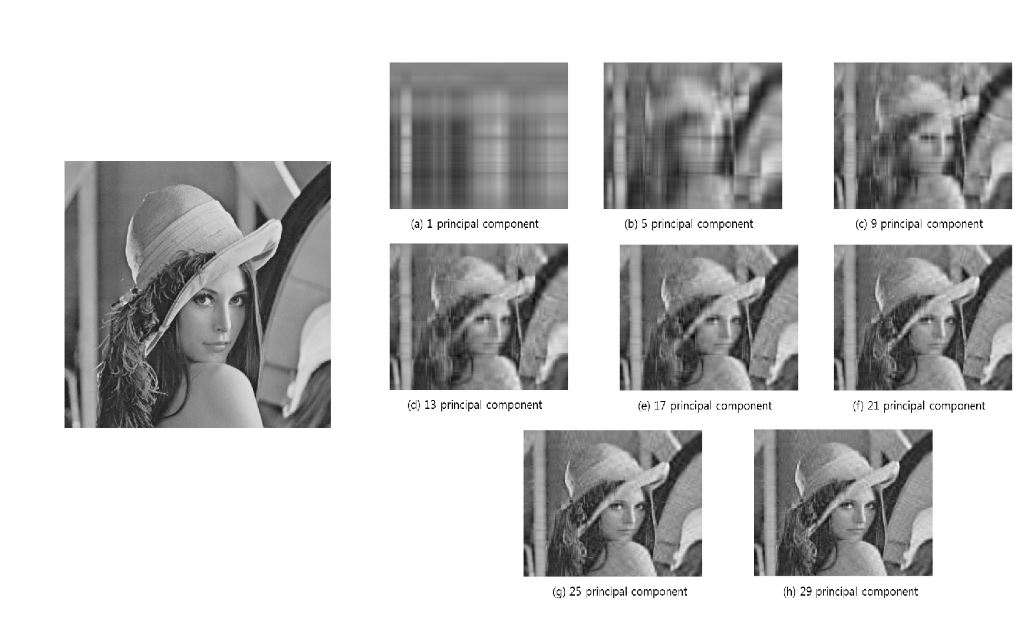
This is such a fantastic example of PCA in action. We can see that the first principal component captures very basic patterns within the image, essentially light and dark. As you dive deeper into the principal components, you are able to distinguish finer and finer details. If you continue to go far enough, you will eventually find a representation that is almost identical to the original as in the final tile for the 29th principal component above. And this is exactly how PCA works, it extracts the largest or strongest patterns first (light and dark above) and then gradually includes finer details.
How PCA Works
Broadly, there are probably two ways to use PCA: the first is simply for dimensionality reduction, to take data in high dimensions and create a reduced-representation as is the case with image compression. The second, is to extract meaningful factors from high dimensional data in a way that helps us interpret the major trends in our data, as is the case with the genetics example above. I want to focus on the second case, being able to extract & explain structure in your data. To understand the outputs of PCA it's important to understand how it works. The key to PCA is that it exploits the variance of features (columns in your data) as well as the covariance between features. Let's quickly explain these two ideas.
Variance & Covariance
Statistics largely relies on two concepts: centrality and spread. Measures like the mean, median and mode are measures of centrality. While measures such as the standard deviation and variance are measures of spread. Pictures are always easiest, so here is a quick example:
abalone <- read.table("http://archive.ics.uci.edu/ml/machine-learning-databases/abalone/abalone.data", sep = ",")
colnames(abalone) <- c("Sex", "Length", "Diameter", "Height", "Whole Weight", "Shucked Weight", "Viscera Weight", "Shell Weight", "Rings")
library(data.table)
library(ggplot2)
features <- melt(abalone[, c("Length", "Whole Weight", "Rings")])
ggplot(features, aes(x = variable, y = value)) +
  geom_boxplot(colour = "darkgrey") +
  theme_minimal() +
  xlab("") +
  ylab("") +
  geom_text(data = data.frame(variable = c("Length", "Whole Weight", "Rings"),
                              value = c(20, 20, 20),
                              text = apply(abalone[, c("Length", "Whole Weight", "Rings")], 2, var)),
            aes(label = round(text, 2)), colour = "darkblue", size = 5)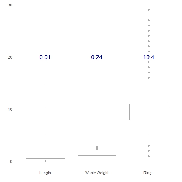
Here we have plotted three of the features from the Abalone dataset from the UCI Machine Learning Repository, along with their respective variances (in blue). We can see that the Length shows the least variance, followed by the Whole Weight and the number of Rings shows the greatest variance. Variance can be a really useful tool to compare the differences between groups, for example:
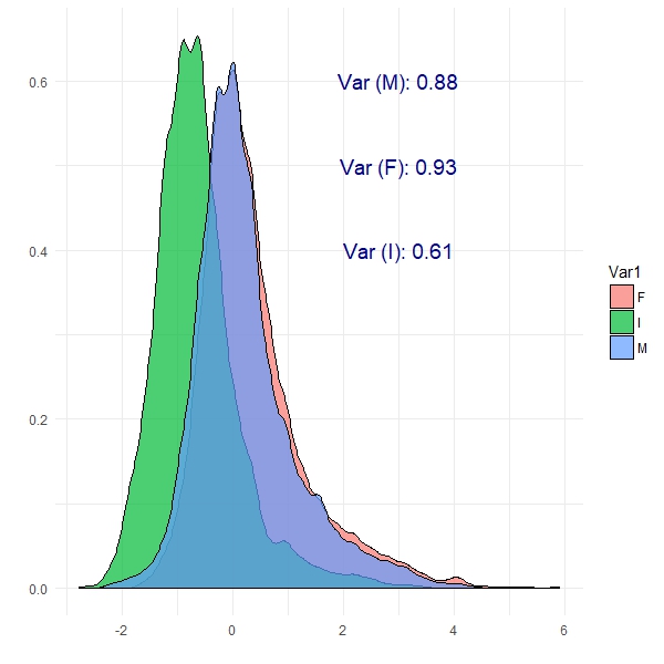
We can see from this plot that Female abalone show the highest variance and infant abalone exhibit the lowest variance. This is the notion of covariance: a measure of variability in two or more dimensions with respect to each other. Specifically here, we are looking at the covariance between abalone sex and the number of rings. These are patterns which PCA should be able to exploit.
There's an important note here that we haven't mentioned. In most machine learning methods, you need to scale your features so that they are all on the same scale (say between -1 and 1, or between 0 and 1). This is an important step which prevents features with large values from having undue influence. Doing this on the abalone dataset will change the boxplots as shown below, but it doesn't change the covariance relationships:
features <- data.table(melt(scale(abalone[, c("Length", "Whole Weight", "Rings")])))
features[, Sex := abalone$Sex]
ggplot(features, aes(x = Var2, y = value)) +
  geom_boxplot(colour = "darkgrey") +
  theme_minimal() +
  xlab("") +
  ylab("")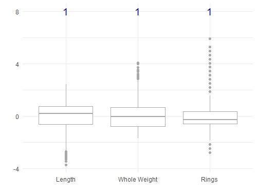
ggplot(features[Var2 == "Rings"], aes(x = value)) +
  geom_density(aes(fill = Sex), alpha = 0.5) +
  theme_minimal() +
  xlab("") +
  ylab("")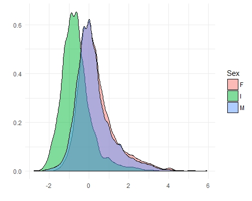
Before we move on, there are a couple of important things to consider if you are thinking about using principal components:
- it extracts linear trends (e.g. covariance) in your dataset. It will not capture nonlinear patterns.
- it relies on strong covariance / colinearity in your dataset. If your features (columns) are not correlated in some way, then PCA won't do much.
PCA in Action
Now that we have a concept of variance and covariance, let's see how PCA is able to exploit these in the abalone dataset. First, we will calculate the principal components and have a look at the results. The prcomp() function performs the principal components analysis. The summary() function tells us a little about the results.
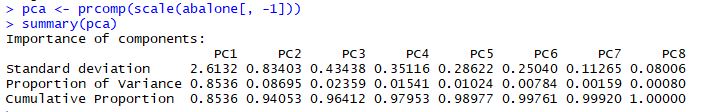
The Cumulative Proportion row is probably the most interesting here: it tells us that the first principal component explains 85% of the variability in the abalone dataset. PC1 and PC2 combine to explain 94% of the variability, which is excellent. These two components are capturing the major trends in the abalone dataset.
The rotation matrix gives us insight into what features are the most important on each new principal component:
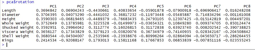
It is really common to find that PC1 encodes "size" and PC2 often encodes "shape" and this seems to be the case here. PC1 certainly encodes size. PC2 and PC3 both seem to encode different types of shapes. In particular, PC2 captures abalone with a high number of rings and PC3 captures a contrast between physical size vs. weight.
The transformed dataset is stored in the pca results as shown below:
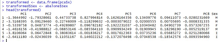
It's this transformed dataset that we are really interested in. For example, we might look at the difference between abalone sex across each of these new features:
par(mfrow = c(3, 3))
for (i in 1:8) {
  boxplot(transformed[, i] ~ transformed[, "Sex"], main = colnames(transformed))
}
par(mfrow = c(1, 1))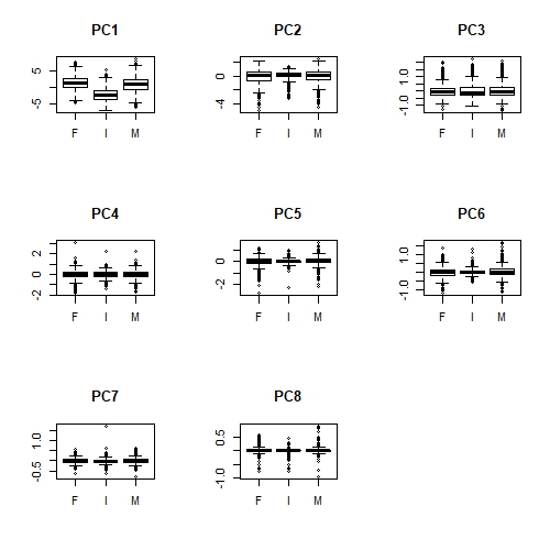
Apologies that these plots are difficult to see here. But we can definitely see that there is a relationship between Sex and PC1 (overall size); infant abalone are generally smaller than adult abalone. Less obviously, infant abalone show less variability, compared to adult abalone, in PC2, PC5 and perhaps PC6. There is some notion of "shape" in all of these principal components, suggesting that infant abalone are more uniform in size and shape than adult abalone.
Prediction using PCA
As we've mentioned, there are two main reasons for using PCA: to gain some insight into hidden patterns in high dimensional data and dimensionality reduction. We've already shown that the first two principal components explain 94% of the variability, which is a good reduction from 8 features to 2. We should be able to take this further and explore how well PCA has captured these patterns. If PCA has captured the patterns well, then we should be able to predict the sex (at least Infant vs. Adult) in the transformed data. Let's try this.
First of all, we will use a generalised linear model to assess the quality of the PCA transformations:
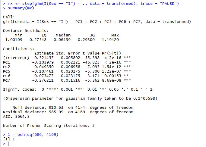
We've used stepwise regression (the step() function) to extract the most parsimonious model and the chisq test to make sure that the fit is adequate (1 - pchisq > 0.95). The result is that 5 principal components do a good job of predicting Infant abalone from Adult abalone. As we might have expected PC1, PC2 and PC5 are strong predictors.
It's always a good idea to confirm your results either by having a separate training and test set or, by trying to emulate your results with another method. Let's see how well a random forest does at predicting Infant abalone:
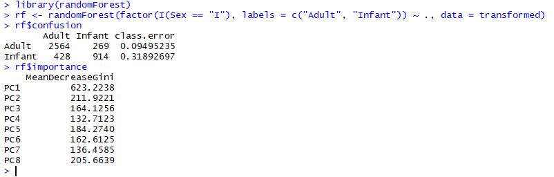
The two results are complementary. We can see from the confusion matrix above, that the random forest has accurately predicted 90% of Adult abalone and 68% of Infant abalone. PC1 and PC2 are the two most important features which support our earlier conclusions that Infant abalone may be distinguished by size (generally smaller) and shape (generally more compact and uniform).
Wrap up
In past posts I have so often glossed over the use of principal components analysis - but it is such an incredibly useful tool. PCA is used for dimensionality reduction across all aspects of machine learning. But I really like the insights that the PCA rotation matrix and the transformed dataset can yield. I have to add one cautionary note here - you have to be somewhat careful when trying to interpret the results of PCA. PCA will always extract the strongest trends first, which might not be the trends that you are interested in. The image compression example is a great example for this, where the first principal component describes light and dark areas of the picture, not shapes, lines or objects, which is what you are probably interested in. It's just worth keeping in mind that like all statistics, you have to be a little sceptical and make sure your results are truly what you think they are.