Visualizing data is important part to understanding the dataset that we are trying to analyses and a different, pictoral view of the data. Instead of a tabular/matrix view or numerical views, a presentation in the form of pictures, diagrams, and graphs can help broaden data insight. Certainly this brings the understanding of data to a new level.
So far, in the previous article we have discussed how to analyze sales data. And from time to time, visualization is much needed. In this article, we will discuss two ways visualizing the data. Namely:
- With Power BI
- With reporting services (SSRS)
- With R Tools for Visual Studio / R Studio
Power BI
For this matter, we will use again the WideWorldImportersDW demo database and we will use the visualization for clustering. Let us take the following query:
DECLARE @SQLStat NVARCHAR(4000)
SET @SQLStat = 'SELECT
       SUM(fs.[Profit]) AS Profit
       ,c.[Sales Territory] AS SalesTerritory
       ,CASE
                     WHEN c.[Sales Territory] = ''Rocky Mountain'' THEN 1
                     WHEN c.[Sales Territory] = ''Mideast'' THEN 2
                     WHEN c.[Sales Territory] = ''New England'' THEN 3
                     WHEN c.[Sales Territory] = ''Plains'' THEN 4
                     WHEN c.[Sales Territory] = ''Southeast'' THEN 5
                     WHEN c.[Sales Territory] = ''Great Lakes'' THEN 6
                     WHEN c.[Sales Territory] = ''Southwest'' THEN 7
                     WHEN c.[Sales Territory] = ''Far West'' THEN 8
        END AS SalesTerritoryID
       ,fs.[Customer Key] AS CustomerKey
       ,SUM(fs.[Quantity]) AS Quantity
FROM [Fact].[Sale] AS  fs
       JOIN dimension.city AS c
       ON c.[City Key] = fs.[City Key]
       WHERE
              fs.[customer key] <> 0
       AND c.[Sales Territory] NOT IN (''External'')
GROUP BY
       c.[Sales Territory]
       ,fs.[Customer Key]
       ,CASE
                     WHEN c.[Sales Territory] = ''Rocky Mountain'' THEN 1
                     WHEN c.[Sales Territory] = ''Mideast'' THEN 2
                     WHEN c.[Sales Territory] = ''New England'' THEN 3
                     WHEN c.[Sales Territory] = ''Plains'' THEN 4
                     WHEN c.[Sales Territory] = ''Southeast'' THEN 5
                     WHEN c.[Sales Territory] = ''Great Lakes'' THEN 6
                     WHEN c.[Sales Territory] = ''Southwest'' THEN 7
                     WHEN c.[Sales Territory] = ''Far West'' THEN 8
        END ;'
DECLARE @RStat NVARCHAR(4000)
SET @RStat = 'library(ggplot2)
              image_file <- tempfile()
                       jpeg(filename = image_file, width = 400, height = 400)
                       clusters <- hclust(dist(Sales[,c(1,3,5)]), method = ''average'')
                       clusterCut <- cutree(clusters, 3)
                       ggplot(Sales, aes(Total, Quantity, color = Sales$SalesTerritory)) +
                       geom_point(alpha = 0.4, size = 2.5) + geom_point(col = clusterCut) +
                       scale_color_manual(values = c(''black'', ''red'', ''green'',''yellow'',''blue'',''lightblue'',''magenta'',''brown''))
                       dev.off()
                    OutputDataSet <- data.frame(data=readBin(file(image_file, "rb"), what=raw(), n=1e6))'
EXECUTE sp_execute_external_script
         @language = N'R'
       ,@script = @RStat
       ,@input_data_1 = @SQLStat
       ,@input_data_1_name = N'Sales'
WITH RESULT SETS ((plot varbinary(max)))
This will be directly imported into Power BI in a slightly different way. On one hand the data will be imported using only a T-SQL query.
SELECT
       SUM(fs.[Profit]) AS Profit
       ,c.[Sales Territory] AS SalesTerritory
       ,CASE
                     WHEN c.[Sales Territory] = 'Rocky Mountain' THEN 1
                     WHEN c.[Sales Territory] = 'Mideast' THEN 2
                     WHEN c.[Sales Territory] = 'New England' THEN 3
                     WHEN c.[Sales Territory] = 'Plains' THEN 4
                     WHEN c.[Sales Territory] = 'Southeast' THEN 5
                     WHEN c.[Sales Territory] = 'Great Lakes' THEN 6
                     WHEN c.[Sales Territory] = 'Southwest' THEN 7
                     WHEN c.[Sales Territory] = 'Far West' THEN 8
        END AS SalesTerritoryID
       ,fs.[Customer Key] AS CustomerKey
       ,SUM(fs.[Quantity]) AS Quantity
FROM [Fact].[Sale] AS  fs
       JOIN dimension.city AS c
       ON c.[City Key] = fs.[City Key]
       WHERE
              fs.[customer key] <> 0
       AND c.[Sales Territory] NOT IN ('External')
GROUP BY
       c.[Sales Territory]
       ,fs.[Customer Key]
       ,CASE
                     WHEN c.[Sales Territory] = 'Rocky Mountain' THEN 1
                     WHEN c.[Sales Territory] = 'Mideast' THEN 2
                     WHEN c.[Sales Territory] = 'New England' THEN 3
                     WHEN c.[Sales Territory] = 'Plains' THEN 4
                     WHEN c.[Sales Territory] = 'Southeast' THEN 5
                     WHEN c.[Sales Territory] = 'Great Lakes' THEN 6
                     WHEN c.[Sales Territory] = 'Southwest' THEN 7
                     WHEN c.[Sales Territory] = 'Far West' THEN 8
        END
And later separately the R code:
clusters <- hclust(dist(Sales[,c(1,3,5)]), method = ''average'')
                       clusterCut <- cutree(clusters, 3)
                       ggplot(Sales, aes(Total, Quantity, color = Sales$SalesTerritory)) +
                       geom_point(alpha = 0.4, size = 2.5) + geom_point(col = clusterCut) +
                       scale_color_manual(values = c(''black'', ''red'', ''green'',''yellow'',''blue'',''lightblue'',''magenta'',''brown''))
After opening Power BI, we select Get data -> SQL Server and insert all needed information, as shown in the print screen below:
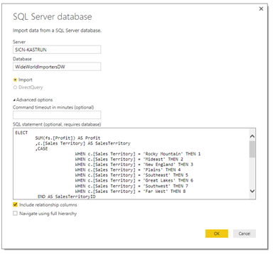
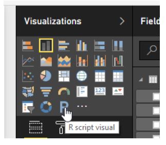
After clicking Ok, data will be imported into Power BI. Next step is to select “New visual” and on the visualizations list select the R script visual.
You might get a dialog window asking for enabling R visualization. After that, select the variables needed for the graph. Based on the R code, we are using columns Profit, Quantity and SalesTerritoryID. All three columns will appear in a predefined dataset as a data.frame that the R visualization is creating by default:
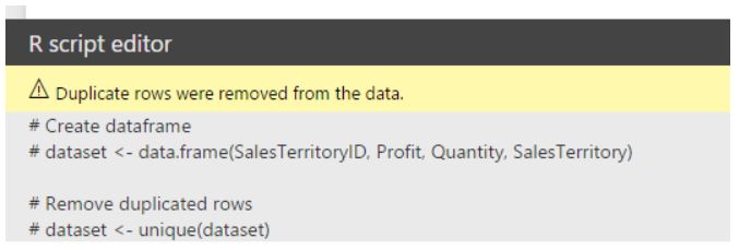
In the R-script code we can paste the R code from the example above. Starting with R code, we need some minor modifications – change the name of dataset and rename the columns. So from this:
library(ggplot2)
clusters <- hclust(dist(Sales[,c(1,3,5)]), method = ''average'')
clusterCut <- cutree(clusters, 3)
ggplot(Sales, aes(Total, Quantity, color = Sales$SalesTerritory)) +
geom_point(alpha = 0.4, size = 2.5) + geom_point(col = clusterCut) +
scale_color_manual(values = c(''black'', ''red'', ''green'',''yellow'',''blue'',''lightblue'',''magenta'',''brown''))
into this:
library(ggplot2)
clusters <- hclust(dist(dataset[,c(1,2,3)]), method = 'average')
clusterCut <- cutree(clusters, 3)
ggplot(dataset, aes(Profit, Quantity, color = dataset$SalesTerritory)) +
geom_point(alpha = 0.4, size = 2.5) + geom_point(col = clusterCut) +
scale_color_manual(values = c('black', 'red', 'green','yellow','blue','lightblue','magenta','brown'))
Also, make sure you check the quotes or double quotes around the declared values in R code. After that, you will get a visualization in Power BI:
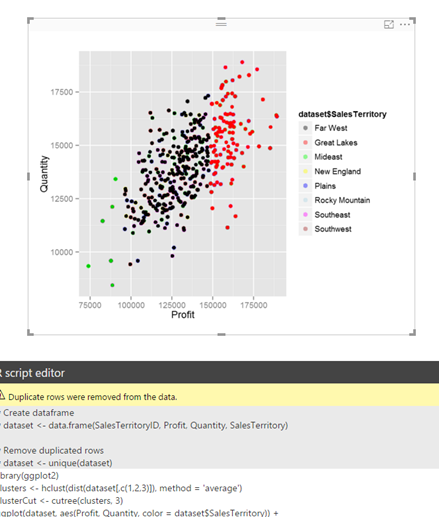
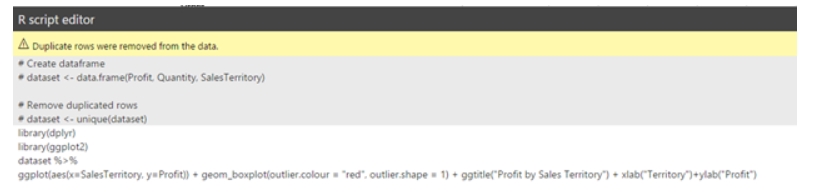
In addition, any kind of other R graph / visualization can be added. Therefore I have decided to add a boxplot on Profit per Sales territory, using R visualizer. So adding additional information to the cluster analysis with boxplot will give end-user additional insight of how profit is spread among sales territories.
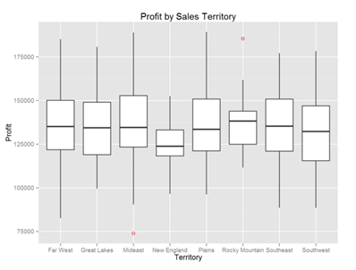
The graph is obtained using the following R code:
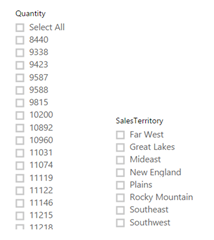
By doing so, what we need in the last step is to add some data slicers, which will dynamically refresh the data on both R visualizations. Of course, any other pre-prepared visualization available in Power BI can also use the advantage of data slicers. I added two slicers: Quantity and Sales Territory. I can select (or multi-select) the values and based on my selections all graphs that are based on dataset using these slicers will be automatically updated.
The end product can resemble a dashboard or a report or a playground for data scientist, data wranglers or anybody wanting to get insight on the data set:

I added the R Language Logo just to show that your company Logo can be added as well. The complete Power BI workbook is also available for download.
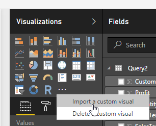
If you want to do more advanced analytics on the imported dataset, where are always additional visuals available at the url address: https://app.powerbi.com/visuals/ . All the additional visuals can be downloaded and added into your Power BI book. There are also R-powered visuals to be downloaded and ready to be used. For this article, I have decided to download additional visual Chord:
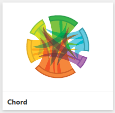
And use it in existing book, by importing it:
And populate it with data with Profit and Sales Territory to see the distribution of profit by territory.
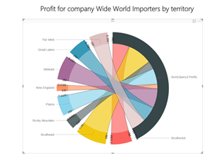
Again, the picture tells more than numbers, but make sure not to overdo on the visuals or create non-sense graphs which could cause people to be stuck understanding the graph, instead of helping them understand.
I have added and made comparison for association rules; basically just comparison between the visualizations. I am just adding the final comparison from Power BI book, the rest you can follow in the Power BI book. The R code is basically the same as the R code in previous article, where I initially discussed Association rules. Here is the final outline of the comparison of two visuals: R code visual and Association rules Visual.
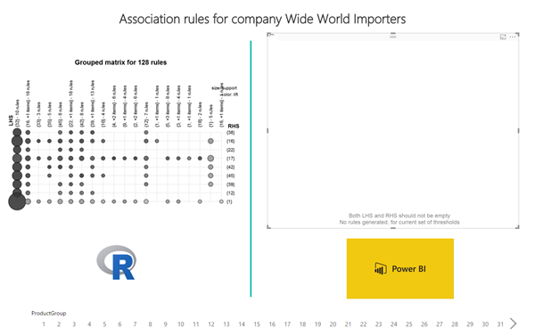
Essentially, both are based on same R packages (arules, aRulesVisual), just that graph on left hand side to be configured through code and the outlook can be changed down to last detail, whereas, graph on right hand side is embedded Visual, also based on R, with all the parameters build in to be set up in Power BI.
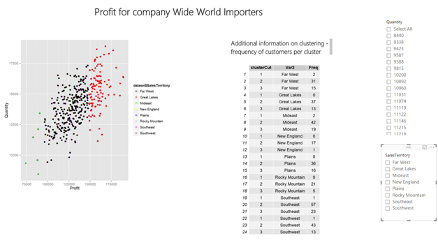
Another very important thing and very useful way to import in Power BI are also R data.frames, that are table presentation of the data. From time to time, when you are doing any advanced analytics or visualizations, you would also like to add some additional information that cannot be read from the graph. For example, let’s take the clustering graph; cluster groups are very nice and visible, but a person who is more into statistics would like to get some statistics to this clustering as well. In this case, we will use R visual again, but maneuver and wrangle the outputted data into the dataframe and have it represent as a table.
For cluster analysis, I have added the number of occurrences for each customer in sales territory in which cluster (1, 2 or 3) is appearing. Table is just a different presentation of graph.
The table has been generated with the following R code in Power BI:
library(gridExtra)
clusters <- hclust(dist(dataset[,c(1,2,3)]), method = 'average')
clusterCut <- cutree(clusters, 3)
df <- data.frame(table(clusterCut, dataset$SalesTerritory))
grid.table(df)
Again, this table will automatically update, based on selected criteria in the slicers, which comes very handy when analyzing data.
As you can see, I have used the package gridExtra, very powerful package to serve the purpose of plotting the tables with data extracted from R datasets.
Reporting Services (SSRS)
Reporting Services has been around very long, so I will not go into the reporting details. But all the R visualizations available in Power BI can also be implemented and used in SSRS. Reporting services brings also an additional practical and useful feature: selections. Power BI gives you the slicers that can, based on selection, dynamically update the graphs, data and visualizations in R script, which can also be done with selections in SSRS. But what SSRS enables is, to add any additional parameter into the code, making R Language through SSRS even more flexible to the end user. I will explain this on an example with the clustering analysis from already mentioned case (and original from previous article).
When creating new report and defining dataset, copy/pasting the R code into the query text:
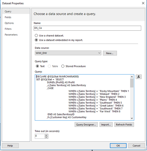
will return – every time report will be executed – an error and the textboxes to populate the values of all the parameters needed in order to execute externa procedure sp_execute_external_script. So, the better (if not the best) way to avoid this, is simply to store the whole code as a stored procedure.
CREATE PROCEDURE ClusterAnalysis_Plot
AS
DECLARE @SQLStat NVARCHAR(4000)
SET @SQLStat = 'SELECT
       SUM(fs.[Profit]) AS Profit
       ,c.[Sales Territory] AS SalesTerritory
       ,CASE
                     WHEN c.[Sales Territory] = ''Rocky Mountain'' THEN 1
                     WHEN c.[Sales Territory] = ''Mideast'' THEN 2
                     WHEN c.[Sales Territory] = ''New England'' THEN 3
                     WHEN c.[Sales Territory] = ''Plains'' THEN 4
                     WHEN c.[Sales Territory] = ''Southeast'' THEN 5
                     WHEN c.[Sales Territory] = ''Great Lakes'' THEN 6
                     WHEN c.[Sales Territory] = ''Southwest'' THEN 7
                     WHEN c.[Sales Territory] = ''Far West'' THEN 8
        END AS SalesTerritoryID
       ,fs.[Customer Key] AS CustomerKey
       ,SUM(fs.[Quantity]) AS Quantity
FROM [Fact].[Sale] AS  fs
       JOIN dimension.city AS c
       ON c.[City Key] = fs.[City Key]
       WHERE
              fs.[customer key] <> 0
       AND c.[Sales Territory] NOT IN (''External'')
GROUP BY
       c.[Sales Territory]
       ,fs.[Customer Key]
       ,CASE
                     WHEN c.[Sales Territory] = ''Rocky Mountain'' THEN 1
                     WHEN c.[Sales Territory] = ''Mideast'' THEN 2
                     WHEN c.[Sales Territory] = ''New England'' THEN 3
                     WHEN c.[Sales Territory] = ''Plains'' THEN 4
                     WHEN c.[Sales Territory] = ''Southeast'' THEN 5
                     WHEN c.[Sales Territory] = ''Great Lakes'' THEN 6
                     WHEN c.[Sales Territory] = ''Southwest'' THEN 7
                     WHEN c.[Sales Territory] = ''Far West'' THEN 8
        END ;'
DECLARE @RStat NVARCHAR(4000)
SET @RStat = 'library(ggplot2)
              image_file <- tempfile()
                       jpeg(filename = image_file, width = 400, height = 400)
                       clusters <- hclust(dist(Sales[,c(1,3,5)]), method = ''average'')
                       clusterCut <- cutree(clusters, 3)
                       ggplot(Sales, aes(Profit, Quantity, color = Sales$SalesTerritory)) +
                       geom_point(alpha = 0.4, size = 2.5) + geom_point(col = clusterCut) +
                       scale_color_manual(values = c(''black'', ''red'', ''green'',''yellow'',''blue'',''lightblue'',''magenta'',''brown''))
                       dev.off()
                    OutputDataSet <- data.frame(data=readBin(file(image_file, "rb"), what=raw(), n=1e6))'
EXECUTE sp_execute_external_script
         @language = N'R'
       ,@script = @RStat
       ,@input_data_1 = @SQLStat
       ,@input_data_1_name = N'Sales'
WITH RESULT SETS ((plot varbinary(max)));
And then you simply add the procedure.
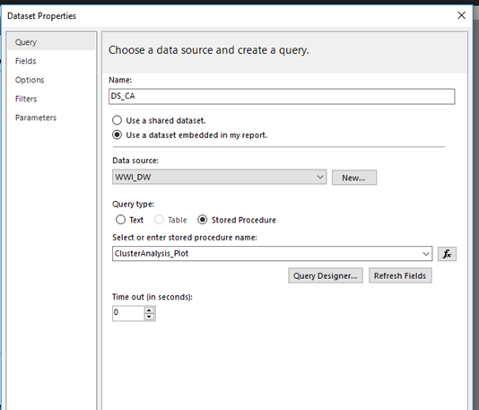
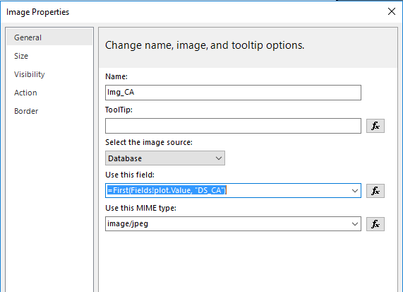
On report canvas, you add Image and do the following properties:
Now Save, (Deploy) and Execute the report in Reporting service. You should see a familiar graph in SSRS.
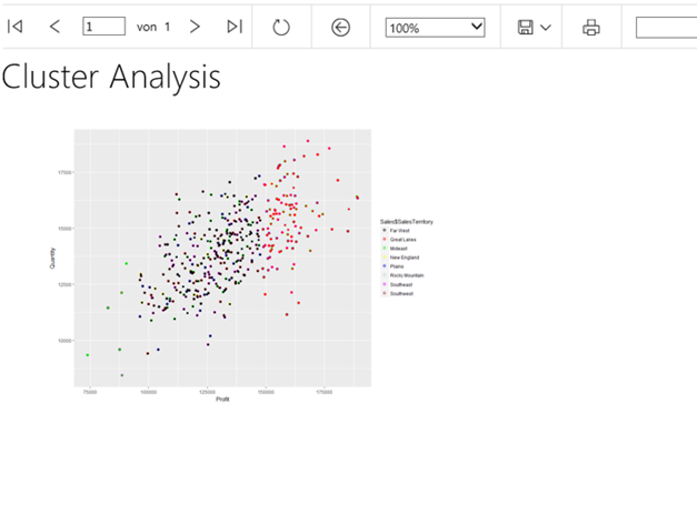
Using stored procedures in SSRS is a very efficient way to visualize the data. Using stored procedures you can also implement the parameters that directly inject some values or chunk of codes to make your visualizations more dynamic. In addition to that, generating tables is much easier done in comparison to Power BI, but if you want to extract data from R results, you should always return the R results to a data frame. Data frame is a data type, that R and SQL Server can operate with each other.
R Tools for Visual Studio / R Studio
One way to visualize the data is to get data into your RTVS or R Studio where you can visualize data. Usually this can be done by storing your data from SQL Server into any of these two programs. One way to do it is to use ODBC driver. Very useful and powerful is available in package RODBC. The very straightforward syntax is:
library(RODBC)
myconn <-odbcDriverConnect("driver={SQL Server};Server=Srv_Tomaz;database=WideWorldImportersDW;trusted_connection=true")
mydata <- sqlQuery(myconn, "SELECT *  FROM [Fact].[Order]")
close(myconn)
After running this R Code, you would get the whole fact table into your R Environment. Now working on any kind of visualization is relatively easy.
Please note, if you will be using larger dataset and importing data into R environment, with RODBC package, you may experience memory limitations. In such cases, I would strongly recommend using RevoScaleR package, that solves memory limitation issues!
Conclusion
Data visualization is an important part of data analysis, data presentation and data comprehension. All three tools are a way how to help a data wrangled, data scientist or data analyst to handle and to deal with plotting data. There are many other ways, and third party tools, that enables you to deepen the data insight, just follow a simple rule, when using visuals: data visual must explain and broaden the data understanding. If this simple rule is not satisfied, most likely you are doing something wrong. I did not go into the theory of visualization, since this was not my point, but I strongly recommend you to do it. Very good place to start is Data Visualization Catalogue.
Author: Tomaz Kastrun (tomaz.kastrun@gmail.com)
Twitter: @tomaz_tsql