
In this Level of the series, we continue our examination of DAX function / iterator pairs, with the Product() and ProductX() functions. Product() and ProductX() support, respectively, the need to return the product of numbers in a column, and the requirement to return the product of an expression evaluated for each row in a table.
As a part of our introduction, we will discuss ways in which we can employ Product() and ProductX(); we’ll look at each function in standalone scenarios, as well as in situations where we combine it with other functions, to meet the business requirements of clients, employers or peers in our own environments. During our exploration of the Product() and ProductX() functions, we will:
- Examine the syntax involved in exploiting each;
- Undertake illustrative examples of the use of each function in practice exercises;
- Briefly discuss the results datasets we obtain in each of the practice examples.
We will examine the output we obtain using these two functions within Power BI Desktop (more on this in the next section) in the practice session that follows our overview and explanation of the purpose and operation of each function. We will create columns and measures (calculations) that put Product() and ProductX() to work in Power BI Desktop visualizations we create (Report view), to further examine the behavior that we will have observed in columns created in the Data view. Along the way, we will compare and contrast differences in use and behavior of the functions in columns and measures in general, suggesting criteria to consider in choosing which of these calculation types to employ to meet the business requirements we encounter.
A Brief Introduction to Power BI and Power BI Desktop
With this Level Stairway to PowerPivot and DAX becomes Stairway to DAX and Power BI. The intent is to recognize the evolving nature of PowerPivot and the other “power” components of Excel, and reflect their absorption into Power BI. We will be working largely within Power BI Desktop, an environment very similar to that of PowerPivot for Excel, within which we launched the series. There are many advantages to this approach, including our working with a tool that will be pervasive and easy to use for all readers, including those that do not have recent versions of Excel.
As most of us have become increasingly aware, Microsoft’s rapidly evolving Power BI comprises a suite of self-serve business intelligence tools whose purpose is to allow data workers to bypass corporate IT and generate their own analysis and reporting, more-or-less directly from organizational and external data sources. The dashboards, and the visualizations that make them up, can support organization business decisions of a diverse range.
The explosive popularity of Microsoft Office Excel, which has been used increasingly for business intelligence over its life, and is on desktops in virtually every organization, has made it the ideal platform for the launch of Power BI. Several elements of Power BI initially debuted as individual add-ons in Excel, and now have emerged as primary players in the integrated set of capabilities.
Two primary components currently comprise what is known as “Power BI:” Power BI Desktop and the Power BI service. While we can accomplish much of the design and construction of a Power BI solution in either of the two components, it’s useful, at least from the perspective of this series, to see Power BI Desktop as the environment within which we can build fully operational self-service BI solutions. Here we can create connections to data sources, upon which we can design and create models to channel our data and contain our business logic. We can then create visualizations from our model to support reporting and analysis. Finally, we can deploy our Power BI Desktop model (a .pbix file) to the Power BI service in the cloud, where we can share our reports with other consumers.
The majority of the activities that we undertake within Stairway to DAX and Power BI will be with Power BI Desktop, where any reader with a supported PC can work within a free, self-contained application that will allow hands-on replication of the steps we take in each Level, as well as to easily extend those steps to practice further with the material presented. We will work largely with downloadable samples that already contain data, in most cases, so as to focus each Level more upon the subject matter involved (typically the practical use of one or more DAX functions) than the import of data, although some instances of data import will arise in scenarios where we wish to delve into topics where multiple data sources are involved, ETL steps are required, and the like.
Preparation for the Levels of Stairway to DAX and Power BI
Install Power BI Desktop
If you are totally new to Power BI Desktop, you’ll find that the online documentation is comprehensive, and updated regularly, consistent with the generally robust evolution of Power BI. To download and install Power BI Desktop, go to Get Power BI Desktop, where you can review minimum requirements, as well as get guidance on download and installation.
NOTE: Keep in mind that regular updates are occurring within the design of Power BI Desktop, as of this writing. Pay attention to update announcements as they are released, and be sure to keep your copy updated to obtain the full benefit of this rapidly evolving technology.
A great place to efficiently familiarize yourself with Power BI Desktop basics is Getting Started with Power BI Desktop.
Install DAX Studio
As many of us already know, DAX Studio is a free tool for learning DAX. DAX Studio is developed and maintained by a highly qualified team within a project site at Codeplex.com, where the feedback, recommendations and other input by users is taken into consideration in the ongoing evolution of the tool. DAX Studio is a great means of constructing, running and analyzing / tuning queries against both Excel PowerPivot models and Analysis Services Tabular models.
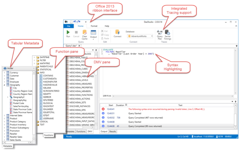
Illustration 1: DAX Studio: Free Tool for Learning, Writing, Executing and Analyzing DAX
One of the advantages to having DAX Studio in our toolkits is that it affords us a means of seeing tables as they are internally arranged during computation. Advanced calculation construction often means we need to employ filtered, intermediate tables to get us to a desired output; DAX Studio excels at giving us insight as to how filtering is being enacted across the tables and rows that become contextually relevant during expression evaluation.
We will rely upon these capabilities of DAX Studio to help illustrate the workings of DAX within prospective Levels of Stairway to DAX and Power BI. These capabilities will be complementary to our work with DAX in Power BI, as they will serve to reinforce concepts from a different perspective. To download and install DAX Studio, go to the DAX Studio CodePlex site, where you can obtain general information, release details, and documentation for the current feature set. You can also obtain source code and participate in discussions with the developers and other users.
Preparation for the Practice Exercises in this Level
Once you’ve installed Power BI Desktop, you are ready to import data that you can use to complete the practice exercises.
Download Samples for Use in this Level
To complete the steps of the hands-on practice in this Level, you’ll need to download the Contoso Sales Sample for Power BI Desktop file. This .pbix file already includes online sales data from the fictitious company, Contoso, Inc. (a familiar organization for many of us in the SQL Server and Excel arenas). Because data in the file was imported from a database, you won’t be able to connect to the data source or view it in Query Editor. (We will import data directly in Levels where we need to be able to accomplish this, and other requirements that go beyond working with DAX, in simple, isolated scenarios.)
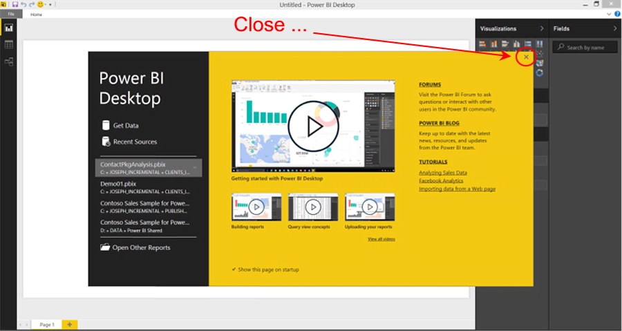
Once the sample .pbix file is downloaded, you can take the following steps to open it in Power BI Desktop. This will put us in position to begin learning the material in this Level.
- Open Power BI Desktop.
- Click the “X” button in the upper right corner of the splash dialog that appears upon entry, atop the Power BI Desktop interface, as shown.

Illustration 2: Close the Splash Dialog that Appears in Power BI
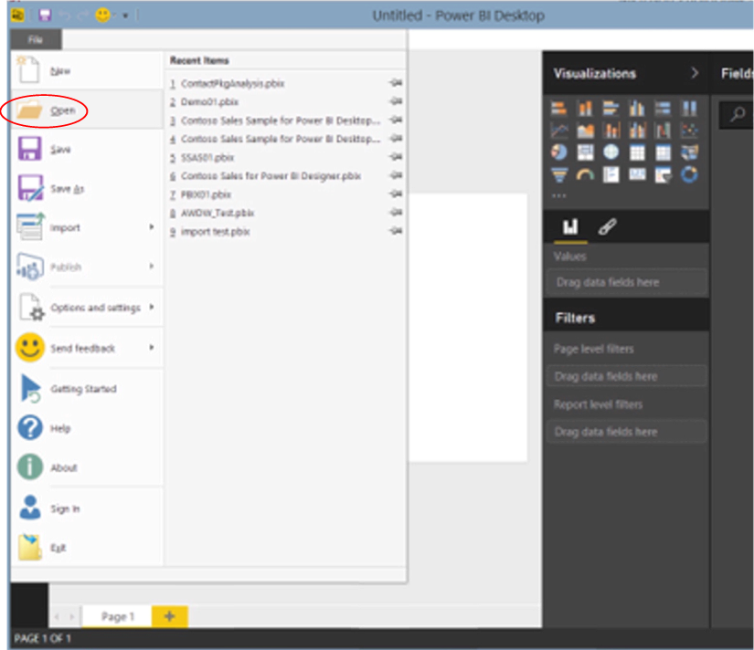
- Select File - Open from the main menu.
Illustration 3: Select File - Open in Power BI
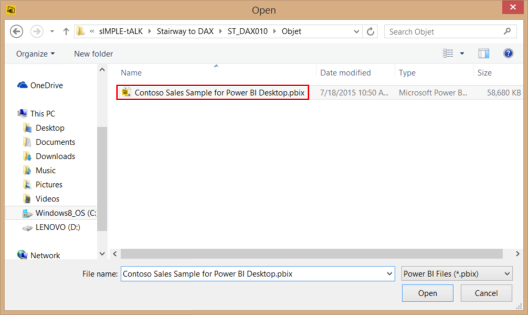
- Locate and open the downloaded sample file, Contoso Sales Sample for Power BI Desktop.pbix, from the Open dialog, as shown.
Illustration 4: Select the Sample File …
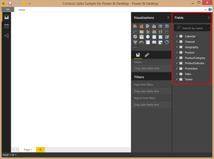
- Click Open.The .pbix file opens and we see the member tables within the Fields pane on the right side of the desktop.
Illustration 5: The Model Opens in Power BI Desktop …
Let’s leave the Report view (our current position in Power BI Desktop, which is indicated by the yellow bar that appears to the immediate left of the Report view icon), and look over the newly opened model from the tandem perspectives of Data and Relationships.
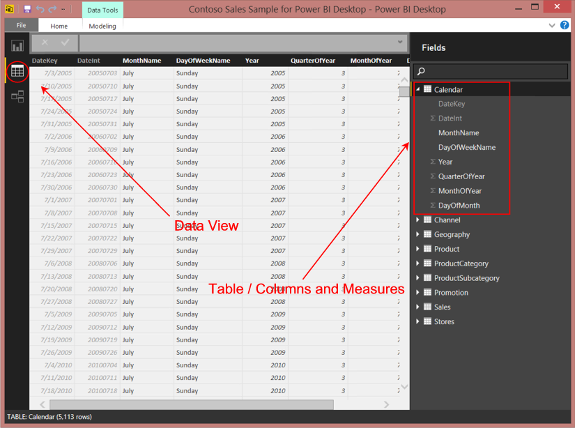
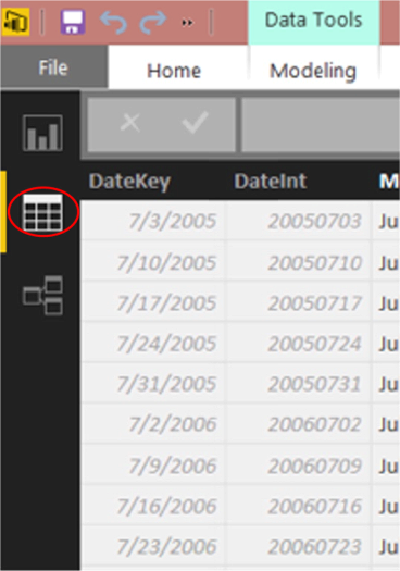
- Click the Data view icon along the left of Power BI Desktop (the middle of the three icons).The data for one of the tables listed in the Fields pane on the right of the desktop appears below (in the immediate case, the Calendar table’s data is partially displayed).
Illustration 6: Power BI Desktop Data View
We can examine each table, as well as add columns and measures, within this view, as we will see throughout prospective Levels of this Stairway.
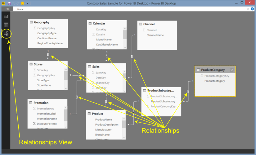
- Click the Relationships view icon next, just below the Data view icon we last clicked.The schema, with relationships between tables, appears.
Illustration 7: Relationships View
Create Additional Data for Use in this Level
For a part of the subject matter we cover in this Level, and for the dataset required to support this material, we will need to create, prepare and import a simple Excel table containing a set of interest rates. To do so, take the following steps:
- Open a blank Excel workbook.
For purposes of this exercise (and the resulting illustrations), I am working with Excel 2013.
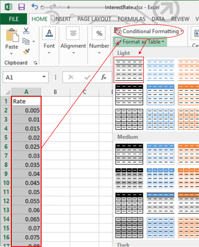
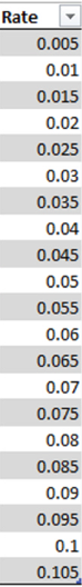
- On Sheet1, populate a simple column, titled Rate, with the following data:
Rate 0.005 0.01 0.015 0.02 0.025 0.03 0.035 0.04 0.045 0.05 0.055 0.06 0.065 0.07 0.075 0.08 0.085 0.09 0.095 0.1 0.105 Table 1: Simple Interest Rate Values
While the data we have input is exactly what we need for the table we’ll be creating in Power BI, we must prepare the data for import. We will next format the data as an Excel table to designate it a candidate data source.
- Highlight the newly input data.
- Select the Format as Table selector in the ribbon atop the Home tab.
- From the dropdown view, select the pattern in the upper left corner (or any other you prefer), as shown.
Illustration 8: Format the Input Data as a Table …
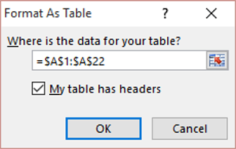
- In the Format as a Table dialog that appears, ascertain that the area for the table data is correct, ensure that the My table has headers checkbox is checked, and click OK.
Illustration 9: Formatting as a Table …
The newly input data appears in table format, as depicted.
Illustration 10: Formatting as a Table …
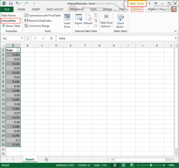
- Once the Excel table has been created, click the Design tab underneath the Table Tools tab that appears atop the ribbon.
- Type the following into the box labelled Table Name that appears in the upper left corner of the toolbar:
InterestRate
Illustration 11: Name the Newly Created Excel Table …
- Save the worksheet as InterestRate.xlsx in a convenient location.
- Close InterestRate.xlsx.
We are now ready to import the new data into our existing Power BI Desktop model.
Import the New Source Table into Power BI Desktop
Let’s import the new RateMultiplier data we have created into Power BI Desktop by taking the following steps:
- In Power BI Desktop, return to the Data View by clicking the appropriate icon, as necessary.
Illustration 12: Return to the Data View in Power BI Desktop …
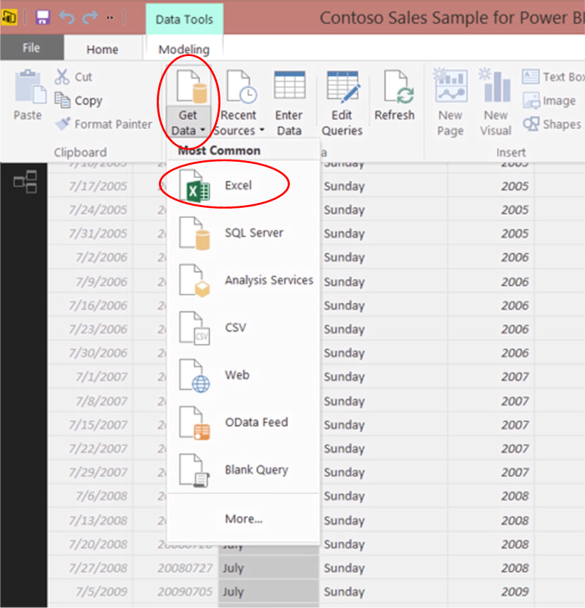
- Click the Home tab atop the view.
- Click Get Data on the ribbon that appears.
- Select Excel from atop the dropdown selector, as shown.
Illustration 13: Beginning Import of the Interest Rate Data
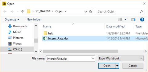
- Navigate to the worksheet that we created earlier, InterestRate.xlsx, via the Open dialog that appears.
- Select InterestRate.xlsx, as depicted.
Illustration 14: Select the InterestRate.xlsx Workbook …
- Click Open.
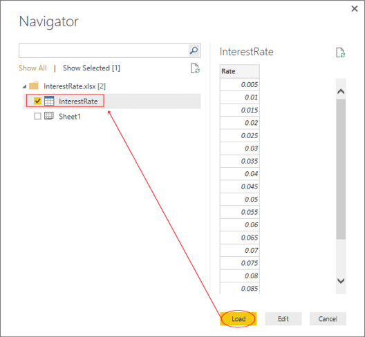
- From the Navigator window that appears next, check the box to the immediate left of the InterestRate Excel table, then click Load, as shown.
Illustration 15: Select and Load the RateMultiplier Excel Table …
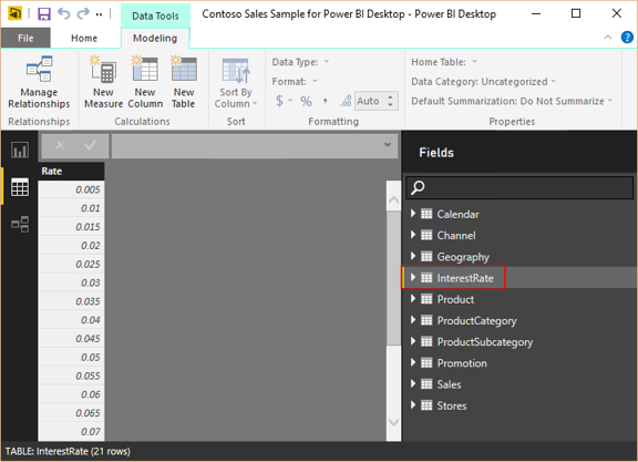
- Loading occurs and the new InterestRate data appears in the Fields list of the Data View.
Illustration 16: InterestRate Table Appears in the Fields List …
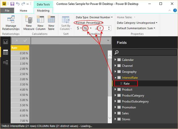
- Click the > to the left of InterestRate in the Fields list to expose the Rate column.
- Click the Rate column, to select it.
- On the Data Tools – Modeling tab, select Format: Percentage / “%” in the respective selectors, and “2” in the decimal place selector, as depicted.
Illustration 17: Configuring Percentage Format for the Rate Value …
With the addition of the new table for import to Power BI Desktop, we have established support for the activities we will accomplish for this Level. We are now ready to pursue the enhancement of our knowledge of DAX while becoming comfortable with Power BI Desktop and the design, creation and maintenance of models therein. Because we may use different models, or even build models from scratch with data we import from different sources, I will repeat the steps of environment preparation in prospective Levels. I do this primarily to make each Level a freestanding session that can be completed independently of other Levels, so that you can focus upon gaining exposure to the specific skills required to meet your own immediate requirements efficiently, with all steps I undertook, from scratch.
The Product() Function
Introduction
According to the Microsoft Developer Network (MSDN), the DAX Product() function “returns the product of the numbers in a column.” Product() is a member of the Math and Trig functions group, and is displayed as a selection in the Power BI Desktop formula bar that appears when creating a new column or a new measure. The function, like many others, is often used in combination with other DAX functions.
NOTE: As of this writing, the Product() function is included in SQL Server 2016 Analysis Services (SSAS), Microsoft Power Pivot in Excel 2016 editions, and Microsoft Power BI Desktop only.
Product() simply returns the result of the numbers in a column multiplied against each other. Each cell of the column must contain a numeric value, or Product() simply ignores it in coming to the value that it delivers. Text, logical values and blanks are ignored; only numbers in the column are considered. Moreover, the Product() function does not take a DAX expression as an argument.
It is significant to note that the Product() function calculates the product of all values within a specified column.
NOTE: If we determine a need to extend the operation of Product(), and take, as an argument, an expression that is, in turn, evaluated for each row in a table, we can explore doing so via the ProductX() function (discussed in its own section of this Level).
When cells containing a value zero (0) exist inside a column specified within the Product() function – as opposed to cells that are blank (which are not considered at all in generating the product result) – those cells are included in consideration of the product delivered for the column, which, as we might expect, is zero for the entire column involved if the column contains a single zero.
We will explore the syntax for the Product() function after a brief discussion in the next sections. We will then gain some hands-on exposure to its use, within a practice example constructed to support a hypothetical business need, in the Practice section later in this Level. This will allow us to activate what we explore in the Discussion and Syntax sections.
Discussion
To restate our initial explanation of its operation, the Product() simply performs successive multiplication of every value in the specified column and returns the product. If we specify a column containing a data type other than numeric, we receive an error. The output of Product() is a decimal number representing said product, and the function can be used with equal utility within Power BI columns or measures. Product() can be employed within other DAX functions.
Syntax
Syntactically, in using the Product() function to return the product of numbers in a column, we specify the column of values we wish to be evaluated within the parentheses to the right of the Product keyword, as shown here:
=PRODUCT(<column>)
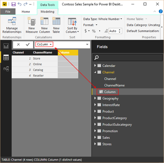
As an illustration, we’ll cite the use of Product() within the Channel table, as seen in the Data View of Power BI Desktop for the Contoso Sales Sample we imported in our earlier preparation. Let’s say we’ve already employed Product(), via a simple calculation, called SimpleProduct, within the Channel column of the Channel table – a column which happens to contain numeric values. The column contains the following expression:
Simple Product = PRODUCT(Channel[Channel])
This produces the product of the identification numbers contained in the Channel column, multiplied times each other, as follows:
1 x 2 x 3 x 4 = 24
The product value of 24 displays within the new SimpleProduct column in the Channel table in the Data View:
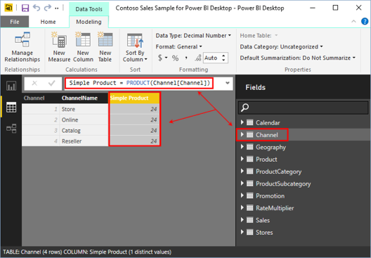
Illustration 18: Simple Example of the Product() Function at Work
Reaching beyond the view we see above, where for the sake of an easy example we’re using the Product() function to generate a product in a somewhat unlikely scenario (multiplying keys together), we can easily see how the calculation returns the desired outcome. We’ll use a similar approach in the hands-on Practice section below, simply to enable easy verification of the accuracy of the results and so forth.
The ProductX() Function
Introduction
According to the Microsoft Developer Network (MSDN), the DAX ProductX() function “returns the product of an expression evaluated for each row in a table.” ProductX() takes two arguments, the first of which must be a table, or any expression that returns a table. The second argument is a column, or an expression that evaluates to a column, containing the numbers for which we want to calculate the product. This enables us, of course, to perform multiplications, based upon the table expression we provide, evaluating the calculation for each respective table row. ProductX(), like other iterator (“X”) functions, and by its very nature, lends itself to use in combination with other DAX functions.
As we’ve noted in other Levels within the Function / Iterator Function Pairs subseries of the Stairway to DAX and Power BI series, iterator functions typically contain a table expression (the first parameter specified within the function), for which a calculation, based upon an expression specified by a second parameter, is performed iteratively for each row of the table. The ultimate result is generated by the application of the respective aggregation function (including SUM, AVERAGE, COUNT, MAX, and MIN, as well) to the dataset returned by the first and second expressions. We expose the behavior of other DAX “X” functions in independent examinations of each of the respective function / x-function pairs published in parallel to this review of the Product()and ProductX() functions.
In cases where there are no “qualified” (meaning “containing number / date values”) rows to for which to calculate a product, ProductX() returns a blank. With regard to nonnumeric values, the ProductX() function ignores any empty cells, text or logical values included within the specified column. (If the column specified within the function consists of only non-numeric values, an error is returned.) Finally, and somewhat intuitively, ProductX() returns a zero (0) for a column containing one or more zeros among other numeric values.
ProductX() is useful anytime we want to calculate the product of an expression, evaluated for each row in a specified table. If we need to return the simple product of numbers in a column, we use the DAX Product() function, which we have explored earlier in this Level. We’ll briefly discuss the ProductX() function in the section that follows, after which we will explore ProductX() from a syntax perspective. We will then activate what we have explored in the Discussion and Syntax sections, through hands-on exposure to its use, within practice examples constructed to support hypothetical business needs.
Discussion
As we have noted, the ProductX() function iterates through a specified table expression – the function’s first parameter. It then employs the second parameter, a column containing numbers for which we wish to calculate a product, or an expression that evaluates to a column. Blanks, text and logical values are ignored by ProductX(); only numbers in the specified column are taken into account.
Let’s look at some syntax illustrations to further clarify the operation of ProductX().
Syntax
Syntactically, in using the ProductX() function to return the product of an expression evaluated for each row in a table, we take a table expression (first argument of the function), and the expression (second argument of the function) that we seek to apply to
PRODUCTX(<table>, <expression>)
Putting ProductX(), or any of the “X iterator” functions, for that matter, to work is intuitive, once we grasp the purpose. Using the above syntax structure, the ProductX() function computes the product for the second argument (a column, or an expression evaluating to a column, containing the numbers for which we wish to compute the product) for each row of the table specified in the first argument (a table, or an expression that returns a table).
As an example, let’s get a feel for the general use of ProductX(), this time from a visualization in Power BI that is based upon simple example we used in the Syntax section for the Product() function above. Say we’ve created a matrix visualization upon the same underlying table, Channel – again, choosing Channel simply because it has a short column containing numbers that we can easily use to demonstrate the operation of the function. (The column houses key values, for which, once again, there would be little business reason to calculate a product in the real world).
Let’s say we want to put ProductX() to use in a scenario, just to see how it handles numbers, using the Channel ID column as an example:
ProductX = PRODUCTX(Channel, Channel[Channel])
This calculation returns the product of an expression, the values contained within the Channel column for the specified Channel table. I’ve included the simple calculation using Product() that we saw earlier, to allow us to compare and contrast the results.
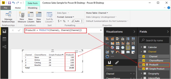
Illustration 19: ProductX() Results: ProductX() Total Agrees to the Product() Function Results
In this simple example, we can see how ProductX() works, allowing us to take, as an argument, an expression that is, in turn, evaluated for each row in a table (in this case, the Channel ID). We’ll see a slightly more sophisticated example in the Practice section below, where we’ll see ProductX() used to support a slicer.
We’ll get some hands-on practice with Product() and ProductX() in the sections that follow.
Practice
Let’s next reinforce our understanding of the basics by putting the Product()and ProductX() functions to work within the definition of some calculations. We’ll do this somewhat as we have in the other Levels of this Stairway series: First, we’ll work with Product() via a column within the data view of the model we have established, and then we’ll work with ProductX() via a measure we create and then put to work within a straightforward visualization. The intent, as in all the practice sessions we undertake together within this series, is to demonstrate the operation of the functions we examine in a straightforward, memorable manner. We will turn to the Power BI Desktop model we prepared earlier as a platform from which to construct and execute the DAX we examine, and to view the results we obtain.
Add a New Column in the Data View
We’ll begin with a straightforward example: We’ll reconstruct the Simple Product column we explored earlier (see Illustration 18). Recall that this is merely an attempt to illustrate how Product() works with a small column of numbers. There would likely not be a genuine business case for multiplying a handful of keys together.
To do so, we will take the following steps:
- Return to the Data View.
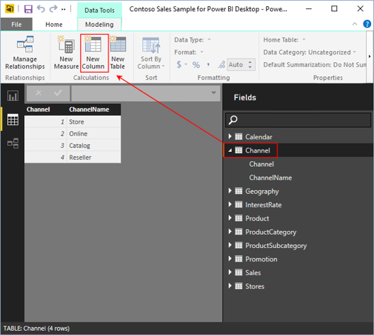
- Click the Channel table in the Fields list on the right side of the Data view to expose the table’s columns.
- With the Channel table selected, click the New Column button on the ribbon, as shown.
Illustration 20: Creating a New Column in the Channel Table …
The placeholder name of “Column” appears in the formula bar, and among the Channel table columns, as depicted.
Illustration 21: The Measure Placeholder Appears …
- Type the following DAX into the Formula bar, replacing the “Column = “placeholder:
Simple Product = PRODUCT(Channel[Channel])
- Press the ENTER key.
The new Simple Product column replaces the placeholder in the Fields list and the column is populated in the Data view as shown.
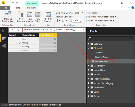
Illustration 22: The Simple Product Column is Populated
The expected result, the product of the Channel keys multiplied times each other (1 x 2 x 3 x 4 = 24) populates the new Simple Product column.
Next, let’s put the ProductX() function to work. As a part of demonstrating its operation, within a somewhat more practical business use, we’ll work with the function in the Report view, introducing both slicer and matrix visualizations.
Putting A Business Solution Together in the Report View
We’ll accomplish multiple things within a straightforward example: Let’s say that our client, the Contoso organization, has asked us for a simple, high-level projection: For each of the product categories that they sell, they’d like to see, first, the corresponding total Sales Amount, alongside the Total Cost. Next they would like to see a projection of future cost, based upon the Total Cost and a specified, (via slicer) variable rate of change. They also want to be able to filter all values in the visualization by Year.
Recall that the table we imported earlier contains a range of interest rates (0.50 to 10.50 percent), which will serve as a basis for our projections. We could, of course, have made the range anything realistic – the one we chose is for illustration of the concepts.
To meet the client requirements, let’s take the following steps:
- Click the Report View icon in the left navigation bar, as shown.
Illustration 23: Go to the Report View in Power BI Desktop …
- Click the Report View icon in the left navigation bar, as shown.
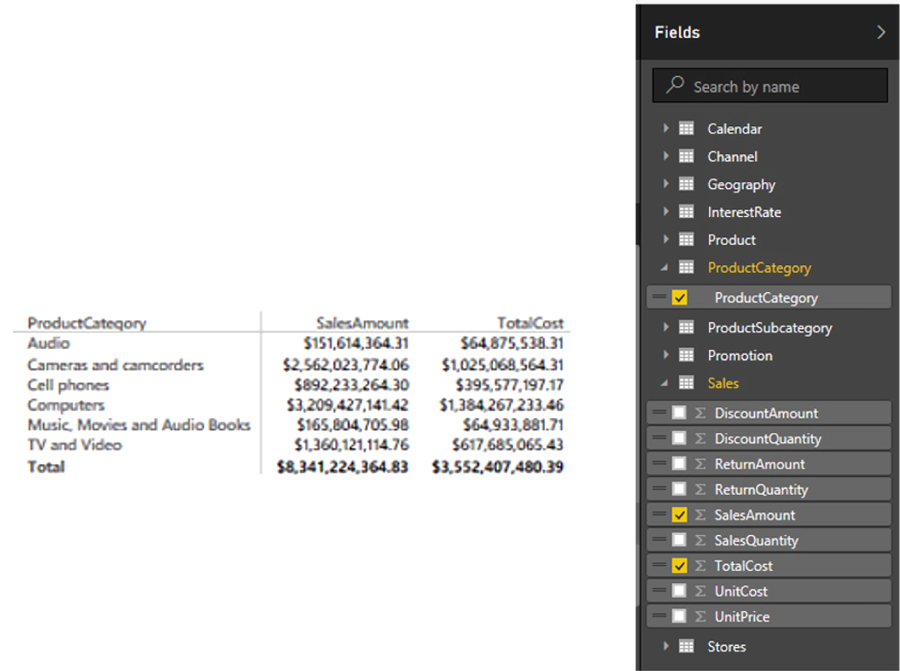
We are greeted with a blank canvas. Here we will pull in the visualizations needed to meet the requirements we have obtained with the Contoso data. Let’s start with the basic report, containing the two basic data values, Sales Amount and Total Cost, for the Product Categories.
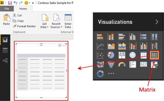
- Click the Matrix visualization within the Visualizations pane.An empty Matrix visualization appears on the canvas.
Illustration 24: Launch a Matrix Visualization on the Canvas (Composite Image)
- In the Fields list on the right of the desktop, expand the ProductCategory table by clicking the right angle bracket (“>”) symbol to its left.
- Click the box to the immediate left of the exposed ProductCategory column, to select its contents into the new matrix.
- Expand the Sales table.
- Click the boxes to the left of the following columns, to select them into the new matrix:
- SalesAmount
- TotalCost
The matrix appears populated as depicted.
Illustration 25: The Newly Populated Matrix (Composite Image)
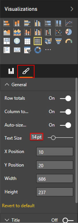
- With the matrix selected, click the Format button underneath the Visualizations pane.
- Click the downward arrow to the left of the General section that appears underneath the Format (brush) icon.
- Increase the Text Size to 14 pt., as shown.
Illustration 26: Resizing the Fonts for the Matrix …
The visualization becomes much more readable, versus with its default text size.
The totals we see in the matrix reflect the totals for all dates in the data source. Next, we’ll add two slicers: one to support the selection of a rate multiplier by which we will derive the third value requested by the client, the projection of future cost, and one to enable us to filter the totals by year(s) we wish to examine.
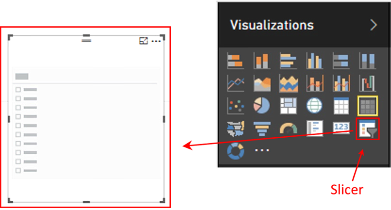
- Click a blank area on the canvas.
- Click the Slicer visualization within the Visualizations pane.An empty Slicer visualization appears on the canvas, as depicted.
Illustration 27: Create a Slicer Visualization on the Canvas (Composite Image)
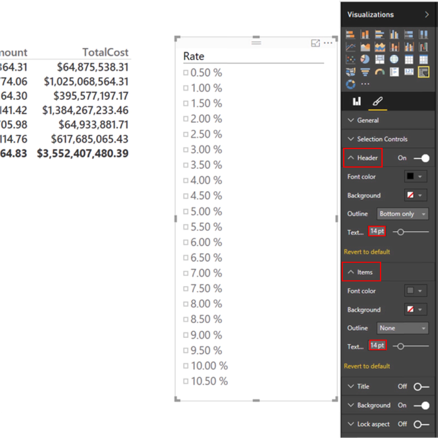
- In the Fields list on the right of the desktop, expand the InterestRate table.
- Check the Rate column that appears.
- Click the Format button underneath the Visualizations pane, once again.
- Expand the Header section by clicking the downward pointing carat symbol to the immediate left of the section title.
- Increase the Text Size to 14 pt.
- Expand the Items section.
- Increase the Text Size to 14 pt.The slicer visualization is populated by the rates housed in the InterestRate table, as shown.
Illustration 28: Populated Rate Slicer with Settings (Composite Image)
We now have the basis for a slicer that allows us to selectively project growth. However, we next need to “marry the slicer to the math” involved: recall that the slicer rests upon a simple, unrelated table at present. To make this all work together, we need to add a couple of measures.
First, let’s create an “intermediate” measure called RateFactor, which we can multiply times the relevant TotalCost value in the Sales table to generate the projection we display in the visualization. To do so, we’ll take the following steps:
- Return to the Data view.
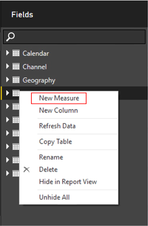
- Right-click the InterestRate table in the Fields list.
- Select New Measure, as shown.
Illustration 29: Creating a New Measure …
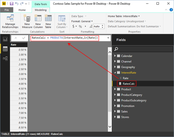
- Type the following into the Formula Bar of the Data view:
RatesCalc = PRODUCTX(InterestRate,1+[Rate])
Illustration 30: First Measure: RatesCalc Multiplier
- Click the checkmark icon to the left of the Formula bar to enter / save the new measure.We will employ the new RateCalc measure within the next measure to generate our projected cost values.
- Right-click the Sales table in the Fields list.
- Select New Measure, once again.
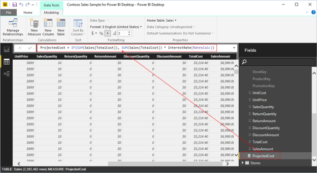
- Type the following into the Formula bar of the Data view:
ProjectedCost = IF(SUM(Sales[TotalCost]), SUM(Sales[TotalCost]) * InterestRate[RatesCalc])
Illustration 31: Second Measure: ProjectedCost (for Display)
- Click the checkmark icon to the left of the Formula bar to enter / save the new measure.
- Click the Matrix visualization within the Visualizations pane.An empty Matrix visualization appears on the canvas.
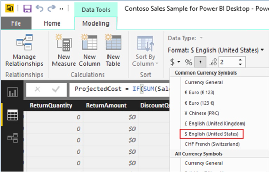
ProjectedCost is the measure that we will display in the matrix visualization we created earlier, containing the SalesAmount and the TotalCost values, juxtaposed with the ProductCategory. Since ProjectedCost is a new measure, we need to format it in Currency (US) to make it consistent with the other values in the matrix.
- With the ProjectedCost measure highlighted, set the Format setting in the ribbon atop the Data view to, as shown in the partial view below.
Illustration 32: Formatting ProjectedCost to Make It Consistent with Other Values (Partial View)
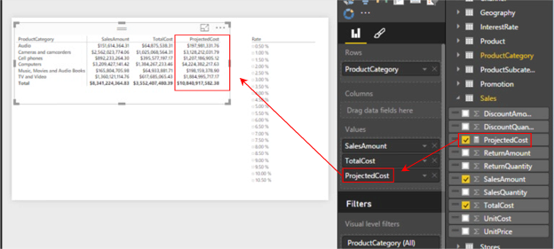
Now, let’s bring the ProjectedCost into the matrix, dropping it to the right of the TotalCost base value.
- Click the Report view icon in the left pane, once again.
- Click the matrix visualization to select it.
- Expand the Sales table in the Fields list.
- Click the checkbox to the immediate left of the newly created ProjectedCost measure, exposed within the columns of the expanded Sales table.The ProjectedCost measure is added to the Values section of the matrix definition, and appears there underneath the SalesAmount and TotalCost measures, as well as to the matrix, as depicted.
Illustration 33: Add the New Measures to the Matrix Visualization
Now, let’s test out the effect of using the slicer.
- Select the 3.00% rate in the slicer by clicking the checkbox to its immediate left.
- With the ProjectedCost measure highlighted, set the Format setting in the ribbon atop the Data view to, as shown in the partial view below.
The members of the ProjectedCost value adjust to reflect the TotalCost value of the respective member, times 1.03, as shown.
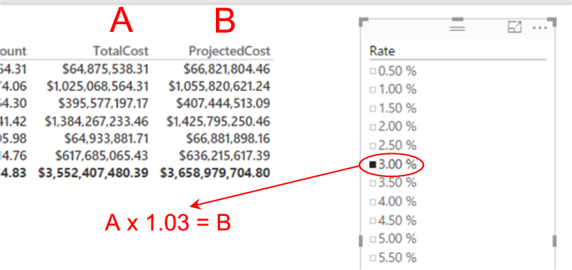
Illustration 34: Selecting a 3 % Uplift in Total Cost …
The math proves out, so we can see that the slicer works as designed (using a single selection at a time, in this simple example). Next, let’s finish up the immediate client requirement by adding a slicer to support our filtering the totals by year(s) we wish to examine.
- Click another blank area on the canvas.
- Click the Slicer visualization within the Visualizations pane, as we did earlier.An empty Slicer visualization appears on the canvas, as before.
- In the Fields list on the right of the desktop, expand the Calendar table.
- Check the Year column that appears.
- Click the Format button underneath the Visualizations pane, once again.
- Expand the Header section by clicking the downward pointing carat symbol to the immediate left of the section title.
- Increase the Text Size to 14 pt., as we did with the first slicer.
- Expand the Items section, again, as we did earlier.
- Increase the Text Size to 14 pt.
The slicer visualization is populated by the years housed in the Calendar table.
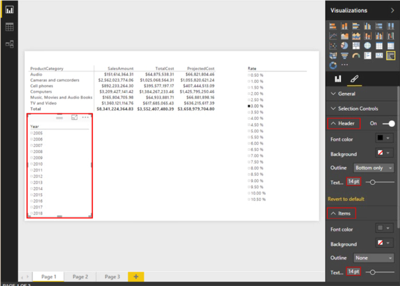
Illustration 35: Populated Year Slicer with Settings (Composite Image)
We now have the capability to filter by year, in addition to projecting the Total Cost, as seen above. An additional visualization (ideally placed on another page in the Power BI Desktop), easy enough to add, to “prove” our solution, might be a simple, unfiltered replication of the initial table report, whereby we break out the same two primary columns (SalesAmount and TotalCost) by Year. We can then easily compare the results we receive from the Year slicer to ascertain accuracy / completeness. A compressed view of the straightforward setup appears below.
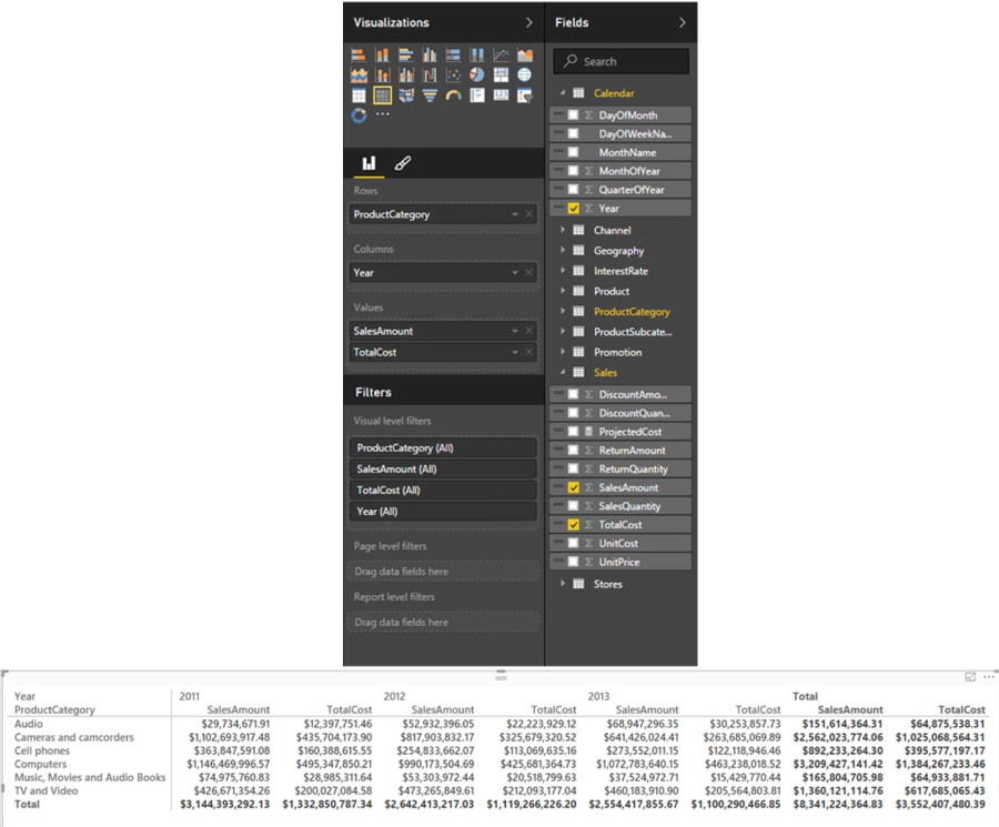
Illustration 36: A Possible “Test” Table Visualization for Proofing Accuracy of the Year Slicer (Composite Image)
As we consistently note in other Levels, particularly where “X-” iterator DAX functions are involved, we can analyze and report upon data based upon date ranges, among other criteria, and create conditions (from simple to complex) that further refine the data, and / or include data taken from multiple tables. Once again, it is easy to see how DAX empowers us to generate and support comprehensive BI within our Excel environments, transforming the relatively limited options we once had with simple spreadsheets into sophisticated and robust reporting and analysis solutions.
Summary …
In this Level of the Stairway to DAX and Power BI series, we explored the DAX Product()and ProductX() functions. We discussed the general purposes, syntax and operation of each of these two DAX functions, and then focused upon using each in general. We also compared and contrasted ways that each can be employed, particularly in situations where we can combine them with other functions to achieve results like those we might need to generate in client or employer environments.
In like manner to our standard approach to every DAX function we explore within the Stairway to DAX and Power BI series, we undertook illustrative examples of the uses of Product()and ProductX() in practice exercises, and then observed the results datasets we obtained. We extended our exploration of Product()and ProductX() to the delivery of illustrative answers to business questions, within both the data model and visualization levels of Power BI. In accordance with another objective of the series, we exposed practical examples of features of Power BI as a platform for employing DAX in our data models and visualizations to meet representative sample business requirements.
Special thanks to Kasper De Jonge for inspiring the slicer example in particular, and a wealth of SSAS Tabular and Power BI information in general.