In this article, I’m going to show you how to use cluster analysis to gain insight into your data where the categories are either vague or unknown. Cluster analysis is used in biology, medicine, business, marketing, social network analysis, computer science, and much more. It is a broad and complex statistical concept with a variety of approaches. For demonstrative purposes, we will only focus on k-means clustering in hopes of getting your feet wet in cluster analysis in SQL Server.
To use an example from John Foreman’s book Data Smart, let’s say you have a table of everybody’s location at a Junior High dance, depicted by the SSRS graph on the left (Figure 1). After performing cluster analysis on the data, you find there are three distinct groups. Delving further into the group reveals the yellow cluster to be junior high girls, the red cluster junior high boys, and the blue cluster to be the teachers (SSRS graph Figure 2). These newly discovered categories begin our journey into asking different questions of our data and hopefully glean better insight into the world around us.
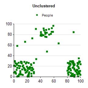
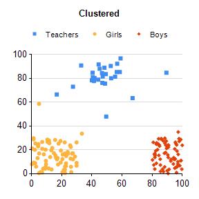
Figure 1 Figure 2
In order to demonstrate this concept in SQL Server, below are a series of steps to set up the Junior High School example above. The scripts associated with this example can be implemented on SQL Server versions 2008 and above.
The Junior High Dance Example
The database has three main components
- tbl_clusters – Junior High dance data
- usp_cluster - Performs k-means clustering
- usp_silhouette - Calculate the silhouette
You’ll need to download the “CA_Example_Instructions.zip” file for the following steps. The code is thoroughly commented to make it easy to follow along.
The first step is to create the database, db_clustering. You have three options here:
- Option 1: Create Database in SQL: Run “create_db_clustering.sql” in SQL Server Management Studio
- Option 2: Import Excel Table: Use the import/export wizard to import the data from Excel (in .zip file) and then run the two scripts that create the stored procedures
- Restore Database Backup: Restore the backup, db_clustering.bak, on SQL Server 2008 or higher.
You can now perform the Cluster Analysis by running “Perform_Clustering_and_Calculate_Silhouette.sql”
For the reporting secton, make sure yo are using SSRS 2008 and above or Report Builder 3.0. First open “clustering_report.rdl”. Next ensure the data source is connected to db_clustering. Now you can run the report, and you are done. Again, the example code is bare bones but hopefully helps you get a start in the fascinating world of cluster analytics.
K-Means Clustering
Here is a little more about how the cluster analysis methods used by the stored procedures work. K-means clustering is method of clustering where k is the number of clusters and mean is a simple average used to find the cluster centers. My method of performing k-means is as follows:
- Randomly assign each data point to one of the k-number of clusters.
- Find each cluster center using the average of each cluster’s data points.
- Reassign each data point to the nearest cluster center.
- Repeat steps 2 and 3 until the cluster centers stop changing and the best cluster center if found.
Silhouetting
With k-means clustering, you are at risk of not getting the optimal number of clusters. Silhouetting solves this by quantifying how well the data are clustered. Basically, for each data point it provides a “score” between -1 and 1. A score closer to 1 means the data point is a good match for its cluster. A lower score means the data point is not a good match for its cluster and there might be closer match to a neighboring cluster. The average of the scores for all the data points is your silhouette. Remember the higher the silhouette, the better the clusters. In the junior high example, we calculated the silhouette for 2 and 3 clusters. The SSRS graphs created earlier clearly show three groups. As you can see in the table below, silhouetting gives a higher score to the 3 groups confirming that it is the best number of clusters to be used for analysis.
K | Silhouette |
2 | .63 |
3 | .78 |
The silhouette formula can be difficult to understand, so here is how to calculate the silhouette score for just one data point. Remember your silhouette is the mean average of all data point scores.
Formula: Score =
1. Take data point P in cluster 1
2. Find the average distance between P and all the other points in cluster 1.
a. Call it X.
3. Find the average distance between P and all the other points in cluster 2, then 3, then 4…
a. Take the smallest average and call it Y.
4. Calculate silhouette = (Y-X)/C, where C is the greater of the two numbers
a. If X > Y, then C = X
b. If Y > X, then C = Y
Conclusion
Cluster Analysis has the potential to give insight into your data not available by any other means. This is just a quick and dirty SQL example that doesn’t require a Doctorate in Statistics to understand. I hope you found this content useful and can find ways to apply it to data where the categories in your data are either ambiguous or unknown.
Bio
Stephan Calderon is a college student who has been programming in T-SQL since he was 12 years old and loves everything to do with databases. When he finished High School at age 15, he immediately began to work toward his goal of earning a degree in computer science with an emphasis in database management systems. He has recently received his Associates in Computer Science, graduating with high honors.