Histogram - 2 labels
-
 Hi,
Hi,
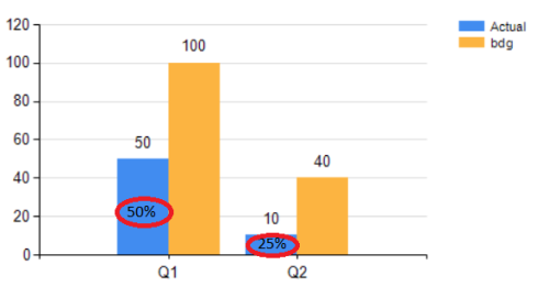
I have to realise a histogram from this dataset:Type Value Quarter
Actual 50 Q1
Bdg100 Q1
Actual 10 Q2
Bdg 40 Q2I would like to use the Quarter on Category Groups, and Type on Series Groups.
I put the label on every bar, but I need to visualize the percentage too Actual/Bdg (only for Actual member). So for Q1 50%, and for Q2 25%.
Does anyone have an idea ?
thks
 Hi,
Hi,Viewing 0 posts
You must be logged in to reply to this topic. Login to reply