SSC Forum Updates
-
January 12, 2017 at 3:29 am
Hi all
Can you post questions, issues, etc. with the revised forums in this thread? We're going to keep track of what changes still need to happen here.
-
January 12, 2017 at 3:34 am
Dave Convery - Thursday, January 12, 2017 3:29 AMHi allCan you post questions, issues, etc. with the revised forums in this thread? We're going to keep track of what changes still need to happen here.
OK, I've been kicking the tyres a bit, and have a few things so far.
- Linebreaks mid-word when resizing window.
- Comic Sans? Really?
- Multiquote / quote button below post - can it say "Quote" or something, 'cos it's not immediately obvious.
- Comic Sans. C'mon, guys, get rid of that thing.
Thomas Rushton
blog: https://thelonedba.wordpress.com -
January 12, 2017 at 3:36 am
ThomasRushton - Thursday, January 12, 2017 3:34 AM- Comic Sans. C'mon, guys, get rid of that thing.
But think of the trolling quote reply possibilities...
-
January 12, 2017 at 3:36 am
Also, there's a lot of blank / sparsely populated space at the top of the screen. I know there's this trend towards wider-spaced metro-style interfaces, but it's a bit annoying if I can't even read the first response to a relatively short question without scrolling down.
(Running on 1920x1080, not maximized, but not too small...)
Thomas Rushton
blog: https://thelonedba.wordpress.com -
January 12, 2017 at 3:40 am
ThomasRushton - Thursday, January 12, 2017 3:36 AMAlso, there's a lot of blank / sparsely populated space at the top of the screen. I know there's this trend towards wider-spaced metro-style interfaces, but it's a bit annoying if I can't even read the first response to a relatively short question without scrolling down.(Running on 1920x1080, not maximized, but not too small...)
Agreed. Right now that's because the search and menu options are encoded into their own little space, but it's something we would ideally move further down the page. It's not simple though.
-
January 12, 2017 at 3:40 am
Looks from my first response as there may also be an issue with posts not trimming blank space
I'll put ten blank lines at the end of this response.
Thomas Rushton
blog: https://thelonedba.wordpress.com -
January 12, 2017 at 3:44 am
Dave Convery - Thursday, January 12, 2017 3:40 AMThomasRushton - Thursday, January 12, 2017 3:36 AMAlso, there's a lot of blank / sparsely populated space at the top of the screen. I know there's this trend towards wider-spaced metro-style interfaces, but it's a bit annoying if I can't even read the first response to a relatively short question without scrolling down.(Running on 1920x1080, not maximized, but not too small...)
Agreed. Right now that's because the search and menu options are encoded into their own little space, but it's something we would ideally move further down the page. It's not simple though.
Sure, I can appreciate that. Personally, I would have put the breadcrumb trail just below the main title bar, and then the search & menu burger to the right of those. But, hey, I'm not in charge here, which is a bit of luck for me! 🙂
Thomas Rushton
blog: https://thelonedba.wordpress.com -
January 12, 2017 at 3:48 am
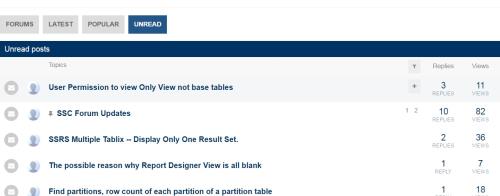
Another one. On the "Latest" / "Unseen" views, we used to see which group a thread was in. Can we get that back? because a question may look as though it's something you can answer just based on the title, but when you see it's in the Programming/XML section, you realise you wouldn't have looked at it anyway as it's not in your area at all...
Not explaining myself very well here, I know.
Thomas Rushton
blog: https://thelonedba.wordpress.com -
January 12, 2017 at 3:55 am
in Addition to the above (really hard to read forums now) it seems a tad bit slower loading the forums initial page.
-
January 12, 2017 at 3:57 am
I almost wonder if the Format menu should be always displayed, rather than only when you hover over.
We have a hard enough time getting people to post their SQL in IFCode tags already, imagine it now without the hints on the left hand side of the text box O.o
Does look pretty at the moment.
Edit: Why have the Emoticon characters changed? 🙁 I just got used to putting a hyphen is my Razz emote 😛
Thom~
Excuse my typos and sometimes awful grammar. My fingers work faster than my brain does.
Larnu.uk -
January 12, 2017 at 4:02 am
frederico_fonseca - Thursday, January 12, 2017 3:55 AMin Addition to the above (really hard to read forums now) it seems a tad bit slower loading the forums initial page.When you say "really hard to read", do you mean on the popular/recent list results?
-
January 12, 2017 at 4:11 am
You can vote on the "Comic Sans Issue" now.
https://www.sqlservercentral.com/Forums/Topic1849980.aspx -
January 12, 2017 at 4:14 am
First spam dammit!
https://www.sqlservercentral.com/Forums/Topic1849984.aspx“Write the query the simplest way. If through testing it becomes clear that the performance is inadequate, consider alternative query forms.” - Gail ShawFor fast, accurate and documented assistance in answering your questions, please read this article.
Understanding and using APPLY, (I) and (II) Paul White
Hidden RBAR: Triangular Joins / The "Numbers" or "Tally" Table: What it is and how it replaces a loop Jeff Moden -
January 12, 2017 at 4:16 am
ChrisM@Work - Thursday, January 12, 2017 4:14 AMIt's been pulled and queued automatically though, which is good.
Viewing 15 posts - 1 through 15 (of 224 total)
You must be logged in to reply to this topic. Login to reply
