The series so far:
- Reporting Services Basics: Overview and Installation
- Reporting Services Basics: Creating Your First Report
- Reporting Services Basics: Data Sources and Datasets
- Reporting Services Basics: Parameters
- Reporting Services Basics: Adding Groups to Reports
So far in this series, I’ve shown you how to create a basic report with parameters. The next necessary skill for report developers is to add grouping levels to the report. Managers often want to see subtotals, for example, at various levels, and adding groups is the way to do this. The report might be divided into categories and subcategories, maybe by locations and departments, or possibly by year and month. Whenever there is a hierarchical relationship in the data, it might make sense to add groups based on those relationships.
There are several ways to add groups, but I’m going to show you the ones that have worked the best for me.
The Groups section
When you look at a report in Visual Studio in design view, you will see a section under the report canvas with Row Groups and Column Groups as shown in Figure 1.
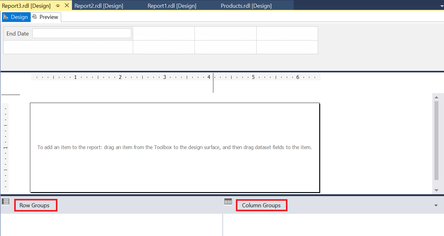
Figure 1: The groups section
If you don’t see the section, click on the report and then select Report View Grouping from the menu as shown in Figure 2 to make it visible.
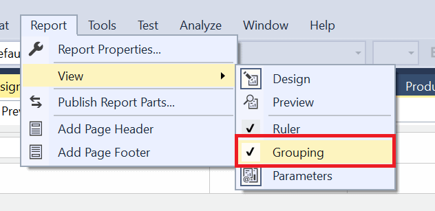
Figure 2: Where to turn on the Grouping section
You may be wondering what the difference is between column and row groups, and they are quite different. Row groups are used to organize the report into horizontal sections in a typical report. Figure 3 shows one page of a report with row groups.
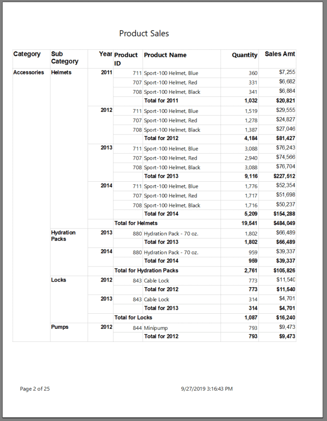
Figure 3: A report with row groups
Column groups are used in matrix reports, which might also be described as “pivot” reports. A matrix report displays data from a column across the top of the report as headings. You can also add row groups to matrix reports. For example, you might want to display several years across a report along with row groups for category and subcategory as shown in Figure 4.

Figure 4: A matrix report
The SSRS Toolbox contains Table and Matrix items. When you add either one to a report, you’ll notice that each is called a Tablix instead of the original name. It’s also possible to turn a Table into a Matrix by adding column groups or turn a Matrix into a Table by removing the column groups. In my experience, it is better to start with the one you need.
For years, I used the SSRS wizard to create matrix reports, but eventually I realized that simple matrix reports were not that difficult.
Creating a matrix report
In this example, I’ll show you how to create the report shown in Figure 4. If you need help with setting up an SSRS project or creating data sources or datasets, be sure to go back to the earlier articles in this series to learn more.
To get started, you’ll need an SSRS project with a shared data source pointing to the AdventureWorks2017 database. Create a new report by right-clicking Reports and selecting Add New Item…. In the Add New Item dialog, select Report. Name the report Sales by year and category and click Add. The dialog will look similar to Figure 5.
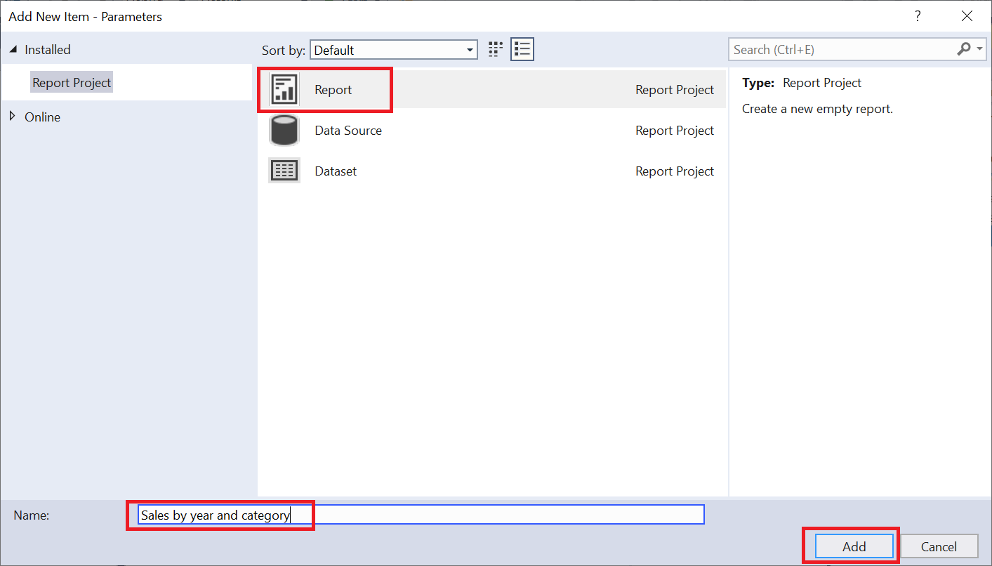
Figure 5: Creating a new report
Inside the Report Data window, create a Data Source that points to the project’s Shared Data Source. Create a Dataset that is embedded in the report named ProductSales with the query below:
|
1 2 3 4 5 6 7 8 9 10 11 12 13 14 15 16 17 18 19 20 21 |
SELECT PC.Name AS Category, PS.Name AS SubCategory, P.Name AS ProductName, P.ProductID, YEAR(SOH.OrderDate) AS OrderYear, SUM(SOD.OrderQty) AS Quantity, SUM(SOD.LineTotal) AS SalesAmt FROM Production.Product AS P JOIN Sales.SalesOrderDetail AS SOD ON SOD.ProductID = P.ProductID JOIN Sales.SalesOrderHeader AS SOH ON SOH.SalesOrderID = SOD.SalesOrderID JOIN Production.ProductSubcategory AS PS ON PS.ProductSubcategoryID = P.ProductSubcategoryID JOIN Production.ProductCategory AS PC ON PC.ProductCategoryID = PS.ProductCategoryID GROUP BY YEAR(SOH.OrderDate), PC.Name, PS.Name, P.Name, P.ProductID; |
After creating the dataset, the Report Data window should look like Figure 6.
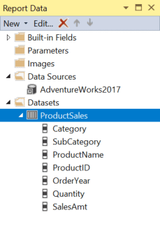
Figure 6: The Report Data window
The next step is to drag a Matrix object to the report canvas from the Toolbox window. You can also right click the canvas and select Insert Matrix. The empty matrix object will look like Figure 7.
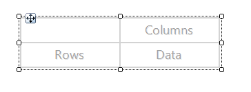
Figure 7: The empty Matrix
When creating a matrix report, the trick is figuring out what goes where. The Columns cell will contain the column you want displayed as headings across the report. The Data cell will contain the value you want to aggregate. The Rows cell will be the remaining columns. In this case, the report must display the years across the report and add up the sales amount.
Drag OrderYear to the Columns cell, SalesAmt to the Data cell, and Category to the Rows cell as shown in Figure 8.
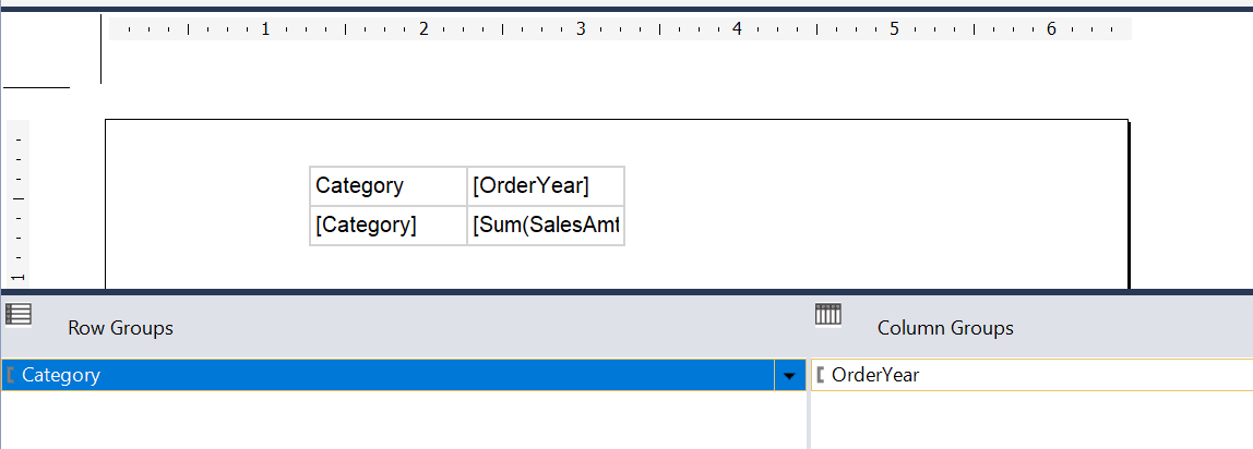
Figure 8: Report after adding main items
Notice that you can see the grouping levels in the grouping section. When you run the report, it will look something like Figure 9.
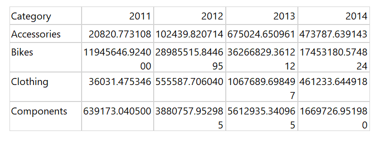
Figure 9: The report so far
The report’s not pretty at this point, but it does display as expected with the years going across the top as headings. The original report also includes subcategories. Go back to design view and right click on the Category group in the Row Groups section. Click Add Group Child Group… as shown in Figure 10.
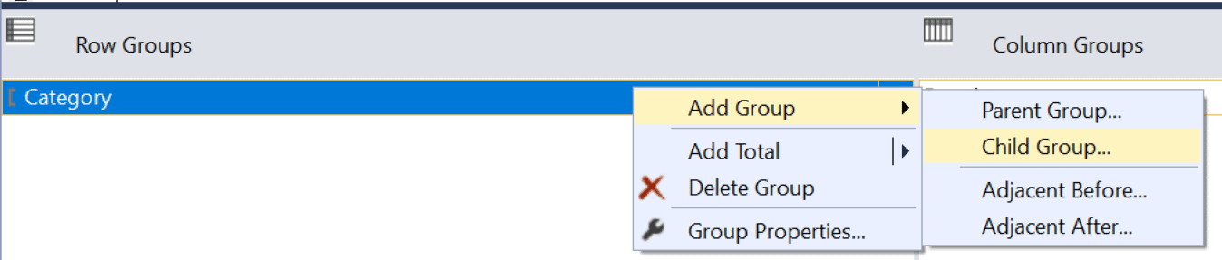
Figure 10: Adding a Child Group
This brings up the Tablix group dialog. Select SubCategory as shown in Figure 11.
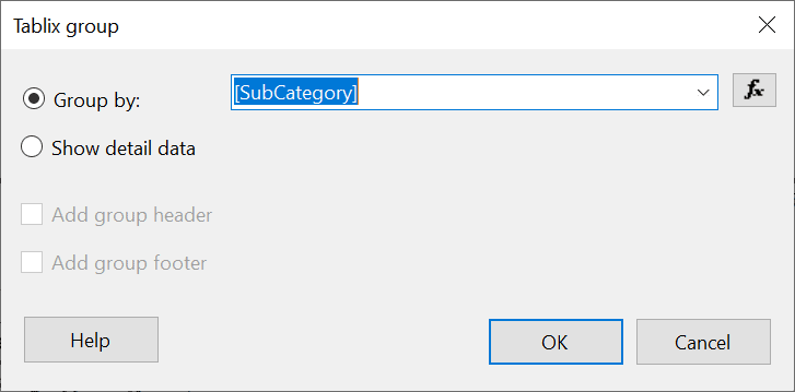
Figure 11: The Tablix group dialog
After clicking OK, the report should now look like Figure 12.
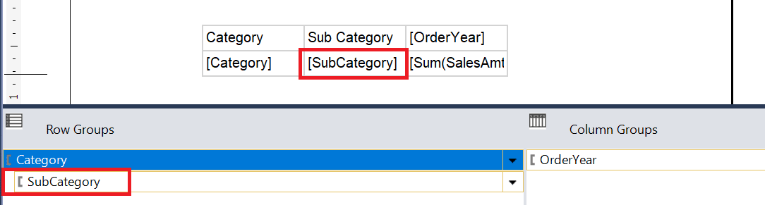
Figure 12: After adding SubCategory
When previewing the report, the top of it should look like Figure 13.
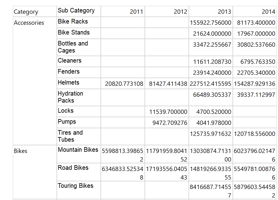
Figure 13: The report
You can format your report or not as desired since this article is about grouping, but at this point, I have to add some formatting for my own sanity! In this case, I have bolded the top row and the first two columns. Everything should end up bolded except for the Data cell as shown in Figure 14.
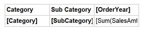
Figure 14: Bold everything except for the total
I also formatted the SalesAmt in the Data cell to be Currency with a thousands separator and no decimal places and added a heading with the report name. The default margins are too wide for this report, so I also changed them in the Report Properties and made sure that everything in the report was pulled to the left. (To learn more about formatting, see the previous articles.)
After the formatting is complete, the report looks like Figure 15.
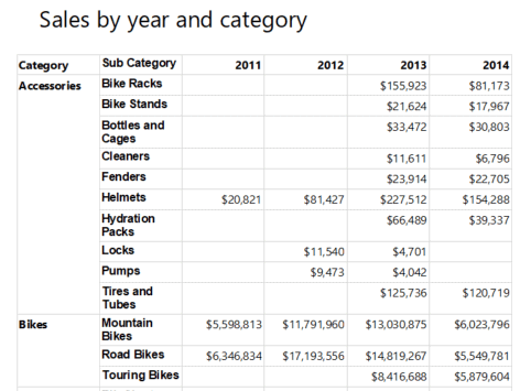
Figure 15: The formatted report
The next step is to add some totals to the report. It is so easy to do when working with matrix reports! Right-click the Data cell that contains the summed SalesAmt and select Add Total Row. Repeat for Add Total Column. Figure 16 shows you where to find these.
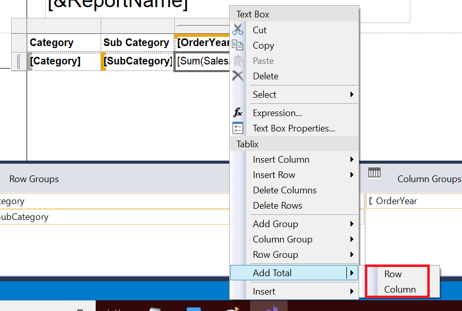
Figure 16: Adding totals
Adding these two totals will leave your report canvas looking like Figure 17.
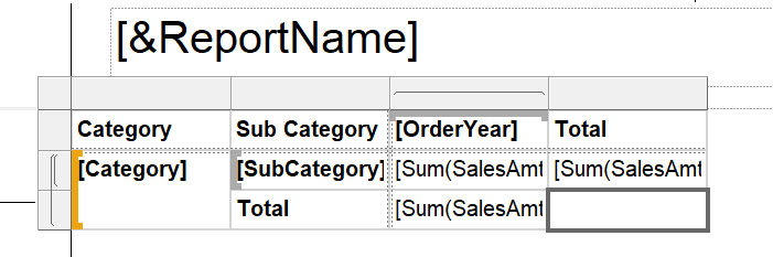
Figure 17: After adding the row and column totals
You might just guess the next step: adding a grand total in the empty cell. Hover over the cell until the column list appears and click it as shown in Figure 18. Select SalesAmt which will automatically sum.
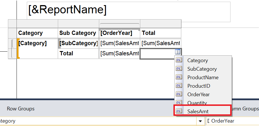
Figure 18: Adding SaleAmt to the empty cell for a grand total
I also had to format that last cell since it didn’t pick up the previous formatting. After running the report, the first page in Print Layout mode looks like Figure 19.
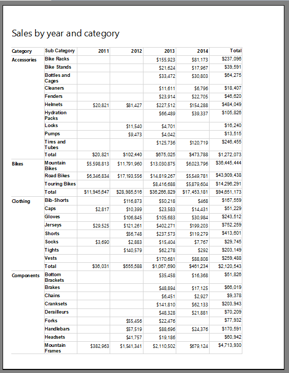
Figure 19: The matrix report with totals in Print Layout mode
Obviously, you can add colors, a footer, and more to make this report look nicer, but just getting the data displayed correctly was quite simple! There’s one more thing that might be useful here. If you are in Print Layout mode and scroll, you’ll see that the top headings do not carry over from page to page. (If you are seeing alternating blank pages, go back adjust the page margins and make sure that the report edge has been pulled to the left.) To get the headings to appear on the second and subsequent pages, go to the Tablix properties and change the RepeatColumnHeaders and RepeatRowHeaders to True as shown in Figure 20. Probably the easiest way to see the Tablix properties is by selecting it from the list in the Properties window.
(Note that this method to repeat headings doesn’t work on regular table reports, and I’ll explain how to do that later in the article.)
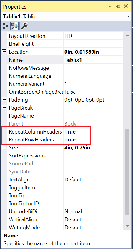
Figure 20: The properties to get the matrix report headings to repeat
Now that you have seen how to create a matrix report, it’s time to learn how to create a regular row-grouped report.
Creating a table report
You saw a glimpse of row groups in the last section, but this time you will learn even more about row groups in reports as you create the report shown in Figure 1. To get started, create a new report in the project with the name Product Sales. It will also point to the project’s shared data source. Create a dataset using the same query that was used in the matrix report. Add a Table control to the report canvas and fill in the Data row, also known as the detail group, as shown in Figure 21. The headings should fill in by themselves.
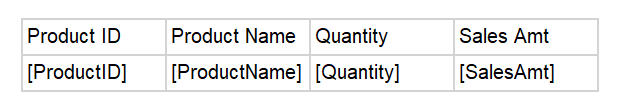
Figure 21: The table with the detail row fields
The report is grouped by Category Sub Category OrderYear, so OrderYear is the first “parent” above the detail. In this type of report, I think it is easier to start at the detail and build out, but you can also go the other way. To add the group, right click the Details group in the Row Groups section. Select Add Group Parent Group… as shown in Figure 22.
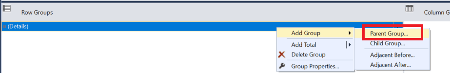
Figure 22: Adding a parent group
This will bring up the Tablix group dialog where you will select the group’s field. Select OrderYear since it is the direct parent of the detail row. Also check Add group footer. This is where the subtotals will go. The dialog should look like Figure 23.
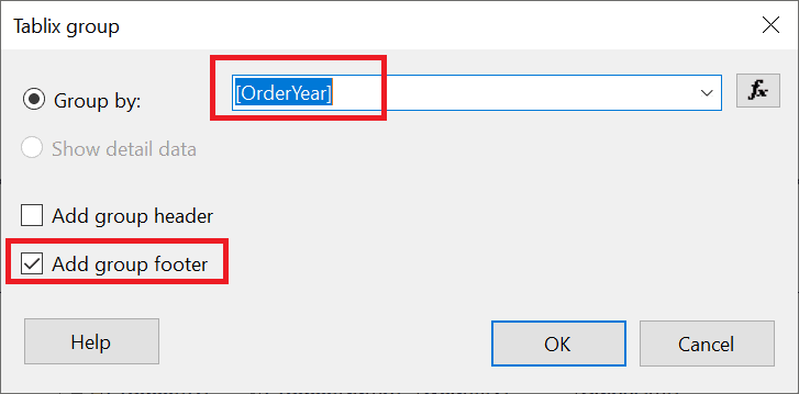
Figure 23: The Tablix group dialog
After you click OK to add the group, you’ll see quite a few changes to the report canvas. The Order Year group has been added to the report and to the Row Groups section. Figure 24 shows the report canvas at this point.
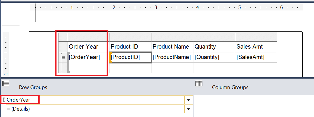 Figure 24: The OrderYear group added to the report
The next parent level is SubCategory. This time, I’ll show you another way to add a group. Right-click on the OrderYear cell and select Add Group Parent Group… as shown in Figure 25.
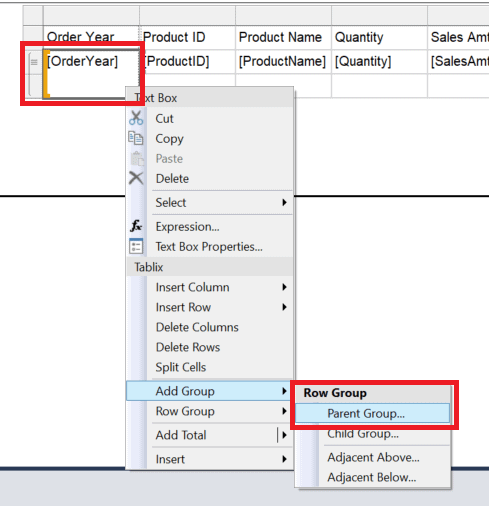
Figure 25: Another way to add a parent group
Add SubCategory as the new group and be sure to select Add group footer. Repeat the process to add Category using either method. Make sure to add the new group as a parent to SubCategory. Once all the groups are added, the report canvas should look like Figure 26.
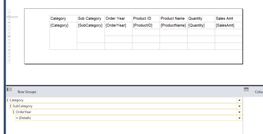
Figure 26: All the groups added to the report
There are a lot of empty cells, and you can add totals to some of them. To figure out which grouping level a particular cell belongs to just select it. You’ll see the grouping level light up in orange as shown in Figure 27.
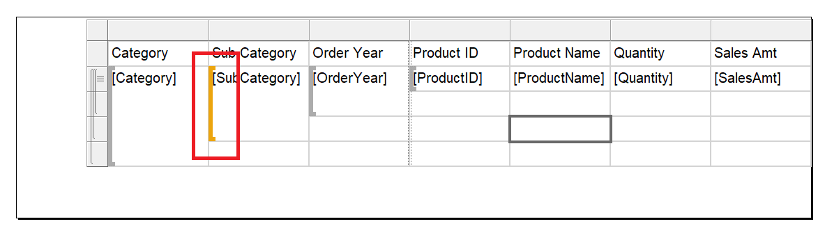
Figure 27: The grouping level lights up in orange
To add subtotal for each level, fill in SalesAmt for each cell underneath the SalesAmt cell. You can also add subtotals for Quantity. They will automatically sum as shown in Figure 28.
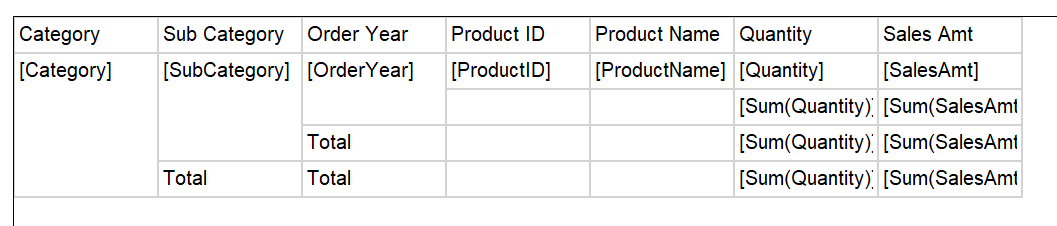
Figure 28: Adding subtotals
You can also add a grand total to the report by right-clicking the bottommost SalesAmt cell and selecting Add Total as shown in Figure 29.
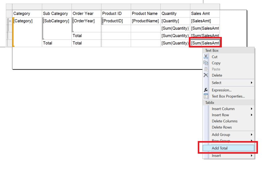
Figure 29: Adding a grand total
When adding a total in this way, it is automatically added to the next parent grouping level. In this case, Category is at the top, so the total is added to the report level. You can add a grand total for Quantity. In this case, just add Quantity to the cell. The report design should look like Figure 30.
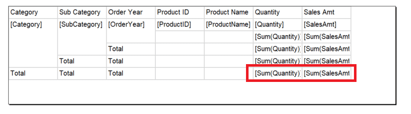
Figure 30: Adding grand totals
Preview the report. The report should look something like Figure 31.
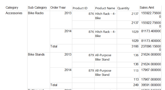
Figure 31: The unformatted report
There is quite a bit of formatting that should be done, but I’ll leave it up to you to decide what to do except to be sure to modify the report’s margins so that all the fields fit on one page. After formatting, my report looks like Figure 32.
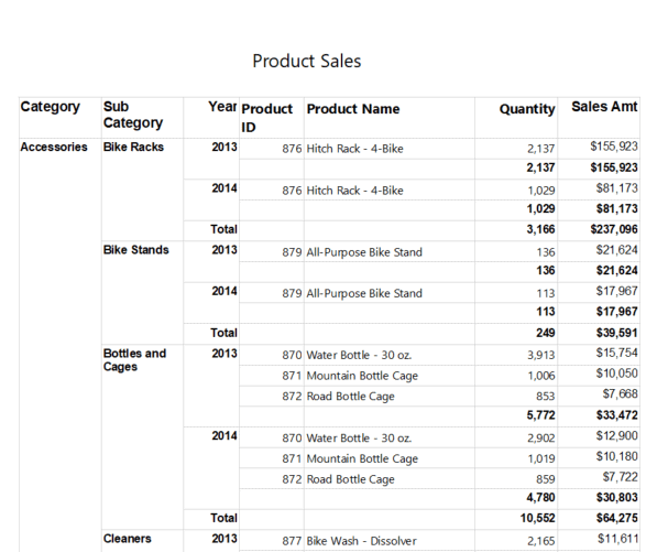
Figure 32: Report with some formatting
If you take a close look, it’s hard to tell what levels the total amounts refer to. To fix that, follow these steps. In the cell under ProductName, add this expression to the Value property:
|
1 |
="Total for " & Fields!OrderYear.Value |
Holding down the Shift key, select the two cells in row 4 and columns 4 and 5. Right-click and select Merge Cells as shown in Figure 33.
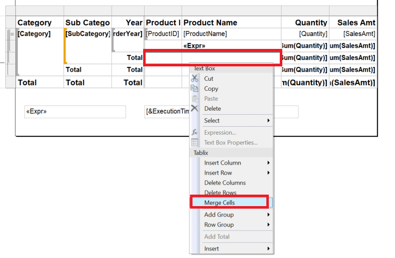
Figure 33: Merging two cells
Add this expression to the new larger cell:
|
1 |
="Total for " & Fields!SubCategory.Value |
Remove the word Total from the cell to the left. Merge the cells in row 5 and columns 4 and 5. Add this formula:
|
1 |
="Total for " & Fields!Category.Value |
Finally, merge the cells in the bottom row and columns 4 and 5. The cell should just say Grand Total. Delete the original word Total from several cells. The report design should look like Figure 34.
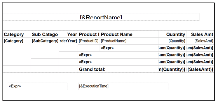
Figure 34: The subtotals labeled
I would like to move some of the labels more to the left, but I found that the Merge Cells option was not always available. If it is for you, then modify accordingly.
The last thing to do to make this report more usable is to have the headings repeat on new pages. If you go into Print Layout mode and scroll to page 2, you will see that the top headings do not repeat. The RepeatRowHeaders property doesn’t seem to do anything on regular table reports. There is a way to do this, though.
On the grouping section at the bottom of the page, select Advanced Mode as shown in Figure 35.
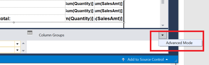
Figure 35: Turning on Advanced Mode
Make sure this is checked which will add Static sections to the row and column groups as shown in Figure 36.
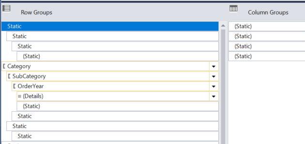
Figure 36: The Static groups
Working only on the row groups, select the first Static group and open the Properties window. Change the RepeatOnNewPage property to True as shown in Figure 37.
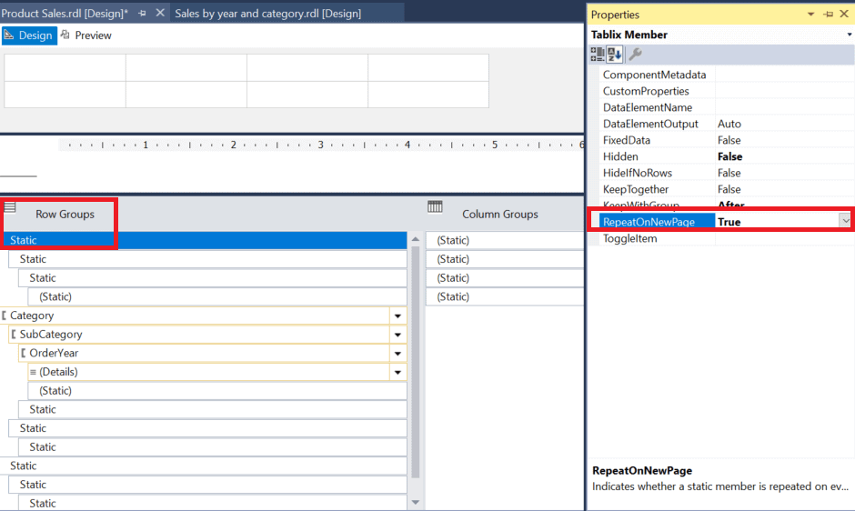
Figure 37: The RepeatOnNewPage property
Repeat the process for the next two Static groups. Now when you run the report and scroll to page 2, you’ll see the top headings repeated. Figure 39 shows you page 2 of my report.

Figure 39: The report with repeating row headings
Summary
This article introduced adding grouping by walking you through the creation of two simple reports. This article covered a lot of ground, but there is still so much to learn. In the next article, you’ll learn more about adding expressions to reports to add even more functionality.
Load comments