Welcome to Six Sigma DMAIC Series. I am launching this series to introduce one of most important problem-solving methodology. DMAIC is one of the most important tools in continuous improvement toolbox. It is closely associated with Six Sigma methodology, but it is also used by many other professionals in various industries. It is a problem-solving framework that helps in discovering root causes of the problem to stable & standard work. It is an iterative process that you can apply to any process problem.
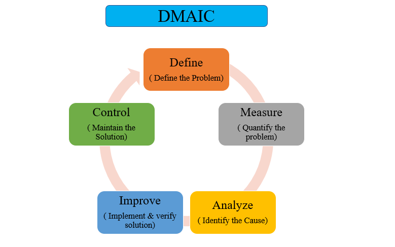
DMAIC is a data-driven quality strategy used to improve processes. DMAIC is an abbreviation of the five improvement steps it comprises: Define, Measure, Analyze, Improve and Control. There is set of standard tools in each phase, which we will learn through this series with help of R computing environment.
Define
In this Part 1 of this series, we will learn about the Define phase and tools used in this phase.
DAMIC cycle begins with Define phase after you identify the problem to solve. The goal of Define phase is to define project goal and deliverable. It includes developing a problem statement and identifying objectives, resources and project milestones.
Three main tools in the define Phase are:
- – Process map
– Cause and Effect Diagram
– Pareto Chart
– Quality Loss Function
Process Map
As the name suggests, the process map is mapping the process. It is a visual representation of the flow of process or work. It shows the series or sequence of events from start to end, for instance from raw material to final product. It helps in following ways:
- – The better understanding of the process, which helps in improving the efficiency of the process.
– Effectively brainstorm ideas for process improvement.
– Improved process documentation and planning of projects.
– Improved communication between team members working on the same project.
– Identifying bottlenecks, process boundaries, and areas for improvement.
In Six Sigma project, you may have different process maps, for example in Define phase you work on “As-Is” Map and Improve Phase you work on “Final process Map”. It is because you did some changes for your process improvement. Improve Phase Map also called as “To Be” Map. In general, there are 2 types of maps in Six Sigma Project: SIPOC and VSM.
- – SIPOC stands for Supplier, Input, Process, Output, Customer ( from Supplier to Customer)
– VSM stands for Value Stream Map. It not only shows the flow of process but also shows which step is adding value to the process and which is a bottleneck.
In this process, we will go through simple 2 stage process mapping strategy which is common for all types. The process map, in general, is built in overall 2 steps:
- – Define Top level map
– Break down the process into simpler steps
Step by Step Creation of process Map
– Identifying Inputs and Outputs: Inputs are X’s of a process and output is Y’s of the process ( also called as CTQ, Critical to quality characteristics of a product )
– Listing the Project Steps: List down your project steps such as Machining, Finishing, Inspection
– Identifying the Outputs of Each Step: Each process create an output, which will be input for next sequential process. So it may be an in-process product or final product.
– Identifying the Parameters of Each Step: Identify and list down parameters affecting the process at a specific step. That is our X’s of that step and they affect the output or features of output.
– Classifying the Parameters – After identifying the parameters, classify them as follows:
- – N Noise: Non-controllable factors
– C Controllable factors: Maybe varied during the process
– P Procedure: Controllable factors through a standard procedure
– Cr Critical: Those with more influence on the process
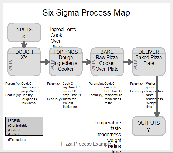
We use SixSigma package to create process map in R. Lets create a process map for making and serving Pizza. The process can be broken down into 4 steps:
- – Prepare the dough
– Spread the toppings.
– Bake the pizza.
– Deliver the pizza to the customer.
Now list the parameters and output at each step.
- – First step: Dough: Parameters: cook (C), a brand of flour (C), the proportion of water (P). Outputs: dough (density, toughness, and thickness).
– Second step: Toppings: Parameters: cook (C), a brand of ingredients (Cr), amount of ingredients (P), preparation time (Cr). Outputs: raw pizza (diameter, weight, thickness).
– Third step: Baking: Parameters: cook (C), queue (N), baking time (Cr). Outputs: baked pizza (temperature, tenderness, taste).
– Fourth step: Deliver: Parameters: waiter (C), queue (N). Outputs: pizza on the table (temperature, taste, tenderness, weight, radius, time).
Now, we know that each process has some input /output and some parameters involved in each process. The data here are character string data that represent Input, process, parameters and output names. Input/Output is represented as vector strings. The output from a process is input to next process.
Let’s create sample process map for piston manufacturing company. There are four processes: Forging, Machining, Finishing, and Assembly.
#Load package
library("SixSigma")
# Create vector of Input , Output and Steps
inputs <-c ("Ingredients", "Cook", "Oven")
outputs <- c("temperature", "taste", "tenderness","weight", "radius", "time")
steps <- c("DOUGH", "TOPPINGS", "BAKE", "DELIVER")

#Save the names of the outputs of each step in lists
io <- list()
io[[1]] <- list("X's")
io[[2]] <- list("Dough", "ingredients", "Cooker")
io[[3]] <- list("Raw Pizza", "Cooker", "Oven Plate")
io[[4]] <- list("Baked Pizza", "Plate")

#Save the names, parameter types, and features:
param <- list()
param[[1]] <- list(c("Cook", "C"),c("flour brand", "C"),c("prop Water", "P"))
param[[2]] <- list(c("Cook", "C"),c("Ing.Brand", "Cr"),c("amount", "P"),c("prep.Time", "Cr"))
param[[3]] <- list(c("Cook","C"),c("queue", "N"),c("BakeTime", "Cr"))
param[[4]] <- list(c("Waiter","C"),c("queue", "N"))

feat <- list()
feat[[1]] <- list("Density", "toughness", "thickness")
feat[[2]] <- list("Diameter", "Weight", "thickness")
feat[[3]] <- list("temperature", "tenderness", "taste")
feat[[4]] <- list("temperature", "taste", "tenderness","weight", "time")
# Create process map
ss.pMap(steps, inputs, outputs,io, param, feat,sub = "Pizza Process Example")
Gives this plot :
A process map can also be created using other packages such as a diagram. Instead of using GUI interface, the advantage of using R for process map is that it is reproducible.
Cause and effect Diagram
While working on team projects, you may observe that different team members have different opinions towards the underlying root cause of a problem. Cause and Effect (a.k.a. Fishbone) Diagram is an efficient way to capture different ideas and stimulate the team’s brainstorming on root causes. It identifies many possible causes for an effect or problem. It helps in following ways:
- – Identify possible causes for an effect or problem.
– Effective Brainstorming as it records most of the possible causes of the problem.
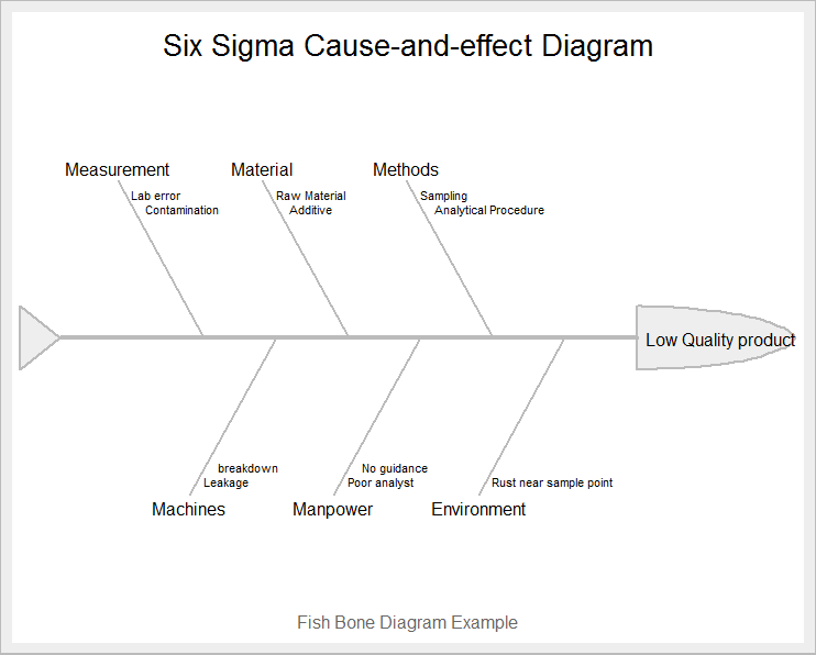
We again use Sixsigma package for creating Cause and effect diagram
# Cause and Effect Diagram
##Create effect as string
effect <- "Low Quality product"
##Create vector of causes
causes.gr <- c("Measurement", "Material", "Methods", "Environment",
"Manpower", "Machines")
# Create indiviual cause as vector of list
causes <- vector(mode = "list", length = length(causes.gr))
causes[1] <- list(c("Lab error", "Contamination"))
causes[2] <- list(c("Raw Material", "Additive"))
causes[3] <- list(c("Sampling", "Analytical Procedure"))
causes[4] <- list(c("Rust near sample point"))
causes[5] <- list(c("Poor analyst","No guidance"))
causes[6] <- list(c("Leakage", "breakdown"))
# Create Cause and Effect Diagram
ss.ceDiag(effect, causes.gr, causes, sub = "Fish Bone Diagram Example")
Gives this plot :
You can also create Cause and effect diagram by qcc package in R by calling cause.and.effect function in R
Pareto Chart
A Pareto chart is a type of chart that contains both bars and a line graph, where individual values are represented in descending order by bars, and the cumulative total is represented by the line. In this way, the chart visually depicts which situations are more significant. The Pareto Principle states that 20% of all potential projects will produce 80% of the potential benefits to the business.
It helps in following ways:
- – Identifying which problem is more important and needs our attention.
– Effective use of resources, as It’s better to have five projects in the 20% high-impact category than thirty projects spread across the payback spectrum.
Let’s create a Pareto chart in R. Imagine you have 6 type of defects in some product category: Defect A, B, C, D, E, F and you have a total number of defects and frequency of each defect. Pareto chart can be created from this data by calling pareto.chart function from qcc package in R
#Pareto Chart
library(qcc)
defect <- c(60,20,16,14,8,9)
names(defect) <- c("A", "B", "C", "D","E","F")
pareto.chart(defect, ylab = "Defect frequency", col=heat.colors(length(defect)))
Gives this plot :
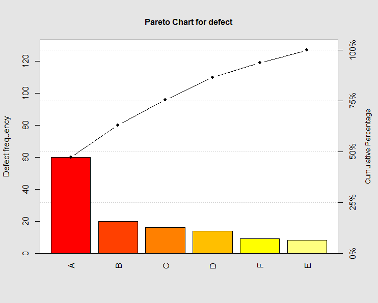
The plot shows that around 65 % of defectives coming from A and B, so we need to focus on these.
Loss Function Analysis
Since there are only a few features of a product that is critical to Quality (CTQ) or important to the customer. So in order to meet that customer expectation, the process should be correct. In Six Sigma professionals language: high-quality processes lead automatically to high-quality products. The cost of poor quality will result in a quantifiable loss for the organization. This loss can be modeled by a function. Its called quality loss function introduced by Taguchi, to calculate the average loss of a process. When the CTQ characteristic lies outside of the specification limits, that is, quality is poor, the company incurs a cost that obviously must be calculated.
Modeling the Loss Function
Notation: The CTQ characteristic will be represented by Y. The loss function will provide a number indicating the value of the cost in monetary units. This cost depends directly on the value of the CTQ. So, loss is a function of the observed value and represent it by L(Y). For every value of the CTQ characteristic, we only have one value of the loss (cost).
The target value of the CTQ characteristic is denoted by Y0 and the tolerance by Δ. Let the cost of poor quality at Y = Y0 +Δ be L0. So L0 = L(Y0 +Δ)
Taguchi Loss Function
It’s not sufficient to have a CTQ characteristic inside the specification limits. In Six Sigma way, it should approximate the target with as little variation as possible. Then the loss function should be related to the distance from the target.
Loss function defined as: L(Y) = k(Y −Y0)^2
This function has the following properties:
- –
Loss=0, when the observed value is equal to the target.–
Loss increases when the observed value moves away from the target.– The constant k is indicative of the risk of having more variation.
Example
A factory makes bolts whose CTQ characteristic is the diameter of the bolts. Suppose you want to assess the process of making 10-mm bolts. The following data is available to you:
- – The customer will accept the bolts if the diameter is between 9.5 and 10.5 mm.
– When a bolt fails to meet the requirements, it is scrapped, and the cost estimation is 0.001 monetary units.
Thus the target is Y0 = 10, the tolerance of the process is Δ = 0.5mm, and the cost at Y0 +Δ is L0 = L(Y0 +Δ) = 0.001.
The value of k can be computed from formula of the loss function:
L(Y) = k(Y −Y0)^2,
L(Y0 +Δ) = k((Y0 +Δ)−Y0) = L0,
k ×Δ = L0,
k = L0/Δ .
So, we can model the loss function knowing the tolerance (Δ) and the cost of poor quality of an individual item (L0). In above example: k= 0.001/0.5=0.002
Loss function for the process of making bolts is L(Y) = 0.002(Y −10)^2
We can plot this function in R with following code :
curve(0.002 * (x - 10)^2, 9, 11,
lty = 1,
lwd = 2,
ylab = "Cost of Poor Quality",
xlab = "Observed value of the characteristic",
main = expression(L(Y) == 0.002 ~ (Y - 10)^2))
abline(v = 9.5, lty = 2)
abline(v = 10.5, lty = 2)
abline(v = 10, lty = 2)
abline(h = 0)
text(10, 0.002, "T", adj = 2)
text(9.5, 0.002, "LSL", adj = 1)
text(10.5, 0.002, "USL", adj = -0.1)
Gives this plot :
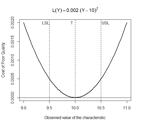
The plot above demonstrates that the target value and the bottom of the parabolic function intersect, implying that as parts are produced at the nominal value, little or no loss occurs. Also, the curve flattens as it approaches and departs from the target value.
In the above example, we created the quality loss function for a single item. However, the objective of the loss function analysis is to calculate the cost of poor quality for a process over a period of time. Therefore, if we have n elements in a period or set of items, the average loss per unit (L) is obtained by averaging the individual losses.
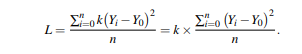
The second factor is the mean squared deviation (MSD). Hence, the average loss per unit in a given sample (period, batch, . . . ) is simply expressed by L = k(MSD)
Let’s create quality loss function for the process in R using sample data of bolts
# Create loss function with Tolerance=0.5 ,target=10,Cost of poor quality=0.001,batch size=100000)
 ss.lfa(ss.data.bolts, "diameter", 0.5, 10, 0.001,lfa.sub = "Bolts example loss function",
lfa.size = 100000, lfa.output = "both")
Gives this plot:
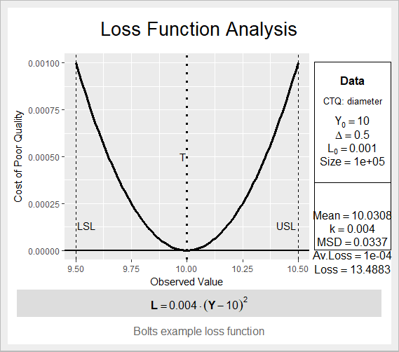
Quality loss function helps in Define phase in a way where you can say that you are loosing on quality because of variation in the process, that’s why you need to initiate the project.
Conclusion
To conclude ,There are 4 above important tools in Define phase, that help us in understanding the process better by process map, identifying possible root cause for a problem by documenting through Cause & effect diagram and selecting high payback projects to work on through Pareto analysis and knowing your quality loss due to variance in your process by quality loss function. These are quite powerful tools in Define phase, as it sets your way forward towards the progress of the project.
In next part, we will go through Measure Phase, where we will learn about Measurement system analysis (Gage R & R study) and process capability analysis in R.
References
- Six Sigma wih R – Book Website
Six Sigma Package in Cran
qcc Package in Cran
Hope you all liked the article. Let me know your thoughts on this. Make sure to like & share it. Happy Learning!!