 Marco Russo
When we decided to create a dashboard for the Best Report Contest, we spent time looking for an interesting dataset that could have been useful in future demos, too. The goal was to invest in something that would have been useful for educational purposes later. At the end, the decision was to create an infographic in a single-page report, which included data about the exploration of the space outside planet Earth. Starting from a draft drawing made using professional graphical tools, which provide complete freedom to the designer, we had to create the same artifact with live data in Power BI. Instead of trying to figure out what to do with the visualizations available in the product, we had to adapt Power BI to our graphical requirements. We certainly made some compromise, but we also found interesting solutions that we wanted to share.
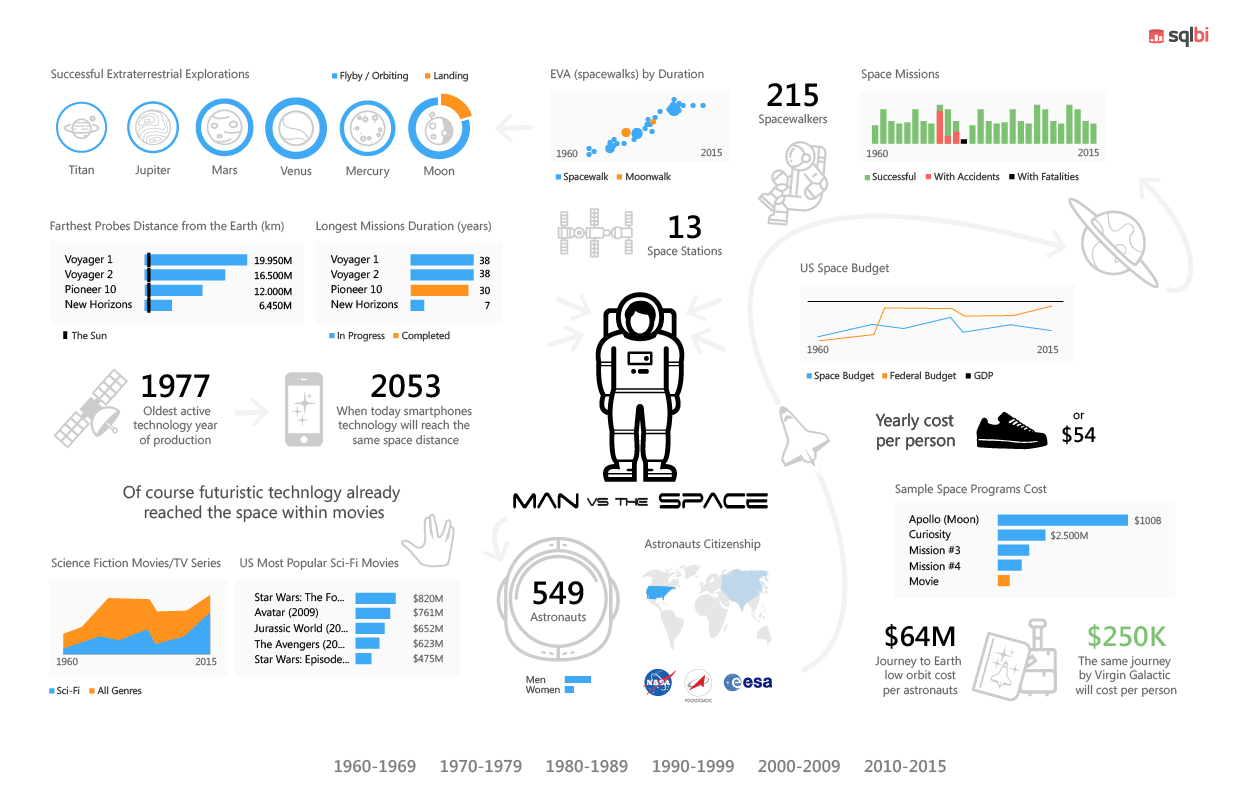
The initial design was the following one (including some mistake for inaccurate editing!). This is a bitmap designed with professional graphical tools before any Power BI model and report was created.
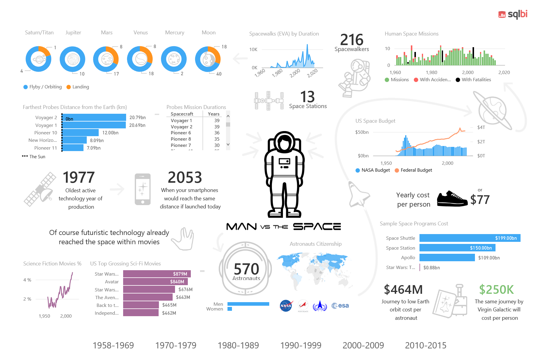
The final result is the report you can try online here, and that you can also see in the following static picture.
We collected several data sources in many Excel tables, and we created a data model based on that. Overall, the dataset is not so large, but we had to do a number of cleansing operation which would have been too hard and expensive to make reproducible. Moreover, most of the data sources were static pages, so dynamic refresh was not really an option. However, different tables with different granularities required the creation of a data model, with several tables, as you see in the following picture.
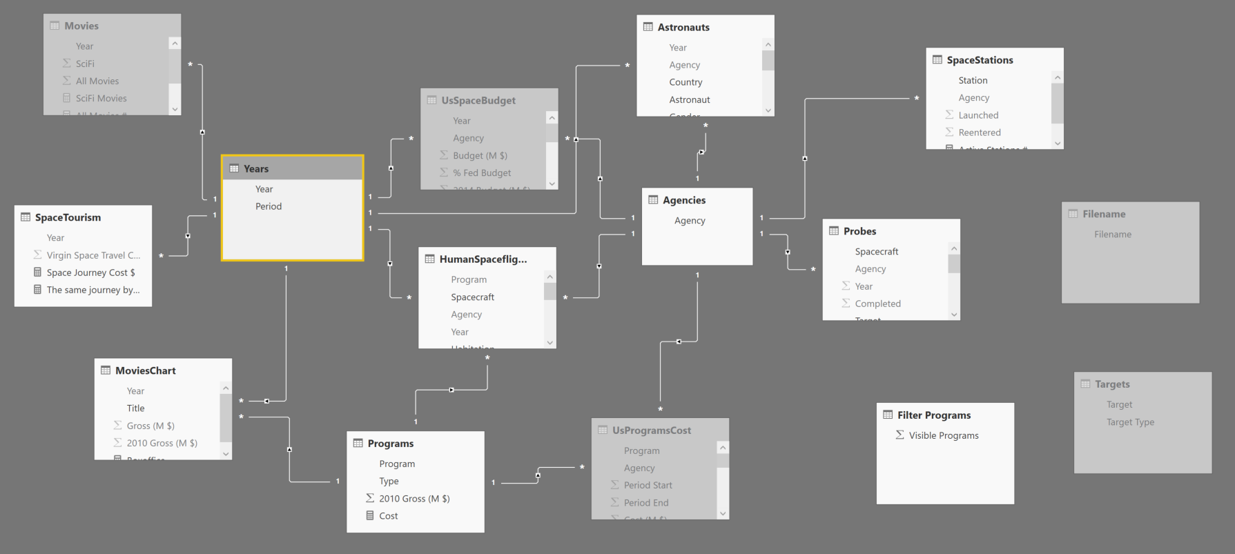
Thanks to relationships between entities, selecting elements in the data model dynamically filters data. For example, you can choose a period in the bottom bar, and you can see only statistics related to that selection.
We will describe more details about the dashboard in three areas:
- Visuals: how to solve specific visualization issues.
- Data model: how to transform data and adapt the data model to visualization and interaction requirements.
- Miscellaneous: combination of both techniques and other considerations.
Visuals
With a precise graphical requirement (the static picture drawn in a professional graphical editor), we had a number of practical issues. How to obtain a dense visualization with certain graphical effects? How to display a dynamic picture based on the value of a measure? How to display the top 3 elements if the chart does not have the option? Let’s see how we solved these and other problems.
Overlapping Visuals
Several objects in the report have a graphical background. The best way to achieve this is placing the “active” component on top of a graphical background, as we did in the label for the number of Astronauts.

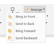
You need to control the z-order, so that the number are “on top” of the picture. You can do that with the Arrange menu. It is pretty easy, but this simple technique solved most of the graphical requirements.
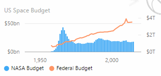
When you display a measure in the report, you should name the measure exactly as you want to be described in the report. For example, in the following chart we had to create two measure named exactly “NASA Budget” and “Federal budget”. Sometime the original names were different, so we had to rename the measures according to the report naming convention.
In fact, you cannot “rename” the visualization of a measure. This is going to be a limitation when you cannot change the underlying data model, for example when you connect to Analysis Services using a live connection. This could be fixed in the future when Power BI will allow you to create “local” measure when you connect to Analysis Services, or when the selected visual will allow you to create a description overriding the original measure name. However, renaming the measure is the most practical solution at the moment.
Show data with blank measures summing zero
By default, Power BI hides values when there are no rows selected. The blank result of a measure might have many side effects, such as removing an item from a table or from a chart. However, you might want to display zero even when the selection produces zero rows as a result. For example, selecting the 1958-1969 period, there are no space stations selected in the related table. However, we want to see “zero” and not “(blank)”, as you would obtain by default.

In order to get the version on the left, we just sum 0 to the original measure definition. In this way, if there are stations counted, the will be 0 instead of blank (look at the last line of code in the measure).
Space Stations :=
CALCULATE (
    DISTINCTCOUNT( SpaceStations[Station] ),
    FILTER (
        SpaceStations,
        SpaceStations[Launched] <= MAX ( Years[Year] )
    )
) + 0
Custom Visuals
The infographic had to display the represent a particular measure (the yearly cost of the NASA budget per person) representing an object that has a similar cost. The requirement is simple, switch the picture depending on the value of a measure. Unfortunately, we did not find a suitable component for this visualization, so we created a small custom visual that displays an image (from a given URL) for a corresponding range of values. The final result is that different values show different pictures.
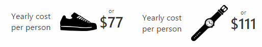
You can find this custom visual in the dashboard. We might publish it if we will receive feedback about possible usefulness for a wider number of reports.
Data model
We collected data from different public data sources, and we manually cleaned most of them. In this case, an automation of the extraction and data cleansing operations was not a priority. However, we applied several small transformations to adapt the data model to the reporting requirements, or to just improve the maintenance and the effort during development.
Centralize external path/filename dependencies
We kept the data source on a single external Excel file, but we needed to be able to refresh the data at any moment. In this way, it was possible to work on the data (adding columns or fixing rows) when at the same time someone else was working on the Power BI report. However, two developers working on different machines will have different local paths for the same file. When you import a local file in Power BI Desktop, the complete path is saved in the query. If the file is not there, you get this error when you open the query.
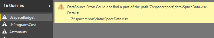
This happens for every single table, so importing more than 10 tables from the same file required to rename the file name in every different query. It was a big waste of time.
We consolidated the name of the file in a specific query, and we referenced it in the queries of the tables, replacing the name created by the wizard with our internal name. First, we created a query (Filename) that just returns the name of the file.
let

    Source = "Z:\spacereport\data\SpaceData.xlsx"

in

    Source
Then, we changed every single reference to the file from:
let

    Source = Excel.Workbook(File.Contents("Z:\spacereport\data\SpaceData.xlsx"), null, true),
to:
let

    Source = Excel.Workbook(File.Contents(Filename), null, true),
In this way, when we open the file on a difference machine, we just have to fix the path in the Filename query and all the queries are automatically fixed.
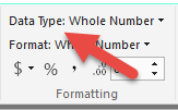
Set the right data type
When you import data from untyped data sources such as an Excel file, Power BI tries to guess the data type of each column, but usually you will have to fix the data type of some columns because of the intended usage of them.
For example, several columns are imported with a data type “Any” in the query of Power BI Desktop. In the data model, these columns are usually considered as Text, but several times we had numbers we wanted to sum. The best practice here is to fix the data type at the query level, and not changing the data type in the column of the data model. Another common change is to use an integer (Int64) instead of a decimal. These small changes will save you time later when you will derive measure, because they will immediately work as you expect, also in terms of default format.
We know this seems a trivial suggestion, but we have seen that being lazy at the beginning, without spending time fixing the data type upfront, will generate many small issues later, which will require small refactoring of data type and/or display format. Moreover, in case you have some wrong data, in a following update of the data source, fixing the error is easier when the query fails (because of an invalid type conversion), rather than when the data model fails (because the column cannot be imported).
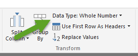
Lesson learned: set the right data type in the query editor (see the picture)
and not in the data model (in the following screenshot)
Create conformed dimensions
We have several tables that contains the Agency column. This attribute is used as a slicer here (we used the synoptic panel in order to use a different size for each logo):

When you click on the agency logo, you filter several tables, as you see in the data model at the beginning of this article. The Agencies table has six relationships, so it filters six different tables. However, we did not have an Agencies table in the data source: we created it using a query that filter the Agency column from the related six tables and generates a list of the unique values, ignoring the blank one. You can see this “normalization” query in the following script.
let

    AgenciesAstronauts = Table.SelectColumns(Astronauts,{"Agency"}),

    AgenciesProbes = Table.SelectColumns(Probes,{"Agency"}),

    AgenciesHumanSpaceflights = Table.SelectColumns(HumanSpaceflights,{"Agency"}),

    AgenciesSpaceStations = Table.SelectColumns(SpaceStations,{"Agency"}),

    AgenciesComplete = Table.Combine({AgenciesAstronauts,AgenciesProbes,AgenciesHumanSpaceflights,AgenciesSpaceStations}),

    #"Removed Duplicates" = Table.Distinct(AgenciesComplete),

    #"Filtered Rows" = Table.SelectRows(#"Removed Duplicates", each [Agency] <> null)

in

    #"Filtered Rows"
Avoid two-way relationships
All the relationships in the data model have the single cross-filter direction. This might seem strange, considering that the default is bidirectional when you create a new data model in Power BI Desktop. The reason is that we have many fact tables (table who contain data for measures) and the bidirectional cross-filter is a good idea when you have a single fact table and as many dimension as you want.
The behavior of bidirectional filters can be unintuitive to many users when you have complex relationships (two or more fact tables is enough to be there).
Lesson: think carefully about keeping the bidirectional cross-filter in your relationships when you have two or more fact tables in the data model.
Miscellaneous
We had to prepare data in a certain way in order to obtain the desired visualizations made by existing visuals.
Compare two different data types
In one chart we compare movies and space programs. They are from different data sources, so for this visualization we created a single table merging two different data sets, and creating an additional column that explains the original data source (which is also the data type for the visualization).
This is the chart we obtained: it combines the cost of space programs (which are in one table) and the revenues of science fiction movies (included in another table).
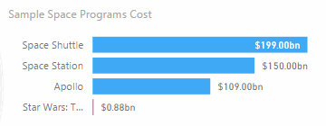
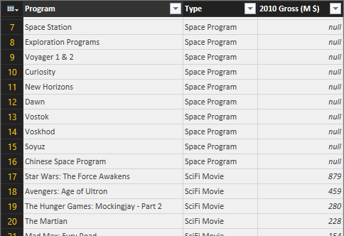
In reality the cost of space programs combines two different tables (UsProgramsCost and HumanSpaceflights), so starting from three different tables (the thirds is SpecialPrograms, which we obtained from MoviesChart) we created a single table with all the data with three columns, as you see in the following picture: Program, Type, and the amount.
The Type column has a fixed string that depends on the data source. The movies have “SciFi Movie”, as you see in the following query (which we defined as “SpecialProgram”):
let

    Source = MoviesChart,

    #"Removed Columns" = Table.RemoveColumns(Source,{"Year", "Gross (M $)"}),

    #"Added Custom" = Table.AddColumn(#"Removed Columns", "Type", each "SciFi Movie"),

    #"Renamed Columns" = Table.RenameColumns(#"Added Custom",{{"Title", "Name"}})

in

    #"Renamed Columns"
The following query generates the final result you have seen in the previous picture, using Combine to append three queries that have the same structure (with three columns).
let

    Programs1 = Table.SelectColumns(UsProgramsCost,{"Program"}),

    Programs2 = Table.SelectColumns(HumanSpaceflights,{"Program"}),

    ProgramsComplete = Table.Combine({Programs1, Programs2}),

    #"Removed Duplicates" = Table.Distinct(ProgramsComplete),

    #"Filtered Rows" = Table.SelectRows(#"Removed Duplicates", each [Program] <> null),

    #"Added Custom" = Table.AddColumn(#"Filtered Rows", "Type", each "Space Program"),

    #"Renamed Columns" = Table.RenameColumns(#"Added Custom",{{"Program", "Name"}}),

    #"Appended Query" = Table.Combine({#"Renamed Columns",SpecialProgram})

    #"Renamed Columns1" = Table.RenameColumns(#"Appended Query",{{"Name", "Program"}})

in

    #"Renamed Columns1"
We created a redundant table just for one visualization, putting exactly the data we wanted to display in a structure that was nice for a visual component. If you cannot bind the data to a component, you can still change the data shape so that it is easier to use to display data.
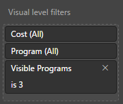
Visible programs
The chart you have seen in the previous example (Sample Space Program Cost) has a particular visualization: it has to filter the first three “Space Program” and then the first “SciFi Movie”. It is not possible to apply this type of filter logic to the visual component, so we implemented the logic in the DAX measure, which returns blank whenever the member should not be visible in the visual component.
In order to keep some flexibility, we wanted to parameterize the number of programs visible before the movie, so we applied the parameter table pattern creating a table “Filter Programs” with numbers from 1 to 10 (in a column named Visible Programs) that we can use as argument in the following DAX measure:
Cost :=
IF (
    HASONEVALUE ( MoviesChart[Title] ),
    IF (
        RANKX ( ALL ( MoviesChart ), CALCULATE ( [Boxoffice], Years ) ) = 1,
        [Boxoffice]
    )
)
    + IF (
        HASONEVALUE ( UsProgramsCost[Program] ),
        IF (
            RANKX ( ALL ( UsProgramsCost ), CALCULATE ( [Program Cost $], Years ) )
                <= IF (
                    ISFILTERED ( 'Filter Programs'[Visible Programs] ),
                    MAX ( 'Filter Programs'[Visible Programs] ),
                    99999999
                ),
            [Program Cost $]
        )
    )
With this implementation, we can apply the filter to the component specifying the number of programs that should be visible (3 in this case).
We did not parameterize the number of movies visible in this case, but you can apply the same pattern, for example by duplicating the Filter Programs in a Filter Movie table and then specifying the same filter in the DAX measure.
Conclusion
Power BI provides high flexibility in the way you can create reports once you realize that you can use all the tools available (its query language, the data model, DAX, and the visual components that you can also extend with custom ones). Expecting that everything should be a property or a wizard in the tool is not the right approach, at least in the current versions. I expect that certain features will be integrated better in the product in the future, but you will always have more visualizations options if you get used to consider the entire toolset available in Power BI, and not just the visual features.