
Last week, the World Bank Data team descended on New York City for Visualized - a two day event exploring the “evolution of communication at the intersection of big data, storytelling and design.”
It was awesome.
Here are seven things I learned:
1) Iteration is the path to perfection
By now you’ve heard of Nate Silver - the statistician behind FiveThirtyEight and a near-perfect prediction of the 2012 US elections. What you may have missed is the best interactive graphic of the year - the New York Times’ “Paths to the White House” built with Mike Bostock’s D3:

Shan Carter from the NYT graphics team showed how newspapers have struggled to represent the potential scenarios and actual outcomes of US elections ever since the late 19th century. His team eventually came up with the graphic above, but see how many revisions they went through to get there:
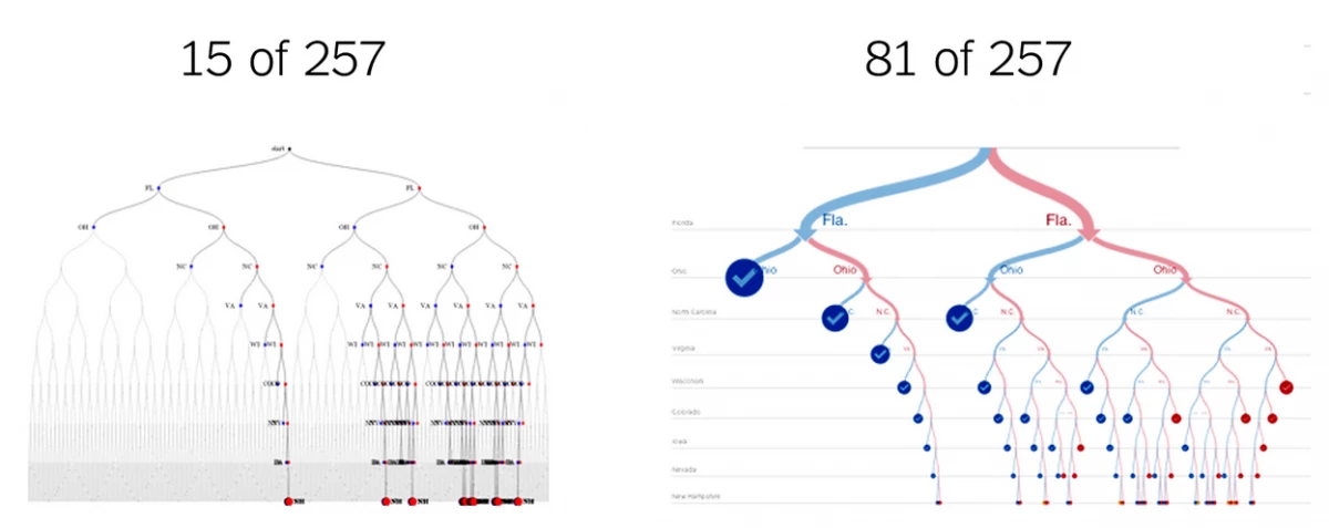
That’s 257 revisions. As early as version 15, you can see the core idea. At version 81, it looks almost done, but it takes another 157 revisions and that extra attention to detail, high production values and pride in your work to be at the top of your game like this.
Lesson: Iterate and aim high: editors are your friends, they’ll make your work stand out. Also: this is the benchmark for what a good data visualization looks like - if you can’t honestly say what you’re doing is at least this good, iterate.
2) Competitions can waste creative talent
Scott Belsky of Behance - an online showcase of creative work talked about “the future of creative careers.” One of his ideas stuck with me:
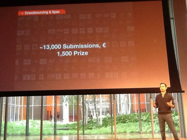
Creative competitions (design / apps contests) can be a tremendous waste of talent.
I paraphrase, but Scott gave the example of a company’s logo design contest that had a prize of EUR 1,500. How many entries did they receive? 13,000. How much creative talent is that? About 4 person years of work. Does that sound like a good use of time?
But wait Tariq! Doesn’t the World Bank hold apps contests like this too? (I hear you say) Yes we do, and I must admit, I sometimes have the same thoughts about our contests, but then I’m reminded of Clay Johnson’s post from way back in 2010 “Build Communities Not Contests”. The most valuable result of a good contest isn’t apps, it’s the people and relationships you bring together - the World Bank’s contestants have demonstrated this for me.
Johan and Amparo (my economist colleagues...) point out that “life is a trade-off problem.” For the Bank the question here is “how do we get creative talent to spend time on what it takes to eliminate poverty.” Participants are often choosing to work on these issues rather than something (presumably) less socially positive. If that is what’s going on, challenges seem to be a good thing.
Lesson: Communities, not contests - competitions can consume a huge amount of person time, focus on building communities instead. Respect that people may choose to work on your challenge, so make sure it’s a worthy one!
3) You too can discover a planet: gamification done right

Javier de la Torre from Vizzuality showed us planethunters.org (Warning: if you’re even slightly interested in space, budget 1-2 hours for getting sucked into this) It’s the tool behind last month’s discovery and identification of “PH1” - the first planet ever found in a four-star system.
How did they do it?
With some citizen-science and a little distributed “human computation”. The data they’re using comes from NASA’s Kepler Space Observatory. Kepler’s goal is to help find planets by looking at the light coming from stars and then checking for “blips” in the signal that may be caused by a planet passing by. After NASA has analysed fresh data for 6 months, they release it to the public to see if they can spot anything they missed.
The Planet Hunters site takes the public “light curves” data (as you can see above) and shows them to humans who are generally much better than computers at pattern matching. Once candidate planets are found by multiple users of the website, the data are sent to professional astronomers for verification. The site uses simple “gamification” principles to make this all fun, usable and seriously useful for research.
Lesson: Even for specialised, high-volume data, there are people outside your organization who can take it to do things you couldn’t and in ways you don’t. There’s lots of people willing to help you if you allow them to, particularly if you make it fun and rewarding.
4) Re-usable visualizations let you focus on the story
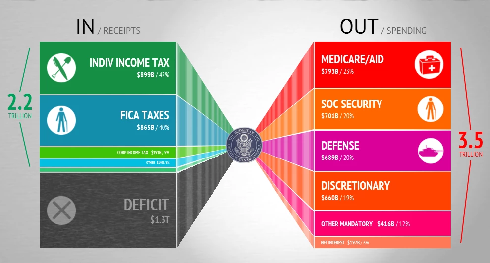
Quick: how many ways have you seen a budget visualized?
If you’re like me, you’ve seen at least a couple of dozen each with their own quirks and charms. Neil Halloran of Visual Budget showed his superb tool designed to “appeal to everyone from policy makers to high school students”
I love things like this and Open Spending. They’re ready-made, re-usable presentations of changing data that let you focus on the story you’re trying to tell. When you listen to Neil this comes through - he didn’t talk about technology or graphic design, he was telling us the story of why good public knowledge of a country’s budget is important.
As far as I know, Neil’s tool isn’t open-source (like Open Spending is) so someone in another country couldn’t adapt it for their own budget. Perhaps that’s part of Visual Budget’s business plan, but the tool's still really useful because Neil can presumably load new data into the system as it becomes available.
Of course, this approach doesn’t just apply for budget visuals. Have you ever used Google maps to plot a route using public transit? It works because many governments publish transit data in the GTFS data format - a standard data format that Google and other map providers can suck in and start building services on top of. We need this stuff for every flavour of public open data.
Lesson: Do not re-invent the wheel! If you must invent a wheel, make it re-usable. Re-usable data visualizations let you focus on the story you’re trying to tell. Opening up the source code for visualisations is even better!
5) Simplicity has impact
Peter Crnokrak’s piece “Everyone Ever In The World” blew me away. He took just two numbers: everyone that’s ever lived on the planet: 77.6 billion and everyone who’s ever been killed in wars, massacres or genocides—969 million—and produced this sombre and unsettling graphic. It shows the 1.25% of people ever killed as a void surrounded by the names of the wars, massacres and genocides in which they are recorded to have died.
Three things struck me about Peter’s piece:
- It was slow, careful work collecting the data. He spent 3 months going through recorded history counting deaths to find just one number.
- The medium was just as important at conveying meaning: a dark vinyl material laser etched (and in other editions, thick laser-etched paper that showed burn marks around the lettering)
- The piece was a great conversation starter - it just draws you into the subject and before you know you’re asking “is that really 1.25%? - my intuition must be way off” (yes) or “how exactly did you calculate how many people have ever lived?” (exponential regression and a bit of census / birth rate data)
Lesson: Simplicity can convey volumes when it’s backed up with thought, style and strong production values - it can be a great conversation starter. PS. The numbers above are Peter's estimates and not the World Bank's
6) Complexity has impact
Cedric Kiefer of Onformative - a “studio for generative design” sent shivers down my spine showing the making of “unnamed soundsculpture” If you’ve got 6 minutes, go and watch the videos.
His team 3D-captured Laura Keil dancing to a piece of abstract electronic music using Microsoft Kinect cameras and a bunch of custom software. Laura’s dancing is beautiful, and when the captured data is brought into an animation system and Onformative’s visualisation geeks have their way with it, the result is mesmerizing.

I found Maral Pourkazemi’s infographics about Internet Censorship in Iran captivating for similar reasons. The data from her research could have been communicated with tables, charts and a few simple diagrams but her beautiful illustrations draw on traditions of geometric design in Islamic art to add depth to the data and for me, offered a connection to the people these data are talking about.
Lesson: Used well, complexity conveys volumes. An emotional response or an invitation to explore are also great conversation starters. Remember, there are always two stories: your story and the story of how you made your story.
7) Expose the data behind every story (licensing!)

Simon Rogers, editor of the the Guardian’s Datablog ended the conference with a call to “expose the data behind every story” - and for me, this doesn’t just apply to news organisations. If you’re publishing something built on data, there’s almost no reason for not making the same data available for others to easily interrogate and re-use.
Katy Harris of Fathom Design reminded me why it’s so important for international organizations like the World Bank to do just this. She’d initially build this interactive presentation of the MDGs and Child Mortality for the Guardian but then showed us this prototype visualization of the Millenium Development Goals she’s been working on based on data the World Bank and UN produce:
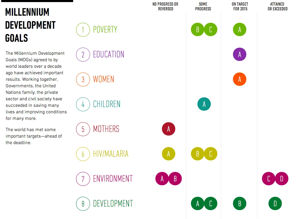
Katy, without ever meeting him, took data that Johan has worked on and produced this great visual that quickly shows progress on the MDGs - it’s one of the best I’ve seen. Now that we’ve all met, I look forward to continuing the conversation with Katy and seeing what happens when development data and visualization geeks meet.
Finally, my favorite line from the event was from Tom MacWright of Mapbox - “As a day job, I make stuff for people to steal and use without attribution - it’s weirdly rewarding.”
While the World Bank’s open data terms of use ask for attribution, Tom’s sentiment and the goal of open licensing are the same: make it easy for others to take your stuff and do awesome things.
Were you at Visualized? What did you think?

Join the Conversation