MSDN and TechNet users are now hammering Microsoft's download servers and getting their hands for the first time on the final Windows 8 build. The various betas have been used and reviewed extensively; what's new in RTM?
The truth is, not a whole lot. The Release Preview was a good representation of what Windows 8 is like to use. Indeed, all the major design and user interface points of Windows 8 have been frozen since the release of the Consumer Preview.
The visible changes are essentially all graphical, and they start fairly early on. We've known since March that Windows 8 would have a tutorial when you first log on, but it hasn't been present in any of the beta builds. It's here in the RTM.
The tutorial is amazingly brief, and there's no obvious way of rewatching it (aside from creating a new user account; the first time that account logs on, it will be shown the tutorial), nor any reminders within the operating system itself of the things the tutorial teaches. The tutorial is also extremely high level. It teaches the fundamental concepts (swipe from the sides if you're a touch user, point to the corners if you're a mouse user) but leaves users on their own when it comes to the finer nuances of the interface. Whether this is really enough—and memorable enough—for a wide range of users, well, we'll just have to wait and see. My instinctive reaction is that it's inadequate.
During setup, the same color combinations for the Metro environment are available as were found in the Release Preview. There's a bunch of tone-on-tone settings, all fairly brightly colored, and a smaller number of options using a bright foreground color against a gray background.
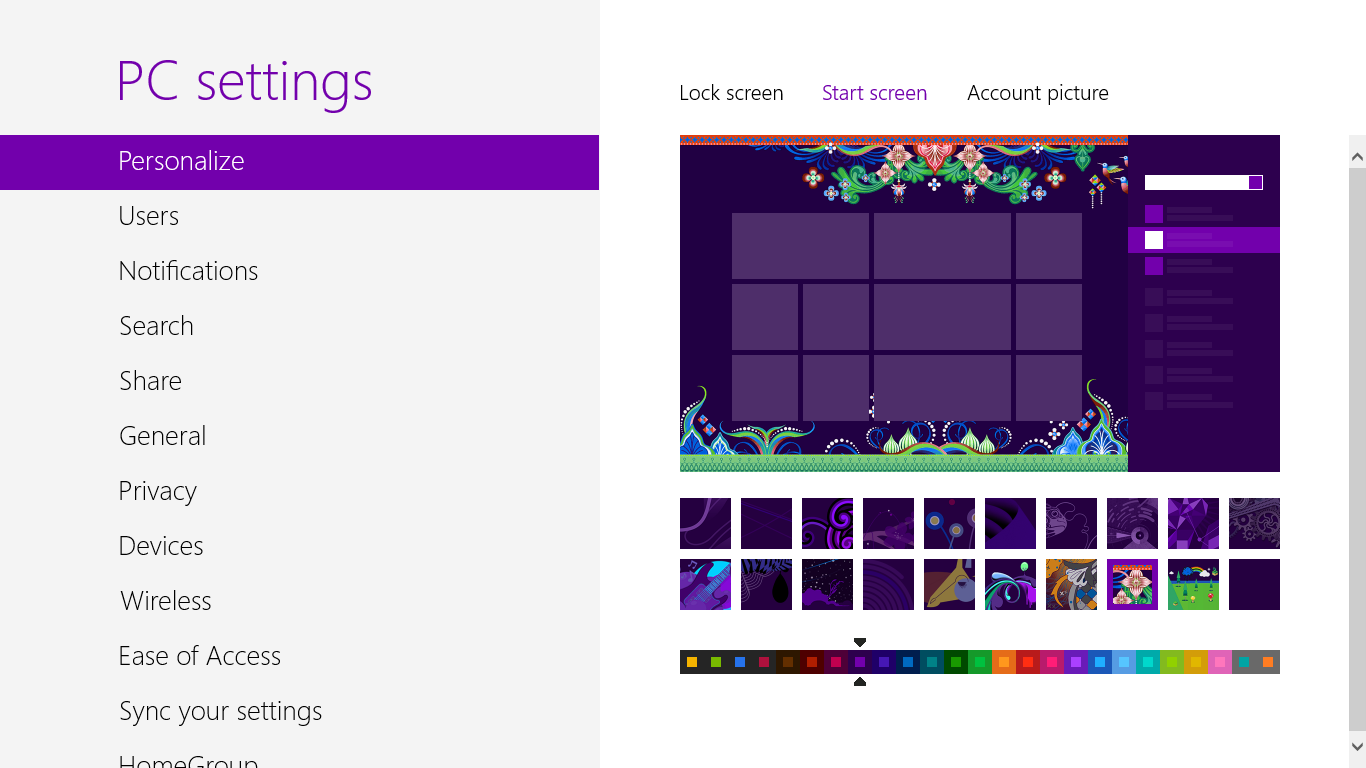
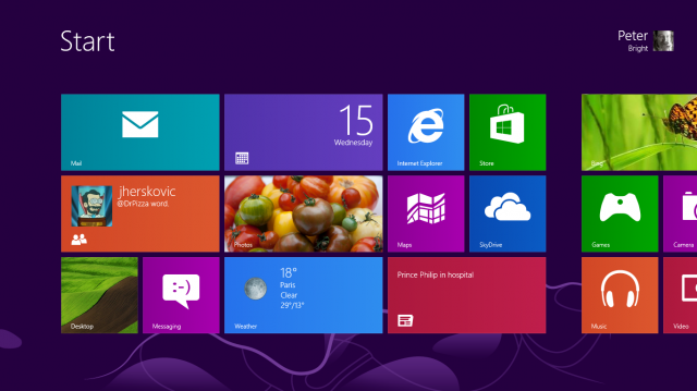
The selection of background images for the Start screen has been extended. As in the Release Preview, they're all quite abstract, but there are now some more colorful options for those wanting a bit more pizazz.
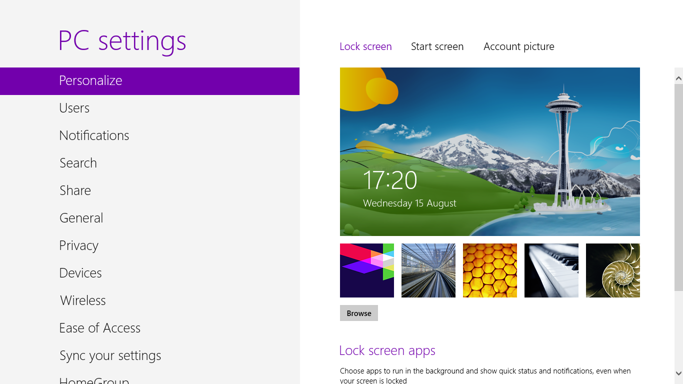
The range of images available for the lock screen are new—the default is a stylized rendition of Seattle, with the Space Needle standing prominent.
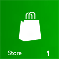
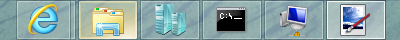
On the Start screen itself, some of the icons have been slightly revised. The Store icon now has a Windows icon on the shopping bag and the whole thing has a different perspective; SkyDrive's icon has lost the "swoosh" going through the clouds. The camera applet now has a purple background whereas before it had a red one.
 The old store icon. |
 Old SkyDrive, with a swoosh. |
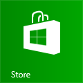 Now unambiguously a Windows Store. |
 Swoosh-free SkyDrive. |
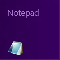 Release Preview: Big writing, little icon. |
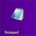 New: Big icon, little writing. |
The most significant alteration is the way desktop applications are presented. Previously, the tiles for desktop icons were large text, paired with a small icon in the corner. This was annoying, as the text would often get cut off, and the icons were too small to be easily distinguished.
In RTM, the desktop app tiles have been switched around, making them much more similar to Metro app tiles. The application icons are larger and prominent. The text is smaller, but no longer cut off. This is a small change, but a big improvement.
We knew that Microsoft was going to introduce a new theme with the RTM build, and now we can see what that theme is.
Aero Glass, with its curves and its visual effects, is gone. Windows are now square-edged, with no shadows and no translucency. The taskbar is still translucent, but even this is simpler than in Windows 7; it no longer blurs the strip of wallpaper behind the bar.
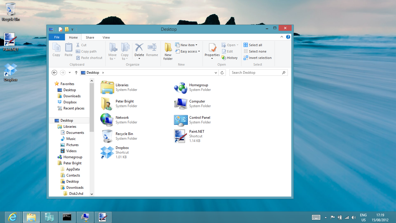
The color of the window borders and the taskbar is now dynamic, based on the predominant hue of the desktop wallpaper. You can override this dynamic color if you prefer, sticking to a fixed choice.

Other user interface elements such as checkboxes and radio buttons have similarly been simplified. Checkboxes, for example, are simple squares, instead of the faux-3D recessed dimples in the user interface. Dropdown lists and tabs are flatter, though not completely flat, and scrollbars are simple rectangles. Aside from the window borders and scrollbars, the differences are subtle and may go unnoticed by many.
During Windows 8's development, one of the things we expressed concerns about was the jarring switch between the Metro look-and-feel and the desktop look and feel. The new theme is Microsoft's attempt to bridge the gap. While it's a step in the right direction (and not unattractive, in my view), I had hoped Microsoft would go further still. The two worlds still look very different, and I'm not sure all the differences are justifiable.
For example, while the automatic colorization based on the wallpaper is cute, colorization based on the Metro-side theme choice would seem more sensible. My Metro world is very purple, because I like the purple background option. My desktop world isn't, because its colors are based on the wallpaper.
Similarly, while those dropdown boxes and so on are flatter than they are in Windows 7, they still have a slight gradient. Their Metro counterparts don't. Differences in font selection and sizing are understandable; changing those things drastically would simply break desktop applications. The aesthetic differences, however, are harder to make sense of.
Microsoft also seems not to have followed through with its flatter, simpler aesthetic. There are still traces of fancier graphical effects such as the "glow" when the mouse is over a taskbar button. So while the new theme means that the desktop is, aesthetically, marginally more consistent with the Metro parts, it's now a little less internally consistent.
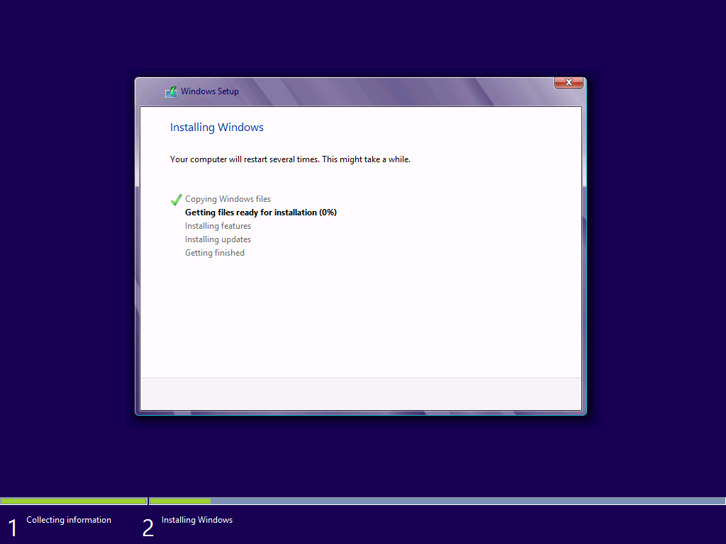
Even the installer has a faux-Aero Glass look to it.
Further separating the desktop world from the Metro world are the new desktop wallpapers included with Windows 8. Just as the desktop's color scheme is independent of the Metro world's color scheme, so too are the desktop wallpapers independent of the Start screen background. The default wallpaper is a picture of a flower, and there are two further wallpaper sets available; some landscape photography called "Earth," and some more flowers in a set called "Flowers."
These wallpapers seem chosen almost deliberately to contrast with the Start screen images. On the Metro side, the imagery is abstract, stylized, and fundamentally unreal. On the desktop, it's photographic and natural. Having such a contrast isn't bad per se, but it makes the desktop feel as if Microsoft wasn't really sure which way to go; on the one hand, the new theme is designed to be simpler and in harmony with the "authentically digital" Metro world. On the other hand, the wallpapers are "authentically natural" as it were.
Beyond these visual changes there's not a lot more to see in Windows 8 RTM. If you've used the Release Preview, you've seen it all already.
In the past, the RTM build of a Windows release, the version that gets shipped out to manufacturers and installed on people's PCs, has been a big deal. That's because once the operating system is RTM, it's pretty much done. We already know what applications we're going to use—because we already have them—and the built-in applications are essentially set in stone.
Windows 8 is very different. While part of the draw of the operating system is, of course, the ability to run regular Windows software, just as important is the ability to run a whole new kind of application: finger-friendly, Metro-styled (though we can't call it that any more) software, distributed and updated via the built-in Windows Store.
Even some of the "built-in" applications—including Mail, Music, and Video—are essentially Windows Store applications, and will receive updates though the Store, just like every other app.
As those early adopters will shortly discover, the problem is that the Store is, at the moment, a very barren place. This is no surprise; developers have only just got their hands on the final software and final version of Visual Studio 2012. It will take them some time to get apps finished up, submitted, and approved for distribution.
Over the next few months, the Store should start to become a little more fleshed out. Even the built-in applications might receive updates—although they've been changed a little since the Release Preview, they're still quite rudimentary and in need of improvement.
We're expecting—we're hoping—that Windows 8's retail launch, on October 26th, will come with a big splash and lots of new apps. Apps that will make sense of Microsoft's Metro user interface, that will showcase Windows 8 as a platform that's equally at home on a tablet as it is on a desktop.
Because without those apps, the Windows 8 experience is incomplete. The design decisions Microsoft made have no rationale. We need an app ecosystem to give them context; to see whether Microsoft's vision really plays out when used day-in, day-out, and whether Metro is a productive, fluent environment.
There's also a question of hardware. Many OEMs are preparing to release a range of new machines with better, gesture-supporting trackpads, 10-point multitouch screens, lightweight tablets, and all manner of hybrids, but this "Designed for Windows 8" hardware isn't out yet. Good trackpads with gesture support make a world of difference to the Windows 8 experience, but at the moment, driver and hardware availability is too limited.
As a result of this, we are not reviewing Windows 8 just yet. We will, but our plan is to do so later in the year, timed to coincide with the retail launch of the operating system on October 26th. This will, we hope, give us an opportunity to use Windows 8 with a selection of real Windows 8 applications and real Windows 8 hardware. Until then, Windows 8 is, in a sense, incomplete. The operating system may be done, but the user experience still needs to cook a little longer.
reader comments
217