

This time the Data for a Cause challenge was to work with Global Fishing Watch and visualize the fishing activity of vessels fishing in other country's waters. I was able to create a Power BI report using their data, however, this blog post is not about best practices of creating analytical reports in Power BI, but it's rather a data story of working with provided datasets and a thinking process of creating an interactive tool to visually explore fishing data.
Link to Global Fishing Power BI report.
Data
Fishing dataset had been presented in a flat file format with the following list of attributes:
fishing_year
,fishing_date: a string in format “YYYY-MM-DD”
,fishing_lat_bin: grid cell
,fishing_lon_bin: grid cell
,fishing_mmsi: unique ID of the fishing vessel, AIS tracking device
,fishing_fishing_hours: hours the vessels were present in this location on this day
,vessel_mmsi: same as fishing_mmsi
,vessel_shipname
,vessel_callsign
,vessel_flag: the country of the fishing vessel, in iso3 value
,vessel_imo
,vessel_registry_geartype: vessel gear types. The column Vessel Registry Geartype refers to the official purpose of the vessel. By analyzing the movement of the boat, GFW identified the vessel as a fishing vessel (even if registered otherwise) - Vessel Inferred Geartype.
,vessel_inferred_geartype
,vessel_inferred_geartype_score
,vessel_inferred_subgeartype
,vessel_inferred_subgeartype_score
,vessel_registry_length
,vessel_inferred_length
,vessel_registry_tonnage
,vessel_inferred_tonnage
,vessel_registry_engine_power
,vessel_inferred_engine_power
,vessel_source
,ISO_Ter1: the country where the fishing occurred (an exclusive economic zone of, in iso3).
,ISO_Ter2
,ISO_Ter3
Data file contained 6,929,885 rows and it covered 5 years of fishing activities from 2012 to 2016.
Additionally, I pulled the list country codes with their names from this Wikipedia resource - https://en.wikipedia.org/wiki/List_of_ISO_3166_country_codes.
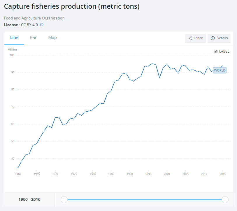
And I also found a Capture fisheries production dataset from the World Data Bank that contained data for the period of time from 1960 to 2016. This datasets was in an Excel file format and where one of the worksheets contained list of countries with some additional attributes, which I thought would be a good candidate for my country profile data table.
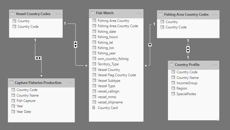
Eventually, after pulling data from the main data file, Wikipedia county codes list and fish capture data, my final data model in Power BI looked the following way, where I replicated the county code table both for Vessel & Fishing Area country info.
Metrics & Relationships between different data attributes
This was my thinking process to create a visual story with this data model:
1) Metrics:
- Total Fishing Hours
- Counts of Vessels (by Country, by Types/SubTypes)
- Fish Caught (other data set)
2) Relationships:
- Fish Caught by Country and its fishing activity on the map
- Relationships between Vessel countries and Fishing area countries
3) Additional consideration to use maps since the Latitude/Longitude coordinates were provided.
Creating visualizations in Power BI
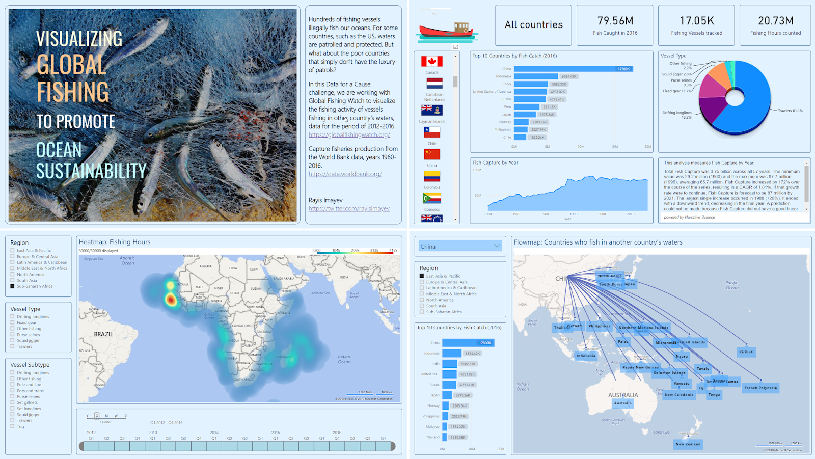
Summary report

For the summary page report, I used the following custom and standard visual components:
- Information cards to show counts of vessels, fishing hours and fish caught.
- Enlighten World Flag Slicer to filter vessel countries
- Drill-down donut chart by ZoomCharts to show country fleet vessel distribution by vessel type
- Area and Bar charts to show fish capture data
- Narrative Science for Power BI component to create natural language narratives based on fish capture time series. I really liked this component in Power BI since it allows me to automatically and interactively generate a textual description of my numeric data, it also helps to show any potential trendlines in my dataset. And I had already blogged about this Narrative Science component for Power BI in the past: http://datanrg.blogspot.com/search?q=narrative+science.
Example of narratives generated for one selected country: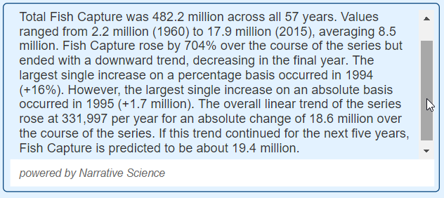
Heat map
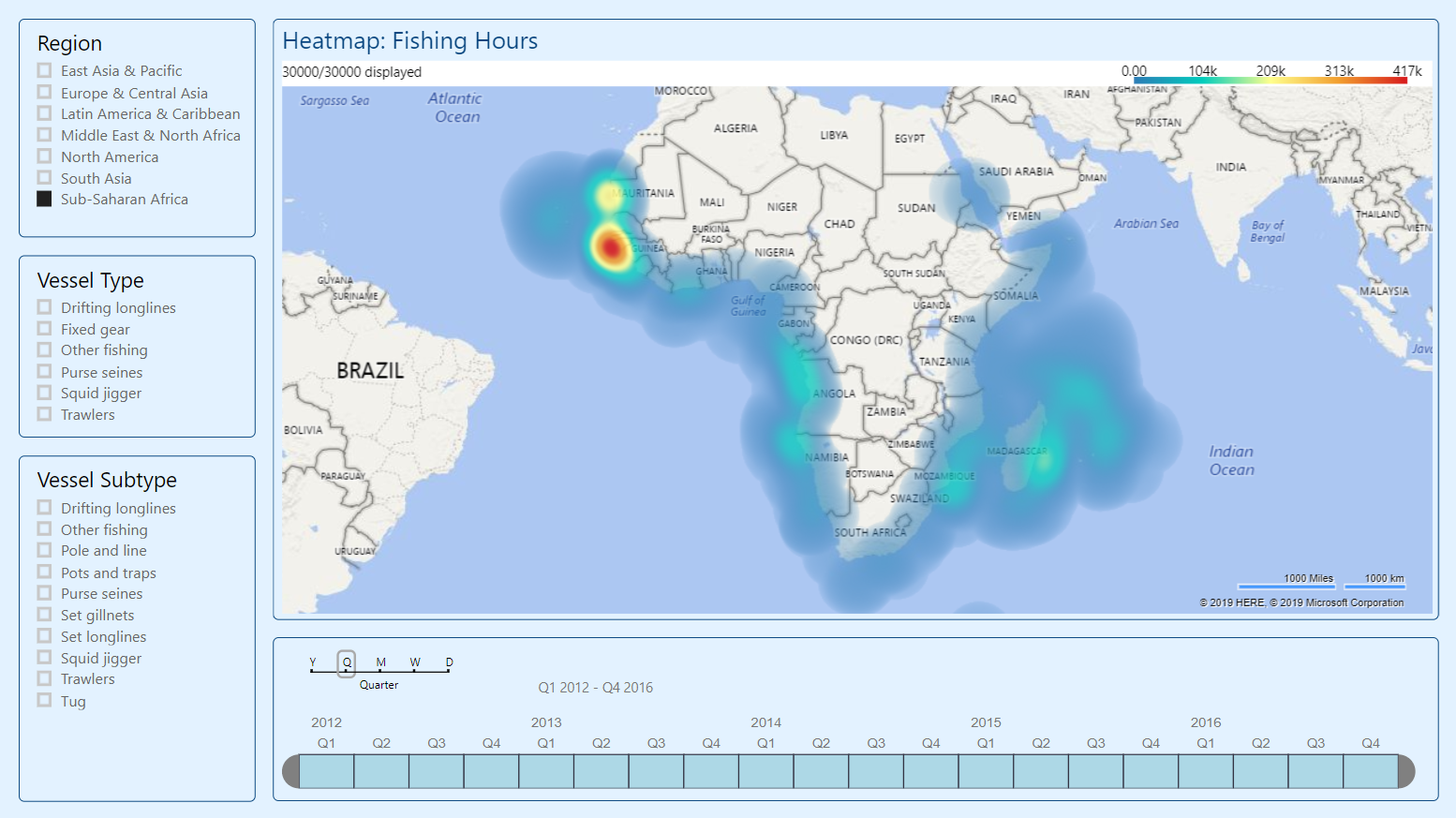
For the second page of my report, I decided to use Heatmap visualization to show fishing hours density across different regions of the world. Latitude & longitude coordinates helped me to plot vessel fishing events on this map along with fishing hours to show different scales of heat.
Timeline slicer was used to select a date range for my heat map using the fishing_date attribute.
Flow map
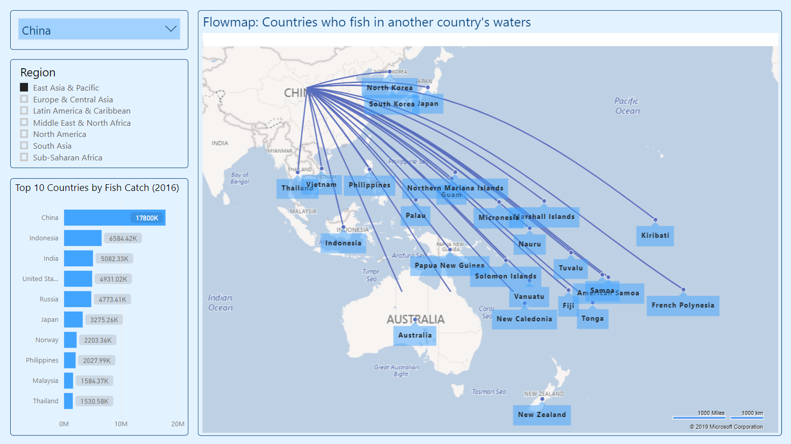
Knowing that my main data set contained information about vessel and fishing area countries, it came naturally to assess how both of them relate to each, i.e. to analyze how each vessel country fish in another country's waters.
And Flow map visualization worked well for this type of analysis, where you can set Origin and Destination fields from your dataset. Also, you can set whether your connections would be in a form of straight or curved lines.
In overall this Flow Map visualization helped to analyze fishing activities of richer countries in poorer countries' waters. And you could select a country vessels flow with the help of the filter at the top of this report page.
Summary
- Working with open data sets is always an interesting experience, especially when it contains geo coordinates that you can utilize with various map visualizations.
- I hope that this Power BI report does help to analyze fishing activities in the world. And if you are aware of other nonprofit organizations that I can help with this type of data analytics, please let me know, it would be my way of giving back to the community.
