The integration of RevolutionR with SQL Server 2016 promises a wider range of analytical methods and greater flexibility for exploratory, predictive and visual data analysis. In this post we use RevolutionR to analyse purchasing behvaiours in the AdventureWorksDW2012 InternetSales schema. We will cover a brief visual summary of the sales data, detect differences in purchasing patterns across regions of the world and finally identify these differences using correspondence analysis.
The Data
Our main goal in this analysis is to identify purchasing patterns in the InternetSales schema of AdventureWorksDW2012. First of all we create a view which draws information from the factInternetSales fact table and relevant dimensions (dimProduct, dimProductSubCategory, dimSalesTerritory):
use AdventureWorksDW2012;
go
create view [vw_RSalesAnalysis]
as
    select
        sales.ProductKey,
        p.ProductSubcategoryKey,
        ps.EnglishProductSubcategoryName,
        p.EnglishProductName,
        sales.SalesTerritoryKey,
        t.SalesTerritoryRegion,
        sales.CustomerKey
from dbo.FactInternetSales as sales
    inner join dbo.DimProduct as p on p.ProductKey = sales.ProductKey
    inner join dbo.DimProductSubcategory as ps on ps.ProductSubcategoryKey = p.ProductSubcategoryKey
    inner join dbo.DimSalesTerritory as t on t.SalesTerritoryKey = sales.SalesTerritoryKey;
go
From RStudio we can access this view using an ODBC connection:
  library(RODBC)
  library(ggplot2)
  library(FactoMineR)
  library(reshape2)
  ## Open Connectioote:
  ## Note: "RSQLAnalytics2016" is an existing ODBC Data Source
  SQLconnection <- odbcConnect("RSQLAnalytics2016", uid="<username>", pwd="<password>")
  ## RetrieveData
  salesData <- sqlFetch(SQLconnection, "vw_RSalesAnalysis")
  ## Close connection
  odbcClose(SQLconnection)
Above, we used the sqlFetch() function from R's RODBC package to retrieve the data in the view. Alternatively, the sqlQuery() function allows you to retrieve the results of a query - this is particularly useful for adhoc analysis. We can view the first few rows using the head() function:
  ## Look at the first few rows
  head(salesData)
| ProductKey | ProductSubcategoryKey | EnglishProductSubcategoryName | EnglishProductName | SalesTerritoryKey | SalesTerritoryRegion | CustomerKey |
| 310 | 2 | Road Bikes | Road-150 Red, 62 | 6 | Canada | 21768 |
| 346 | 1 | Mountain Bikes | Mountain-100 Silver, 44 | 7 | France | 28389 |
| 346 | 1 | Mountain Bikes | Mountain-100 Silver, 44 | 1 | Northwest | 25863 |
| 336 | 2 | Road Bikes | Road-650 Black, 62 | 4 | Southwest | 14501 |
| 346 | 1 | Mountain Bikes | Mountain-100 Silver, 44 | 9 | Australia | 11003 |
The sales data has one row for every sale made, and includes the product and customer keys along with relevant information about which region the sales was recorded in. We are interested in whether different regions exhibit different purchasing patterns which could help the business make decisions about stock levels and targeted marketing campaigns across the regions.
Exploratory Visualisations
Let's begin with some visualisations of the sales data. For example, we can look at the total number of sales across the regions as well as the total number of sales by ProductSubcategory. We will use R's GGPLOT2 library for this.
  sales_by_region <- ggplot(salesData, aes(x=SalesTerritoryRegion, y=..count..)) +
          geom_bar(fill="steelblue") +
          theme(axis.text = element_text(size=5, angle=0), panel.background = element_blank()) +
          xlab("") +
          coord_flip() +
          ggtitle("Number of Sales by Territory Region")
  sales_by_region

The most interesting thing about this plot is that there are very few sales for the Central, Northeast and Southeast regions. The relative imbalance between these three regions and the rest means that we should be cautious about making any conclusions about these regions.
      sales_by_cat <- ggplot(salesData, aes(x=EnglishProductSubcategoryName, y=..count..)) +
              geom_bar(fill="steelblue") +
              theme(axis.text = element_text(size=5, angle=0), panel.background = element_blank()) +
              xlab("") +
              coord_flip() +
              ggtitle("Number of Sales by ProductSubCategory"
      sales_by_cat

The plot above shows that some ProductSubcategories are far more popular than others, for example "Tires and Tubes" and "Bottles and Cages". We can also see that Road Bikes and Mountain Bikes form a good portion of overall sales.
Since we are interested in the differences between regions, let's view the relative proportions of products sold by region:
          product_sales_by_region <- ggplot(salesData, aes(x=ProductKey, y=..density..)) +
                  geom_density(fill="steelblue", alpha=0.8) +
                  facet_wrap(~ SalesTerritoryRegion) +
                  theme_bw()
        product_sales_by_region

This plot hints at some interesting differences between the regions, but it also highlights the limitations of basic summaries to shed light on underlying patterns and trends. For example we can see that there are two very popular products in Canada. Also obvious is the different profiles for the Northeast and Southeast - though as mentioned we won't focus on these regions. Beyond this however, this plot fails to obviously distinguish the other regions, for example it is very difficult to distinguish Australia, France, the UK and Germany.
Given that we cannot easily see differences in these regions, the question is whether there are any differences in purchasing behaviours? Below, we will explore this using Principal Components Analysis (PCA). When plotted, the principal components should give us a reasonable indication about which regions are similar and those that are different. First, we will summarise the number of sales by product and by region:
by_region <- with(salesData, table(SalesTerritoryRegion, ProductKey))
This creates a table with 10 rows (one for each region) and 158 columns (one for each ProductKey). To visualise this, we will map the data onto two new dimensions using PCA. This results in a table that has 10 rows (the regions) and 2 columns which capture the purchasing behaviours in each region.
  pca_regions <- prcomp(by_region, scale=TRUE)
  pca_data <- data.frame(pca_regions$x)
  pca_data$Region <- rownames(pca_data)
Although we haven't shown this here, the first two principal components (which we will use for visualisation) capture 89 % of the variation in this data. This is a good result, and suggests that the purchasing behaviours have been well captured by these new dimensions (visualised below):

From the above plot, we observe that Australia is quite unlike the rest of the regions. The European regions (UK, Germany and France) are all very similar. Canada, the Northwest and Southwest are all distinct. This plot hints at some interesting differences between the regions, which we dig into in more detail in the following section.
Purchasing Behaviours
We will use correspondence analysis (CA) to identify which products are most popular by region. CA is also known as 'Market Basket Analysis' (for more info, see this blog post by MapR). First of all, let's see if there is an association between ProductSubcategories and the various regions. We begin by creating another contingency table, a count of the number of sales by ProductSubcategory in each region:
by_region <- with(salesData, table(SalesTerritoryRegion, EnglishProductSubcategoryName))
Then we will use the CA() function in R's FactoMineR package.
  results <- CA(by_region, graph=FALSE)
  plot.CA(results, col.row="red", col.col="grey", cex=0.6, title="Region : Subcategory")

From this plot we can see that Dimension 1 and Dimension 2 explain 75% and 17 % of the association in the dataset respectively. Dimension 1 seems to be a contrast between purchasing preferences in Australia versus Canada (again we are ignoring the Central and East Coast). More specifically we see:
- Sales of bikes (road, mountain and touring) contribute a greater proportion of the Australian sales than they do in other regions.
- There is a clear association between the UK and "Tires and Tubes", Helmets and Caps. Caps are also popular in Germany and France.
- The sales of clothing (Socks, Gloves, Vests and Jerseys) is particularly strong on the West Coast
More generally, we might conclude that sales are predominantly centered on the actual bikes in Australia, and as we move from left to right (from Australia to Canada in the plot above), we observe an increase in the sales of clothing and accessories.
Let's drill down further and look at the sales patterns by product. Again, we create a contingecy table of the number of sales per product by region, and then perform correspondence analysis:
  by_region <- with(salesData, table(SalesTerritoryRegion, ProductKey))
  results <- CA(by_region, graph=FALSE)
  plot.CA(results, col.row="red", col.col="grey", cex=0.6, title="Region : Product")
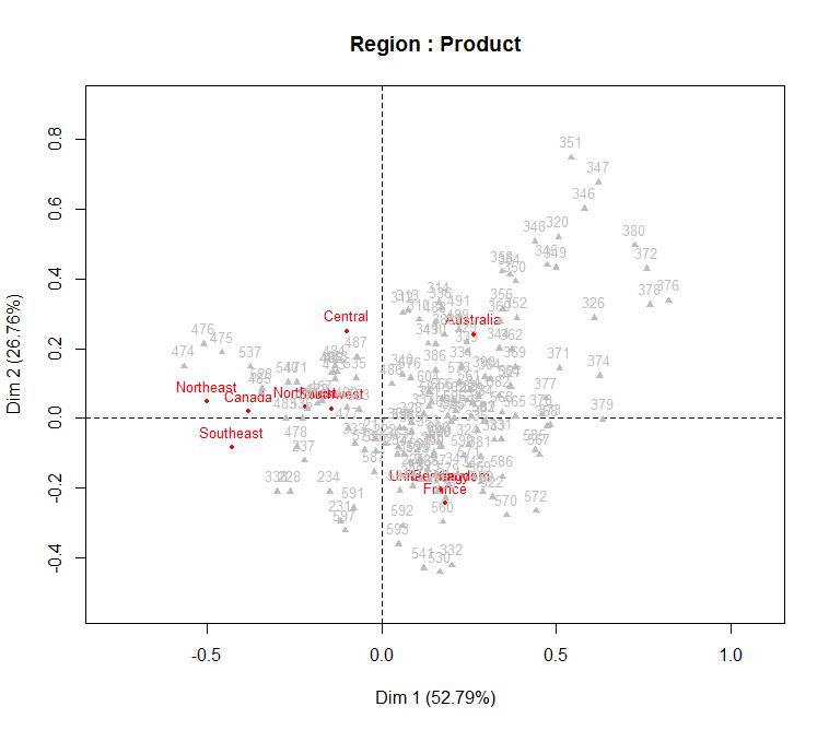
This plot is a hot mess and very tough to interpret. But in general, we can again see the contrast between Canada and Australia across the first dimension, and a contrast between Europe and Australia in the second dimension. Beyond that, it is a bit tough. The distance between the Region and each product indicates how strongly that product is associated with that region. So we can see a number of products up in the top right and a bunch of products in the center which show weak associations. We can improve this plot by removing weak associations and only focusing on the strong ones:
  ## get strength of associations, include the ProductKey in this
  strength <- data.frame(results$col$contrib[, 1:2])
  strength$ProductKey<- rownames(product_contributions
  ## find the strongest associations (values > 1.5)
  ## loosely corresponds to associations outside the 95% confidence interval
  major_products <- strength[strength$value > 1.5, "ProductKey"]
  ## from the sales data, identify which rows belong to the 'strong' products
  ## and retrieve only these rows
  idx_major <- which(salesData$ProductKey %in% major_products)
  majorSalesData <- salesData[idx_major, ]
  ## repeat the Correspondence Analysis
  ## (create contingency table and perform analysis)
  by_region_filter <- with(majorSalesData, table(SalesTerritoryRegion, ProductKey))
  results_filter <- CA(by_region_trimmed, graph=FALSE)
  ## now create a new data frame for visualisation
  ## get the coordinates for both the products and regions
  products <- data.frame(results_filter$col$coord)
  regions <- data.frame(results_filter$row$coord)
  ## get the product names for visualisation
  product_names <- unique(salesData[, c("ProductKey", "EnglishProductName")])
  get_product_names <- function (key) product_names$EnglishProductName[which(product_names$ProductKey==key)]
  ## Finally, visualise
  ggplot(products, aes(x=Dim.1, y=Dim.2)) +
      geom_text(data=products, aes(x=Dim.1, y=Dim.2),
                label=sapply(rownames(products), get_product_names),
                colour="darkblue",
                size=2,
                alpha=0.7) +
      geom_point(data=regions, aes(x=Dim.1, y=Dim.2), colour="red", shape=4) +
      geom_text(data=regions, aes(x=Dim.1, y=Dim.2), label=rownames(regions), colour="red", size=4, vjust=-1,alpha=0.4) +
      theme_bw() +
      ggtitle("Region : Product")

Finally, from this plot we can conclude:
- The sales of women's mountain shorts are particularly high in Canada and the West coast of the USA.
- In addition the sales of , "HL Mountain Tires", "HL Road Tires" and "Mountain Tire Tubes" are particularly high in the same regions.
- The sale of "Road Tire Tube", "LL Road Tires", "Touring Tyres", "Touring Tyre Tubes", "AWC Logo Caps" and "Long-sleve Logo Jersey (M)" is particularly strong in Europe. This confirms our intuition that road racing is likely to be popular around France.
- There are a number of mountain and road bikes which are sell well in Australia. The "Short Sleeve Classic Jersey" also sells well in Australia.
Conclusions
We have managed to build an interesting picture of the cycling communities and their purchasing behaviours in Canada / USA compared to Europe and Australia. Our analysis suggests that mountain biking is particularly popular with women in Canada and the US, and that products relating to this sell well. This is clearly different from the UK, Germany and France where road racing appears to be the most popular. In Australia, road biking and mountain biking is popular, with the sale of bikes forming a major part of their total sales. Information like this is invaluable for managing stock and for marketing departments. There is clearly no need to heavily invest in stock and marketing of mountain bikes in Europe, or road bikes in the US.
So why use R, when we could have performed a Market Basket Analysis using Analysis Services? For me, more than anything it is the flexibility, convenience and power of R. Based on Microsoft's very clear investment in R (integration with Azure Machine Learning and SQL Server 2016), it looks to become a core part of Microsoft's business intelligence and analytics stack.