

Principal components analysis (PCA) is one of those basic statistical methods that (I think) could really transform your classic-style dashboards. There is generally an explosion of charts on your traditional dashboard: sales by country, sales by region, sales by product, sales-by-every-column-in-your-data-warehouse. Again, in my opinion, this is a symptom of business intelligence toolsets, which make it too easy to slice and dice your data every which way, leading to an explosion of charts.
You certainly see less of this in web-based visualisations where there is usually better reuse of visualisations and user controls to change the specific view or metric displayed. And, I attended a SQL Saturday event earlier this year where a BI guru from Trade Me (New Zealand) was strongly advocating the considered design of dashboards and the reuse of visualisations where ever possible to unclutter the real estate. It was a really refreshing presentation! This is where PCA comes in - to display the most information in a condensed format.
PCA and Visualisation
I'm always a little vague about the ins-and-outs of PCA. I use it every day to analyse and visualise data, but I am always deliberately vague about what is happening under the hood - mostly because my colleagues generally don't care, or perhaps because I think too much technical detail simply muddies the message. However, recently I have found myself talking a little more about what's going on and what the outputs mean. What we are trying to do is to condense a dataset and highlight the most important trends or patterns. Here's a great example:
We monitor the performance of servers across our client's environments, we need quick and easy methods to determine which servers are the most problematic and to track how the performance of a server changes over time. The problem is, we monitor about 25 different performance metrics for each server and there is no way that our team can sift through dozens of visuals to get a quick idea of a machine's performance state. This is where PCA comes in, we take all 25 metrics and calculate the first two principal components to provide a quick, visual performance snapshot:
library(ggplot2)
library(data.table)
pca <- prcomp(dist(scale(data)))
pca <- data.table(pca$x[, 1:2])
g <- ggplot(pca, aes(x = PC1, y = PC2)) +
  geom_point(aes(colour = log10(PC1^3 + PC2^2 + 1),
                 size = log10(PC1^2 + PC2^2 + 1)), alpha = 0.5) +
  geom_point(aes(x = 100, y = 60), size = 5, shape = 20, colour = 'red') +
  geom_point(aes(x = 100, y = 60), size = 10, shape = 1, colour = 'red') +
  scale_color_continuous(low = "steelblue", high = "magenta") +
  scale_size_continuous(range = c(1, 4)) +
  theme_minimal() +
  guides(colour = FALSE, size = FALSE)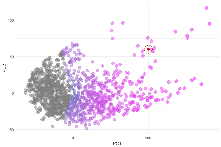
This plot is reasonably intuitive - each point is a server which we monitor, coloured by their overall performance patterns. There is a trend, from left to right, of increasing severity. Here, we have also plotted an example in RED - this might be a new server that we are monitoring and, in this case, we can see that falls amongst the most severe of the servers. This plot doesn't explain what is driving the performance patterns, but it does give a good overall trend. It is also a massive improvement on other attempts to visualise this data, which involved a whole raft of plots that showed each server-by-some-metric and where it was up to the user to make some judgement calls about which metric was most indicative of "poor performance". I have to apologise in advance, we can't share this data, for obvious reasons.
One of the things that makes this plot work, is that the overall trend is clear and obvious and the points are reasonably well separated. Specifically, this works with PCA because the performance trends actually do have strong linear patterns, there is a reasonably high level of correlation between groups of metrics and our monitored environments truly do cover the whole "performance spectrum". These are the reasons that PCA has worked well here and the visual is not bad. However, I have found that this is rarely the case with most datasets and as a result, the visualisations can be incredibly messy, like the one shown below:
pca <- prcomp(dist(scale(data)))
pca <- data.table(pca$x[, 1:2])
pca[, cluster := factor(data$cluster)]
ggplot(pca, aes(x = PC1, y = PC2)) +
  geom_point(colour = "steelblue", alpha = 0.25, size = 10) +
  theme_minimal()

At face value, this plot looks alright. But there is a bunch of detail that is hidden in this plot and which is also hidden by the results of the principal components analysis. According to the results of the principal components analysis, PC1 captures a massive 88% of the variance in this dataset. Therefore, PC1 should be an excellent surrogate measure for this dataset. But what I haven't shown you here are the cluster labels.
This is definitely a complex dataset, which has approx. 15 - 20 genuine clusters hidden within it. Most of these clusters are all bunched up under that dense region around (0, 0). There are 3 different clusters grouped up the top left-hand corner of the visual and 8 clusters that extend along the line of points which spread out to the right-hand side of the visual. It's worth stressing too, that this plot is a lot better than the simple principal components plot because we have tried to adjust for the distance between each observation too (using the dist() function). Even then, the visual is cluttered and doesn't do a good job of representing the complexity of this dataset. Again, I apologise for not being able to share this data.
Network Diagrams
We've found that a lot of our datasets result in cluttered PCA plots. It's a real shame because plots using PCA are easy to produce and, when they work well, you can attribute some meaning axes. But more often than not, PCA hasn't been useful for the visualisation of our data. So, we have found ourselves turning to network diagrams. There are a few reasons why network diagrams are working really well for us:
- We deal with a lot of data, but not a lot of problems. We're really interested in the underlying problems, which are completely masked by the sheer volume of data we collect. However, our data forms nice clusters in most cases.
- By visualising clusters, we are reducing the size of our problem from hundreds (or thousands) of examples to a handful of representative types.
- Most of our users are interested in exploring all of the clusters and coming up with their own interpretations of these clusters, rather than just focus on the most extreme groups.
- The problem is that PCA usually does a good job of separating out the most extreme groups, but the less extreme clusters all bunch up around (0, 0).
- This is where network diagrams come in hand because they provide a better layout for the clusters and let users explore them all.
- Finally, the other reason we have recently turned to network diagrams is that we have just discovered the GGally and ggnet2 packages in R. These are extensions to R's ggplot2 library and they make producing network diagrams a piece of cake.
Let's have a look at how easy it is to produce a network diagram using ggnet2 and the sna package. First though, let me explain the structure of the data we are working with a little bit. Our data is in a plain, simple table format. Each row represents one server and contains a variety of metrics about that server across the columns. The other important thing to note is that we have already clustered each server into one of 20 groups. We've included a column with the cluster label. It is the server name and the cluster label that we are going to use to produce the network diagram. We will take this step-by-step.
Step 1: create a frequency table of Servername by cluster
This is the key step, we will create a table with 429 rows (one for each server) and 20 columns (one for each cluster). This will be a very sparse table of mostly zeros, there will be a single 1 in each row corresponding to the cluster that the server belongs to. Below, we have the necessary code and a small sample of the table:
server_by_cluster <- with(data, table(ServerName, cluster))
| Cluster1 | Cluster2 | Cluster3 | Cluster4 | ... | Cluster19 | Cluster20 | |
|---|---|---|---|---|---|---|---|
| J105 | 0 | 0 | 1 | 0 | ... | 0 | 0 |
| P5766 | 0 | 1 | 0 | 0 | ... | 0 | 0 |
| A7499 | 0 | 0 | 0 | 0 | ... | 1 | 0 |
| Z2058 | 0 | 1 | 0 | 0 | ... | 0 | 0 |
| F8125 | 0 | 0 | 0 | 0 | ... | 0 | 1 |
Step 2: use the sna package to create a network
This is one of the key breakthroughs for me. We have to create a network-centric representation in order to plot it as a network. This involves defining the nodes (or vertices) and declaring the edges between each node. The sna package makes this very easy:
library(sna)
net <- network(server_by_cluster, directed = FALSE)
If you type "net" at the R prompt it will tell you that the graph has 429 vertices with 409 undirected edges between them.
Step 3: add attributes to your network
It's very likely that we will want to plot additional metrics about our data, for example we might add colours, or change the size of points etc.. To do this, we simply add attributes to our network (see below). Let's add the servername and a custom metric which will control the size of the points:
net %v% "servername" <- data$ServerName
net %v% "score" <- unlist(log2(data[, 6, with = FALSE] + 1))   # custom metric to score each node of the graph by
Step 4: plot the network
Finally, we can use the ggnet2 package to plot the network. ggnet2 is available along with the GGally package, or it can be installed directly from github. There is a great tutorial on ggnet2 here.
library(GGally)
ggnet2(net, size = "score",
       label = "servername", color = "steelblue",
       label.color = "darkblue", label.size = 2, alpha  =0.5) + guides(size = FALSE)
This isn't a bad plot (apologies, it is a little small to see clearly here). It's the same data as our second PCA example, which was cluttered and didn't let users see each cluster. Here, we have a great layout of each cluster and the size of each point corresponds to the particular metric we selected. It is trivial to allow the size, colour or labels to be generated dynamically in response to some sort of control or selector in the interface. Additionally, we can quickly get a sense for how large a cluster is - which is a nice result. The other aspect which I like about network diagrams, which you don't get from methods like tsne, is that the relative distances mean something. Clusters which are nearby are more like each other than clusters which are far apart.
Wrap Up
PCA is definitely one of my favourite tools. I use it every day to analyse data and to visualise data. Increasingly, however, we are finding PCA just isn't cutting the mustard in terms of visualisation. But where PCA might fall down, we are finding network diagrams are able to fill the gap and these are reasonably easy to produce with R's ggnet2 package.
