If you have taken even a quick glance at Power BI you must surely have come to appreciate the sheer range of visual possibilities that Power BI Desktop has to offer. From an extensive gamut of chart types to gauges, tables and cards it delivers a wealth of easy to use ways of delivering insight into your data clearly and effectively.
Yet Power BI Desktop does not stop with the built-in visualizations that you have seen when you open Power BI Desktop and begin to create dashboards. It has been designed to be a completely open and extensible business intelligence application that will allow third parties (and even Microsoft) to add other visuals. This means that the core elements that you have probably met so far are only a starting point. There are many other chart, text and map visuals that you can add to Power BI Desktop in a few clicks-and then literally stun your audience with an eye-catching variety of dashboard elements.
Fortunately adding and using these enhancements is both quick and easy. This is because all Power BI Visualizations use the same interface and are based on the underlying data model in exactly the same way. Consequently learning to use a new visual will most likely only take a couple of minutes as you will always be building on the knowledge and techniques that you have already acquired when using Power BI Desktop.
Nonetheless you need to be aware that not all the custom visuals that are available are entirely bug-free. Also they might (or might not) have all the formatting attributes or interactive capabilities available that you might wish for. However, this does not make them any less useful-or any less fun to use. In any case we can reasonably expect them to be enhanced and improved over time.
In this article I will presume that you already have a basic knowledge of Power BI. Consequently I will not repeat here the basics of how to create a starter dashboard, but instead I suggest that you look at some of the other articles (including on SQL Server Central) that explain how to start using this amazing piece of self-service BI software.
The Power BI Visuals Gallery
The first thing to do is to acquaint yourself with the Power BI Visuals Gallery. This is a central hub where you can find a range of free visuals developed either by Microsoft or by third parties that are ready to be added to your Power BI dashboards.
To connect to the Power BI Visuals Gallery open your web browser and navigate to https://app.powerbi.com/visuals. You will see a set of available visuals rather like the one in the following figure.
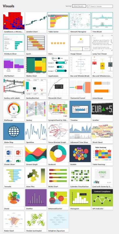
This page is constantly evolving, and so I imagine that what you are looking at now is very different. Hopefully, though, you should be excited to see lots of new and amazing types of data visualization that will allow you to add unparalleled pizazz to your dashboards.
Loading Custom Visuals
Now that you have found a treasure trove of extra presentation elements for your reports you need to learn how to add them to Power BI Desktop.
1 - In your web browser navigate to https://app.powerbi.com/visuals.
2 - Click on the visual that you want to download. A dialog will appear asking you to confirm the download. It will look something like the following figure.

3 - Click Download Visual. The community agreement dialog will appear - as you can see in the following figure.

4 - Click I Agree. The visual will be downloaded. Depending on your version of windows (and any machine-specific configuration) it will be placed in a specific folder or give you the choice of a folder.
5 - In Power BI Desktop click on the import custom visual button (the ellipses) in the Visuals Gallery of visuals in the Visualizations Panel. A cautionary dialog like the one in the following figure will appear.

6 - Click Import. The Windows File Open dialog will appear.
7 - Navigate to the folder where you downloaded the visual file in step 3 and click on the visual file. You can see an example of this in the following figure:

8 - Click Open. The confirmation dialog will appear as shown in the following figure.

The icon for the visual will appear at the bottom of the gallery of visuals in the Visualizations Panel. You can then use this visual just like any other Power BI visual
It is worth noting that additional visuals are added as required to each individual Power BI Desktop file. So while you will only download the visuals once, you will have to load them into each Power BI Desktop (.pbix) file where you want to use them. One technique to mitigate the effort required if you find yourself using the same third-party visuals frequently is to create a Power BI Desktop file that contains all the visuals that you use, and then make this a template for all your future dashboard development.
Enabling Custom Visuals
As an added security measure you will have to enable custom visuals each time that you open a Power BI Desktop file that contains third party enhancements. Indeed, every time that you open a file that contains custom visuals you will see an alert like the one in the following figure.

What is more, any custom visuals in the report will not be displayed. Instead, and in place of each one, you will see the blank placeholder that is shown in the following figure.

If you are happy that the file only contains visuals that are safe then all you have to do is to click on the Enable Custom Visuals button. This will
- Remove the alert from the top of the dashboard
- Allow custom visuals to de displayed in the report
- Display the icons for any installed custom visuals in the visualisations pane
A Rapid Overview of a Selection of Custom Visuals
As the gallery of custom visuals is in a state of permanent flux it is impossible, here, to discuss all the currently available extensions to Power BI. However, to give you an idea of some of the possible enhancements that are available you can see on the next few pages some of the added visuals that have been made available by Microsoft. As there is no guarantee that these visuals will still be available in their current state forever I have not described how to create them, but merely shown some examples of other chart types using the data available in the sample data that accompanies this article.
However, if you want to try and create the following visuals then feel free to download the sample Power BI Desktop file that accompanies this article where you can find the sample data that was used to create these examples.
Aster Plot
An Aster Plot is derived from the standard donut chart. However it uses an extra data value to provide the “sweep” that you can see in the following figure.

Radar Chart
Radar charts are often used in performance analysis to display metrics. They allow you to show multiple values relative to a shared axis-as you can see in the following figure.

Bullet Chart
Bullet charts are extremely useful for tracking key performance indicators (KPIs) against targets. They frequently require you to add data that provides the thresholds against which performance is measured, either as absolute values or as percentages. However they can be extremely effective at displaying how results compare to targets, as the following figure shows.

Wordcloud Chart
A wordcloud shows how many times words in a data set appear relatie to each other. This can be an uniquely visual way to show relative weights of values, as you can see in The following figure.

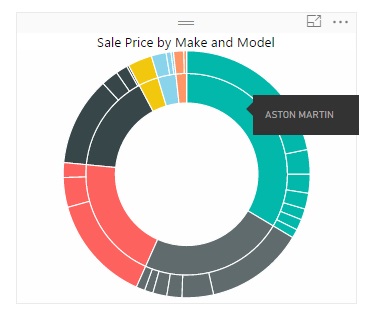
Sunburst Chart
Sunburst charts are essentially multilevel donut charts. However, as you can see in the following figure, they are good at showing hierarchies of data, as the inner ring represents each make and the corresponding segments of the outer ring show the sales for each model compared to the sales by make – and the whole.
Streamgraph
This kind of chart is a kind of smoothed stacked area chart. As you can see from the following figure it is good at showing how values change over time.

Tornado Chart
A tornado chart is a variation on a bar chart, only the separation between two sets of values is made clearer by the vertical separation-as you can see in the following figure.

Histogram Chart
This chart type shows data as ranges. In The following figure you can see sale process grouped into discrete “buckets” using a histogram chart.

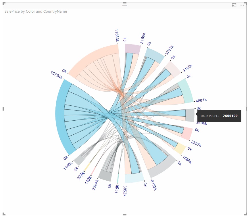
Chord Chart
This is an interesting-and somewhat less traditional-way of displaying the relationship between values in a matrix structure. The following figure shown how colors and countries relate by sales.
Sankey Diagram
The Sankey diagram in the following figure also displays how colors and country sales relate.

There are, inevitably, many more visuals that you can add to a Power BI Desktop file. And once you have added them you can upload them to the PowerBI.Com service, where they will work equally well in Azure.
So unleash your creativity and dive into the ever-expanding universe of Power BI. You are sure to find new and impressive ways to deliver your analyses.
Pro Power BI Desktop
If you like what you read in this article and want to learn more about using Power BI Desktop, then please take a look at my book, Pro Power BI Desktop (Apress, May 2016).