R comes prepackaged with a bunch of really useful statistical tests, including the detection of outliers. However, basic statistics methods for outlier detection rely heavily on 3 key assumptions: that the observations are independent, normally distributed, with constant mean and variance. These assumptions are rarely met in the real world where data sets are simply non-normal (for example count data), or highly skewed. In this post, we will look at two statistical methods for addressing both count data and moderately skewed datasets.
The data
The majority of tests for outliers assume that your data is normally distributed. That is, the data is continuous (like measuring someone's height) with a known mean and a constant & symmetrical spread around the mean. The spread around the mean is particularly important because it is this that is used to determine how far from "normal" an observation is and therefore, whether it is an outlier or not. So often though, our data isn't symmetrical but it is skewed. The plots below show two typical examples: the top plot is of count data, which is nearly always moderately skewed; the bottom plot is also clearly skewed.

The basic battery of statistical outlier tests can't be applied to either of these skewed datasets. But we do have options.
Outliers in count data
Our first option is to model count data explicitly. Normally distributed data is easy because it conforms to a well-known distribution with reliable properties. There is also a standard distribution, the Poisson distribution, which can be used to describe count data. R has a number of functions to help us explore the Poisson distribution, in particular:
- rpois(): simulates from a poisson distribution
- ppois(): calculates the probability of observing a point under a poisson distribution (i.e. calculates the area under the curve up to a point of interest)
We're going to use the ppois() function to calculate an "outlier score" for every observation in our dataset. The intuitive way to think about this score is the 'likelihood of observing a point this large'. This is a somewhat loose interpretation of a p-value, but suitable for detecting outliers. R code and the resulting plot are shown below:
## calculate a "p-value" for outliers, based on the poisson probabiliies
mypoisson[, Score := 1 - ppois(Measure, mean(Measure))]
## apply a Bonferroni correction factor to the p-value, to control the long-run error rate
mypoisson[, Outlier := Score < 0.05 / 1000]
## visualise the results
ggplot(mypoisson, aes(x = Timestamp, y = Measure)) +
  geom_point(aes(colour = Outlier), size = 3, alpha = 0.7) +
  scale_colour_manual(values = c("darkgrey", "red")) +
  theme_minimal()
From the plot above, only 6 observations were identified as outliers with a threshold around 35. From my perspective, this a great result - it is robust, data-driven and the threshold is quite a bit higher than I think most of us would have picked just by looking at the data. If we can trust the results, then having an accurate and higher threshold will reduce the number of false outliers we detect in the future.
Transforming skewed data
Statistically, the technique above is an ideal - we have data that comes from a well-known distribution with properties that we can describe and leverage. In the real world, we might not be able to tell which distribution best models our data, especially if the data is skewed. We can try to use distributions that reflect more skew, like the Chi-squared distribution, or the negative binomial distribution. Or, we can try to transform our data so that it appears "more normal" and then apply the standard outlier detection tests from the Outliers package in R. Let's look at an example using the same data as above.
First of all, let's score each observation using the standard tests in the Outliers package:
library(outliers)
tests <- c("z", "chisq", "t")
results <- rbindlist(lapply(tests,
                            function (t) {
                                data.table(Timestamp = mypoisson[, Timestamp],
                                           Measure = mypoisson[, Measure],
                                           Score = scores(mypoisson[, Measure], type= t, prob = 0.95),
                                           Method = t)
                            }))
results <- rbind(mypoisson[, .(Timestamp, Measure, Score = Score < 0.05 / 1000, Method)],
                 results)
ggplot(results, aes(x = Timestamp, y = Measure)) +
  geom_point(aes(colour = Score), alpha = 0.3, size = 2) +
  facet_wrap( ~ Method) +
  theme_minimal() + xlab("Timestamp") +
scale_colour_manual(values = c("darkgrey", "red")) 
Straight away, we can see that compared to our robust analysis (shown again in the top right panel), that naively applying the test from the Outliers package results in a huge inflation of outliers. We get slightly better results if we log transform the data, to make it "seem" more normal:
tests <- c("z", "chisq", "t")
results <- rbindlist(lapply(tests,
                            function (t) {
                                data.table(Timestamp = mypoisson[, Timestamp],
                                           Measure = mypoisson[, Measure],
                                           Score = scores(mypoisson[, log(Measure)], type= t, prob = 0.95),
                                           Method = t)
                            }))
results <- rbind(mypoisson[, .(Timestamp, Measure, Score = Score < 0.05 / 1000, Method)],
                 results)
ggplot(results, aes(x = Timestamp, y = Measure)) +
  geom_point(aes(colour = Score), alpha = 0.3, size = 2) +
  facet_wrap( ~ Method) +
  theme_minimal() + xlab("Timestamp") +
scale_colour_manual(values = c("darkgrey", "red")) 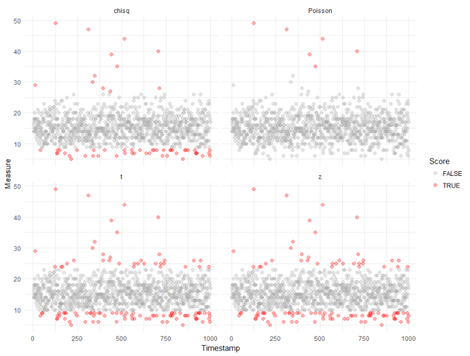
We can probably ignore outliers that fall below the majority - these are unlikely to be interesting in most anomaly detection cases. And we can see the "chisq" method from the Outliers package doesn't do too bably, though with more false positives than we would like. This, however, is the tradeoff when applying standard tests to non-standard data.
We can apply a slightly stronger transformation, for example taking the square root, the cubed root etc. etc.. Below, is the visualisation resulting from taking the fifth root of the data:

Again, ignoring the low-lying outliers, this more extreme transformation has marginally better results - but still doesn't compete with using the Poisson method.
Wrap up
We've looked at a couple of different methods for detecting outliers in count data. The first worked well but relies on the data being Poisson distributed. The second method relies on transformations to make the data appear more normal, and then application of standard outlier tests to the transformed data. The results here were noisier, but were a reasonable approximation of the Poisson method. The difficulty here is that all basic statistical methods rely heavily on their underlying assumptions to evaluate our data. These assumptions are effective if our data belongs to one of the well-understood distributions. But things get tricky when this isn't the case.
So, can we afford to relax these assumptions? In most cases we probably can, if we can accept more false positives without serious implications. However, I wonder whether machine learning methods might provide a better methodology in the real world? The majority of machine learning methods are data-driven, they learn from the data at hand, compared to statistical tests which rely on strict assumptions. There are caveats to this, of course, machine learning methods also rely heavily on the quality of your data. Perhaps we can explore some machine learning approaches in a future post.