Introduction
As a follow up to my first article "Monitoring on a Budget", here's how we present the fact data to management using Microsoft Excel. This has little to do with SQL Server and much to do with Excel but is certainly useful in quickly creating graphs from SQL Server data (or any external data). There are many other ways to present this data. I'd welcome your ideas and/or examples.
Technique
- Open Excel (you can add this data to an existing sheet or use a blank one)
- Click Data on the menu bar.

- Select PivotTable and PivotChart Report...
- Click the radio button for External data source and PivotChart report (with PivotTable report)
- Click Next
- Click Get Data...
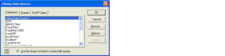
- Highlight <New Data Source> and click OK
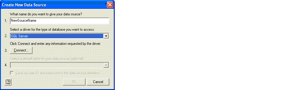
- Enter a NEW source name on line 1.
- Select SQL Server on line 2.
- Click Connect... on line 3.
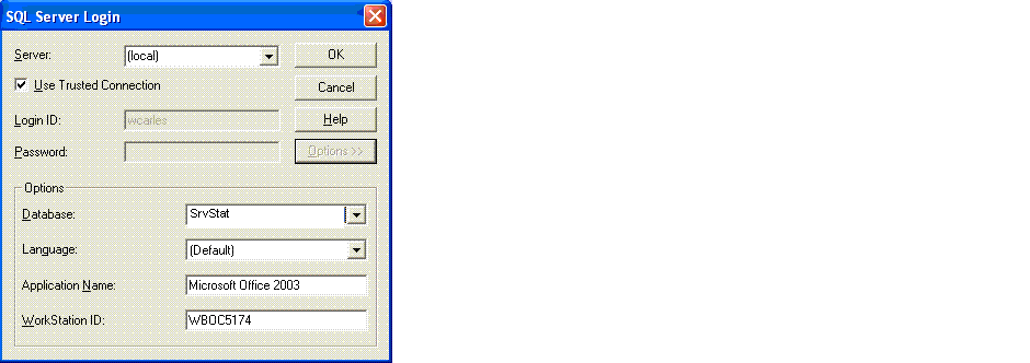
- Enter a server name and the appropriate connection credentials. Since I'm always the person generating these charts, I use a trusted connection. If many people will be viewing your charts, you may want to use a native SQL Server login.
- Click Options >> and select the database that host's your statistics.
- Click OK
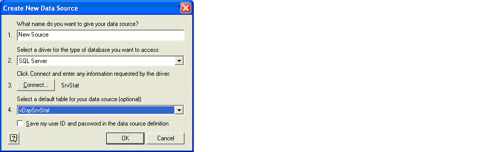
- Select one of the views defined in the original article
- Click OK
- Click OK
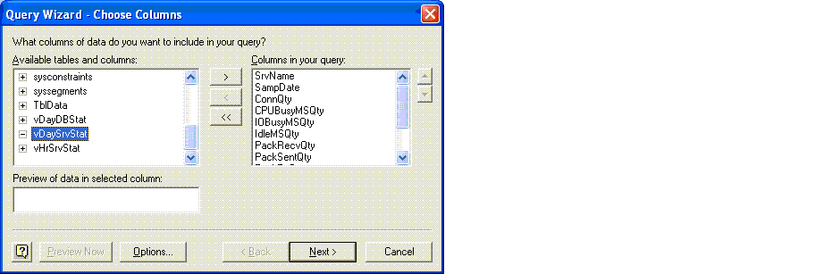
- Click > to select all columns in the view
- Click Next
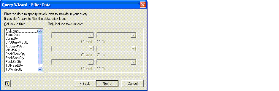
- Click Next (I'm not sure why you'd want to, but you can add your own filters here if you'd like)
- Sort by: SrvName Ascending, Then by: SampDate Ascending
- Click Next
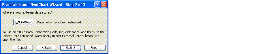
- Select the radio button for Return Data to Microsoft Office Excel
- Click Finish
- Click Next
- Select the radio button for Existing worksheet
- Select a cell which will be the starting point for inserting data into the sheet.
- Click Finish
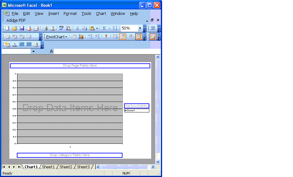
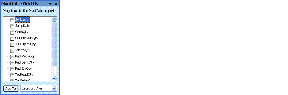
- Highlight then drag SrvName from PivotTable Field List to Drop Page Fields Here
- Highlight then drag SampDate from PivotTable Field List to Drop Category Fields Here
- Highlight then drag any or all (one at a time) of the FACT columns to Drop Data Items Here. We created separate charts for each fact (repeating each step 2-30 above for each fact) for a cleaner presentation.
- You can double click any of the labels and tags to enhance the appearance. We replaced all of the column and tab names with meaningful, unabbreviated words and added commas to the numeric scale.
- Finally, you need to save the spread sheet.


Show me the money
Obviously, we have so much data that the dates across the bottom are no longer readable. If you pass your cursor across a point on the graph, it will pop up with the date and the value for that date.

You'll notice drop down boxes so you can select a specific server and/or dates. You'll need to click the exclamation point (!) to refresh the data if the database has changed since your last viewing. After a period of time, refreshing the data will take longer. 
Conclusion
As I stated in the beginning, there are many ways to present this data. This technique is relatively simple and inexpensive. It is easy to view, allows access by multiple users, and provides the ability to filter the data. Immediately, you will be able to observe spikes/dips and over time, trends in performance metrics.