

Like all DBA’s out there I worry about the runtimes of my SQL jobs, and in January 2013 I shared the first version of my take on the subject with then SQLServerCentral community. It worked, but it needed a cumbersome Excel file to visualize the timeline. Why Excel, do you ask? Well, most of the SQL Servers I maintain simply do not have Reporting Services.
In my continual search of a better way of doing things I started looking for a “external renderer” for my graphic idea, i stumbled upon Google Charts (http://developers.google.com/chart/). After playing around with it for an hour or so i realized that this awesome product could be used to replace my Excel sheet by nice looking dynamic timeline graph, and that I could even email that timeline from within a stored procedure!
And its free to boot, which as a dutchman I do like 🙂
An example of the job timeline you can create using google graph:
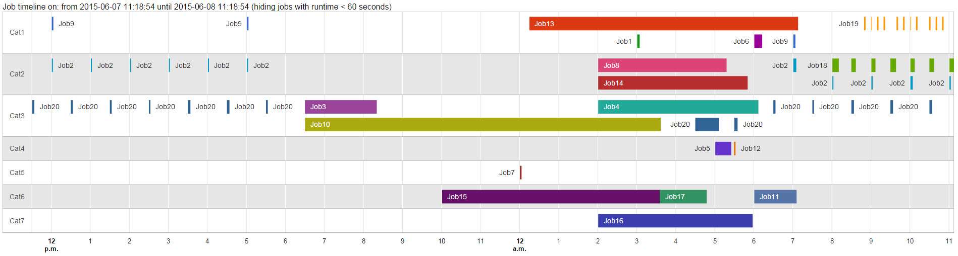
Click here for a live version of this example http://www.ekelmans.com/FTP/Web/JobTimeline.html
TIP: try to hover over some bars.
The creation of this timeline is actually quite simple; create an (3 part) HTML file you can send as an email attachment using sp_send_dbmail
Part 1 (The Header), contains the java script declarations and all the HTML up to the data.
<html><head><!--<META HTTP-EQUIV="refresh" CONTENT="3">--><script type="text/javascript" src="https://www.google.com/jsapi?autoload={'modules':[{'name':'visualization', 'version':'1','packages':['timeline']}]}"></script><script type="text/javascript">google.setOnLoadCallback(drawChart);function drawChart() {var container = document.getElementById('JobTimeline');var chart = new google.visualization.Timeline(container);var dataTable = new google.visualization.DataTable();dataTable.addColumn({ type: 'string', id: 'Position' });dataTable.addColumn({ type: 'string', id: 'Name' });dataTable.addColumn({ type: 'date', id: 'Start' });dataTable.addColumn({ type: 'date', id: 'End' });dataTable.addRows([
Part 2 (The data): The data is formatted as one text row per record using this format: Job category, job name, Start datetime, End Datetime
[ 'Cat1', 'Job1', new Date(2015, 5, 8, 3, 0, 0), new Date(2015, 5, 8, 3, 4, 29) ],
Part 3 (The footer): Here the options are set for the timeline and the rest of the HTML page.
]);var options ={timeline: {groupByRowLabel: true,colorByRowLabel: false,singleColor: false,rowLabelStyle: {fontName: 'Helvetica', fontSize: 14 },barLabelStyle: {fontName: 'Helvetica', fontSize: 14 }}};chart.draw(dataTable, options);}</script></head><body><font face="Helvetica" size="3" >Job timeline on: ServerName from 2015-06-07 11:18:54 until 2015-06-08 11:18:54 (hiding jobs with runtime < 60 seconds)</font><div id="JobTimeline" style="width: 1885px; height: 900px;"></div></body></html>
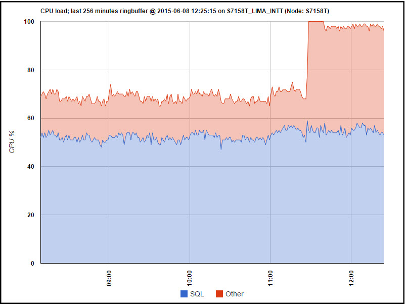
If you know basic HTML you can easily tweak the bedjeezus out of this idea and go wild like i did, and build with all sorts of HTML based charts to enrich alerts, like these:
CPU (over)load,
Diskspace (alerts)

So.... go for it guys, and i hope you'll share some of your ideas for graphs in the comments .
Happy coding!
Theo 🙂
Alternate download link: http://www.ekelmans.com/FTP/Web/GoogleJobTimeline.sql
